Standout Features:
- Bold, eye-catching cover designs
- Strong color palette for gender awareness
- Stylish, trend-focused editorial spreads
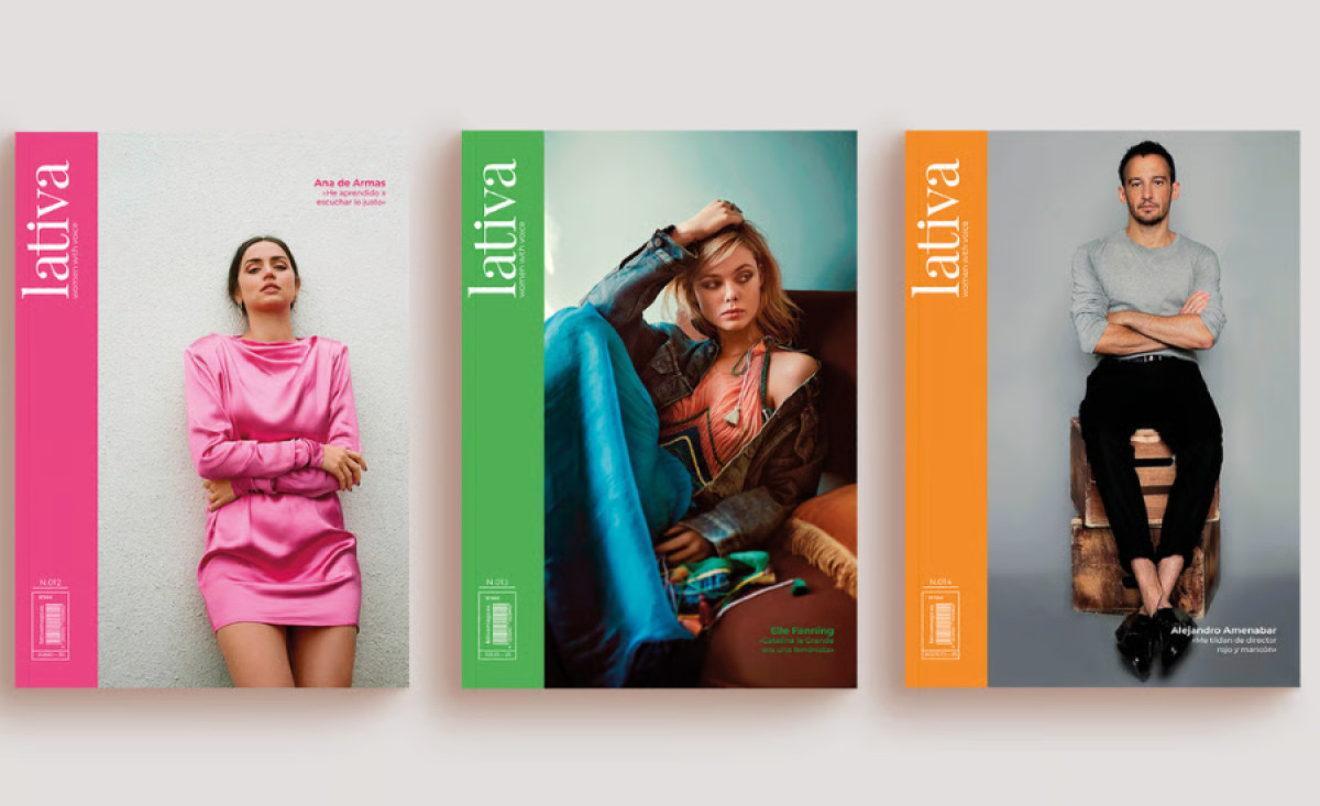
Lativa is a lifestyle and trends magazine with a clear female orientation, focusing on culture, current affairs, and gender equality. Created by Eureka Studio Creative, the print design blends bold visuals with a modern aesthetic. Each design element creates a dynamic reading experience that captivates the audience from the first page.
Each issue features vibrant colors — such as pink, green, and orange — which instantly grab attention and reflect the publication's energetic and youthful tone. The large, clear typography adds a sense of authority and sophistication, making it clear that this is a publication that wants to be noticed in the competitive magazine landscape.
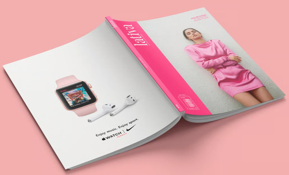
The bright colors, combined with the choice of images — often of strong women in empowering poses — underscore the magazine's mission to reclaim and amplify the role of women in society. The hues evoke emotions of confidence, power, and vibrancy, while also being in tune with contemporary trends in fashion and design.
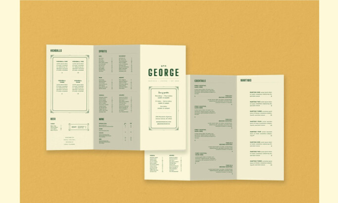
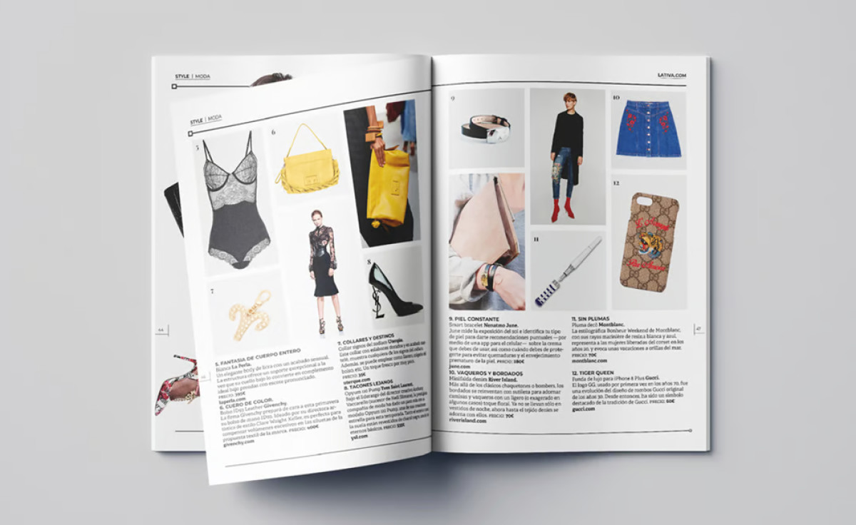
Inside the magazine, the editorial spreads maintain a stylish and modern layout. Clean lines, well-balanced spacing, and an engaging mix of images and text make the content easily digestible. Each spread is thoughtfully designed to ensure that visual elements support the magazine's narrative, from fashion features to in-depth cultural discussions.
With its bold covers, vibrant color palette, and trendy editorial spreads, the Lativa magazine design effectively blends visual appeal with a socially conscious message. It creates an immersive experience that not only entertains but also sparks conversations around gender equality and the empowerment of women.