Standout Features:
- Dynamic, vibrantly warm color palette
- Strong visual identity through logo and brand mark
- Clear and impactful typography
Born from a passion for problem-solving and a shift towards sustainability, MCH Solar Solutions offers bespoke renewable energy options. Its print collateral, designed by Marx, uses a strong, bold aesthetic to communicate the company's commitment to energy efficiency and innovative solar solutions for a greener future.
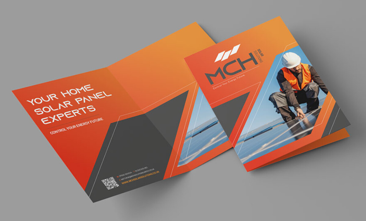
The brand materials feature vibrant orange gradients and deep grays. Orange conveys warmth, energy, and optimism — fitting for solar solutions — while gray adds professionalism. This high-impact combination grabs attention and provides the print that modern feel.
Additionally, the MCH logo uses a geometric design with sharp, intersecting lines and rectangular cutouts. This design, with its stylized solar panel logo and shapes, is memorable and directly ties to the core product. The logo’s clean, modern lines reinforce the idea of a future-oriented company.
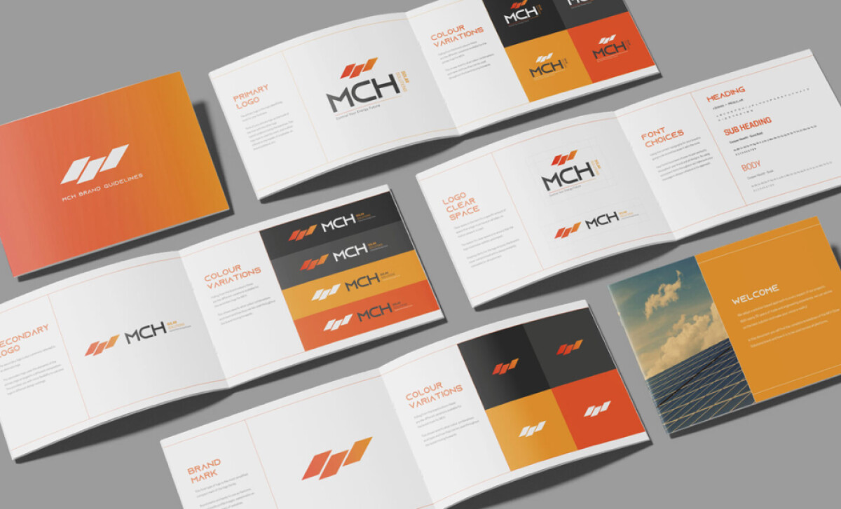
The print collateral uses clean, modern, and legible sans-serif fonts. Bold headers are paired with lighter subheadings, creating a distinct visual hierarchy. This contemporary font choice ensures readability and gives the design a strong presence, effectively guiding clients through MCH's offerings and highlighting key messages.
The MCH Solar Solutions print design demonstrates how color gradients can add depth and a contemporary feel to traditionally static print materials. For professional service providers wanting to appear modern and forward-thinking, incorporating subtle or bold gradients into your print design can enhance visual appeal.