Standout Features:
- Simple rectangular shapes
- Sleek aesthetics
- Sans-serif typography
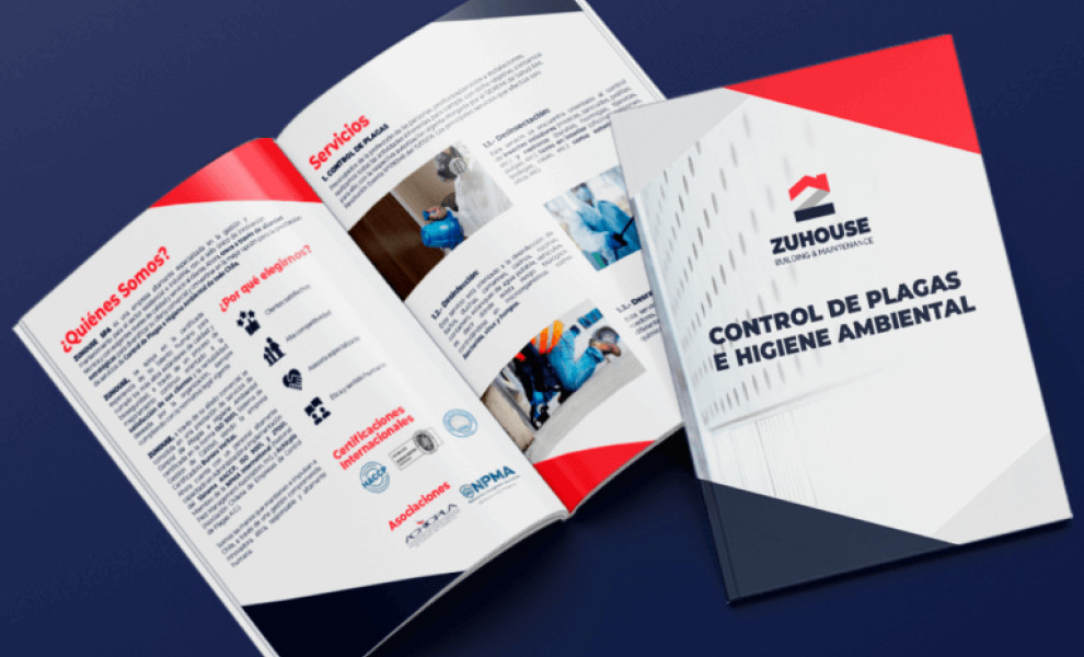
ZUHOUSE's print design represents the core values of this building and maintenance firm in a simple, professional, modern way.
Created by Pow Ideas, the design features simple rectangular shapes in the corners of each page to create a clean, structured layout that mirrors the precision and attention to detail inherent in construction work.
The overall aesthetics is sleek and minimalist, exuding a sense of professionalism and reliability. This approach ensures the design conveys a clear message of trustworthiness, while the clean lines and uncluttered layout reinforce the firm's commitment to high-quality service.
Sans-serif typography enhances readability and contributes to the modern vibe. This clean and straightforward font ensures that the information is easily accessible.