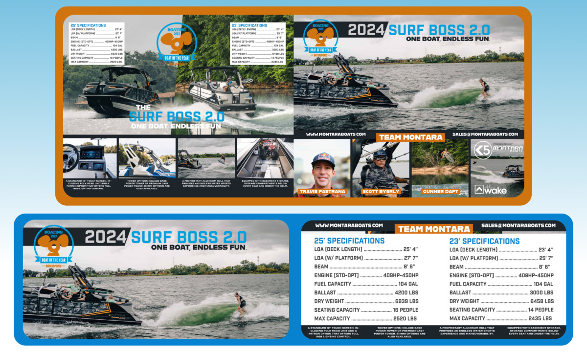
Montara Boats' collaboration with REV Branding Industries has resulted in a show flyer for the Surf Boss 2.0 boat that masterfully captures the essence of Montara's pioneering spirit in the boating industry. This flyer is a compelling brand presentation, weaving together high-quality imagery, bold typography, and strategic layout to create a memorable and impactful experience.
Key Insights for Brands:
- High-quality imagery enhances brand authority while creating a personal connection
- Bold, industrial typography communicates power and innovation, reinforcing a forward-thinking identity
- Structured layouts improve readability and inject professionalism to the design
The Design Showcases Industry Authority and Humanizes the Brand with High-Quality Imagery
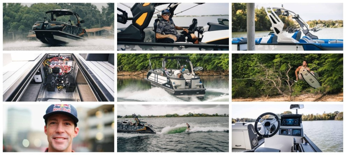
REV Branding Industries crafted a flyer that prominently utilizes captivating, high-quality images of Montara boats in action, showcasing their sleek designs and advanced technological features. These images underscore Montara's industry authority by highlighting their cutting-edge innovations and the thrill of the boating experience.
Top-notch print designers incorporate team photographs to add a personal touch that humanizes the brand. Here, the images of the company's key members establish a connection between the viewers and the people behind Montara, making the brand more approachable and engaging by fostering trust and relatability.
The balance between these compelling visual elements and well-placed text ensures the flyer grabs attention and intrigues the viewer even before they delve into the content of this exquisite promotional marketing material. By placing vivid, action-packed images alongside succinct, informative text, REV Branding Industries achieves a harmony that invites further exploration, effectively bridging the gap between visual appeal and informational depth.
Bold Industrial Typography Conveys Innovation and Power
The flyer employs a sharp, bold, industrial sans-serif font to convey the power and innovation inherent in Montara boats. This choice ofbrand typography is functional yet meaningful, enhancing readability while reinforcing the Montara Boat's forward-thinking identity.
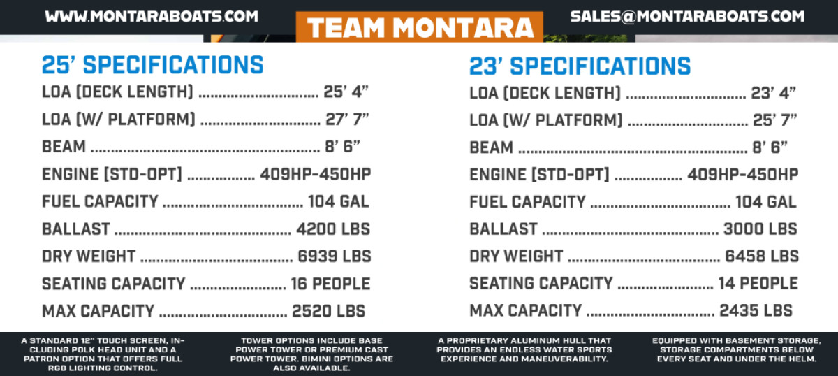
Moreover, the flyer’s text is neatly organized within text boxes or backgrounds in contrasting colors, so crucial details such as boat details and staff names are easily accessible. The menu-like organization for boat specifications further aids in readability, allowing viewers to absorb key information quickly.
Often, professional print designs feature emphasized typographic iterations to catch the viewer’s attention and spark further engagement. In this case, the extra bold typeface for contact information reinforces the brand's message of strength and innovation and ensures clarity and impact.
The Prominent Branding Message and Award Badge Reinforce Montara Boats' Excellence and Appeal
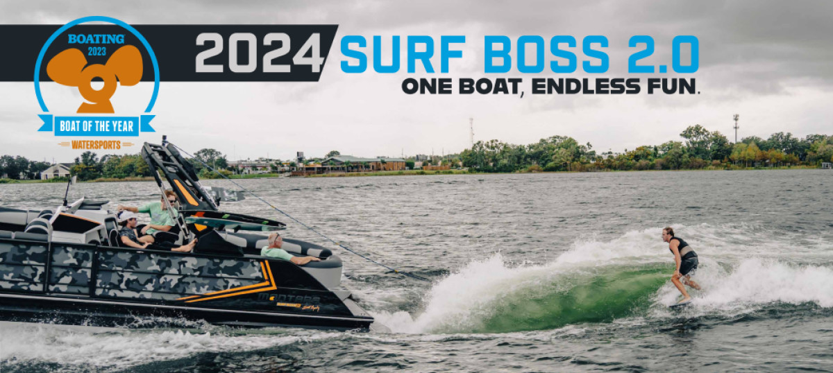
The boat name in a vibrant blue typeface and the branding message "One boat, endless fun" are direct and powerful branding elements that introduce Montara’s offerings. The boat name's prominent presentation ensures immediate recognition and solidifies brand identity.
The strategic placement of the Boating 2023 award badge further enhances the flyer’s credibility, signaling excellence and industry recognition. This badge is prominently displayed, drawing immediate attention and establishing Montara’s boats as superior in quality and innovation.
The brand’s logo, which appears subtly on the vehicles and in the right corner of one side of the flyer, is minimalistic. This allows the award badge to take center stage, making the flyer’s message of the product’s excellence unmistakable.
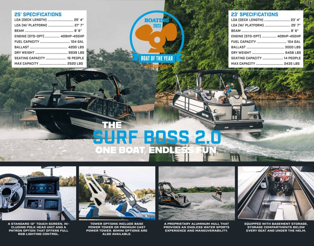
Structured Layout Enhances Readability and Professionalism
The flyer’s structured layout, defined by sharp lines and geometric boxes, ensures each design element has its own space to shine, making the content easy to digest.
Using a grid system maintains order and professionalism, which is crucial for conveying the high-tech and luxurious nature of Montara boats. This composition highlights the flyer’s aesthetic appeal and functionality, making it stand out at local shows.
Explore our list of graphic design trends that will raise your brand impact.
Overall, the flyer balances engaging visuals, clear typography, and an organized layout to create an impactful marketing tool for viewers and potential customers. It showcases the design’s ability to blend visual appeal with practical information, making it a deserving winner of the Design Awards.


