Team Behind the Design
Print Design Analysis
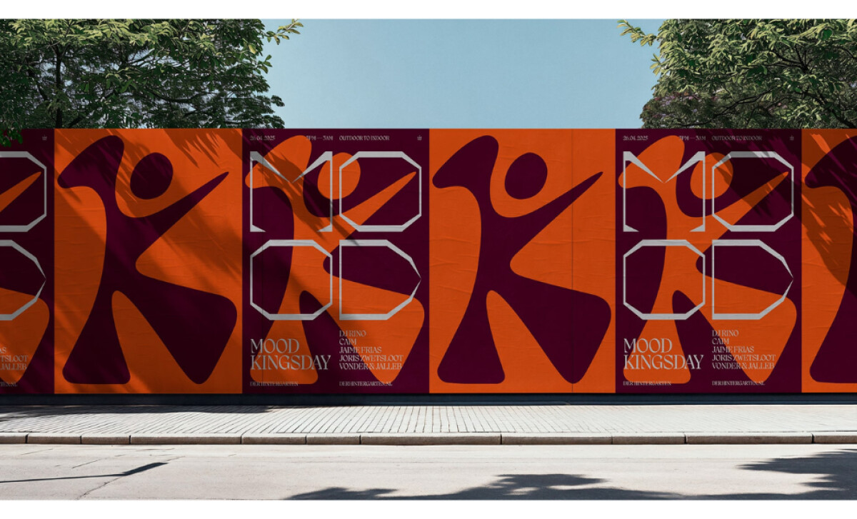
For festival print works, I look at how composition, typography, and color work together to convey mood and energy.
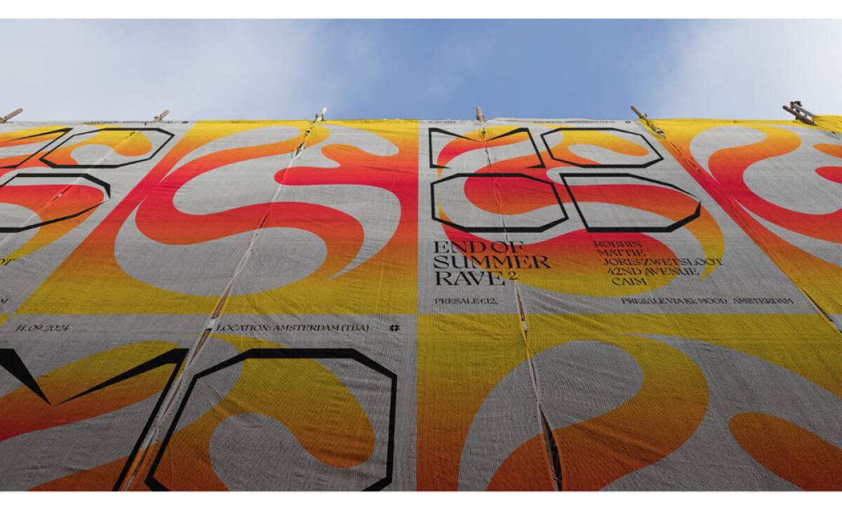
I also pay attention to how the visuals scale across different physical contexts since print demands immediate impact.
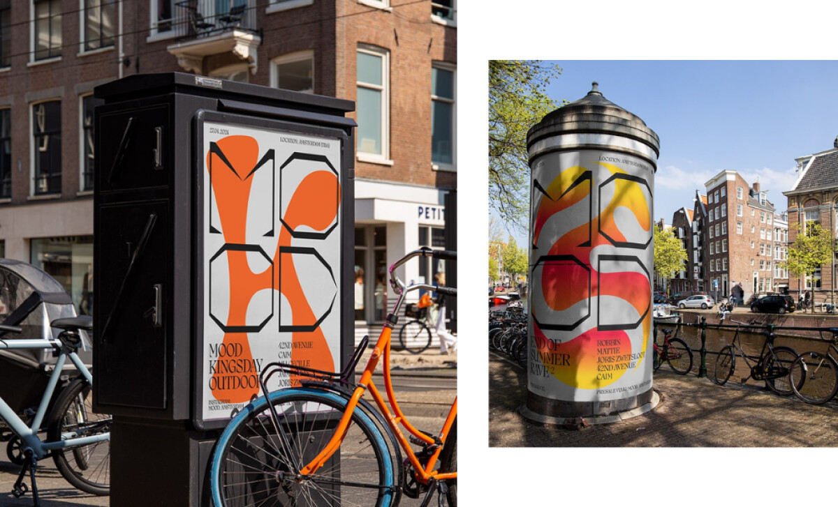
- Typography: I see sharp, angular lettering that brings an edge to the compositions. The type contrasts well with the flowing illustrations, creating a rhythm that fits the music genres represented.
- Layout: The posters use large abstract figures and strong framing to pull attention quickly. The alternating blocks and repeated shapes form a steady visual cadence that works well across long runs of street posters.
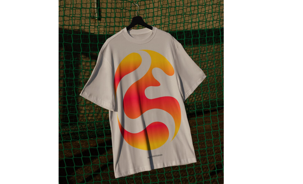
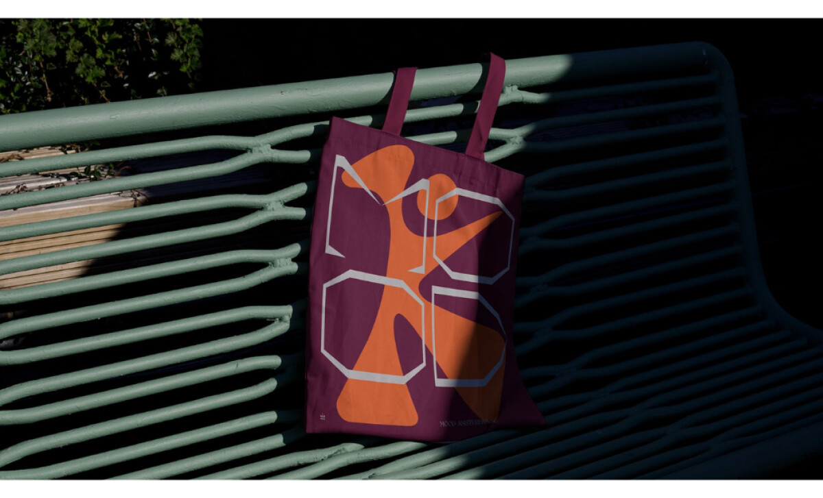
- Imagery: The fluid silhouettes and gradient forms feel playful and expressive. They echo late ’90s rave culture while keeping the design contemporary and bold.
- Production Quality: The bright orange, deep burgundy, and neon gradients translate well across different print surfaces. Even on fabric, the shapes keep their clarity and punch, which helps maintain a consistent festival identity.
What Brands & Agencies Can Learn from MOOD
Dennis Wuisman’s work for MOOD shows how print design can capture the pulse of an event through attitude, rhythm, and visual intensity. It’s a strong example of how to build a festival identity that is both expressive and cohesive.
1. Pair Bold Typography with Fluid Illustration for Dynamic Contrast
The sharp, angular typeface creates structure while the soft, gradient-filled illustrations inject movement. This contrast is a powerful reminder that mixing rigidity with flow can generate visual energy that mirrors music and nightlife culture.
2. Use Repetition and Framing to Build a Recognizable Visual Cadence
The alternating blocks, silhouettes, and repeating shapes give the posters a rhythm that makes them unmistakable at a glance. This approach shows how consistency—not uniformity—can strengthen recognition across large-format print.
3. Ensure Colors and Shapes Hold Up Across All Materials
The neon gradients and saturated tones retain impact on posters, merch, and on-site visuals. This highlights how essential it is to test print elements across real-world surfaces to maintain clarity and brand intensity.
About DesignRush Featured Designs
At DesignRush, we review hundreds of agency projects each month. The featured selections stand out for clarity, creativity, and execution across digital and brand experiences.
Exceptional works proceed to our Monthly Design Awards, where they’re recognized as leading examples of design craft.
Explore standout print design projects that push creativity forward:
- Best Print Designs
- Best Website Designs
- Best App Designs
- Best Logo Designs
- Best Packaging Designs
- Best Video Designs
For a full list of design agencies and related services, see our Agency Directory.