- Designer: Moises Mendoza
- Category: Print Design (Book Cover)
- Location: Los Angeles, California, United States
- Project Brief: Create a Taschen-style coffee table art book cover that interprets John Singer Sargent’s work through refined editorial design, drawing inspiration from Taschen’s accessible art series while presenting a contemporary personal perspective.
Restraint and material selection can transform a standard book cover print design into a collectible piece of art.
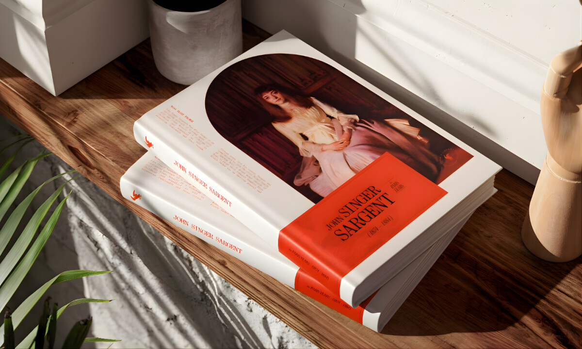
“Taschen” Style Art Book Cover honors a legacy publishing philosophy while injecting a personal perspective through a sophisticated tonal shift.
- Taschen Editorial Influence: I like how that this project successfully democratizes art history without stripping away the inherent prestige of the subject matter. The pairing of high-fidelity imagery with a refined editorial system creates an experience that feels both timeless and accessible.
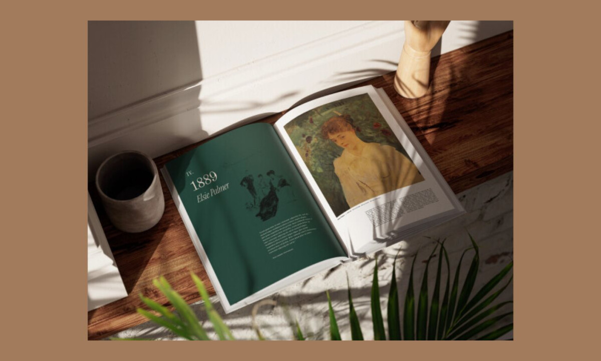
- Cover Composition & Hierarchy: The decision to center the artwork within a framework of structured typography and ample negative space gives the cover a museum-grade quality in my eyes. This approach mirrors the proportions of classic catalogs while maintaining a visual rhythm to be contemporary and energized.
- Typography & Historical Context: I believe the choice of a graceful serif typeface lends the necessary historical gravity to Sargent’s portfolio without becoming decorative. This balance of authority and readability aligns perfectly with my view of Taschen’s tradition for scholarly yet engaging art presentation.
- Materiality & Object Quality: The hardcover format and oversized coffee table scale immediately elevate the book to a tactile, physical presence for me. My assessment is that this design treats print as a sensory experience where the weight and texture are just as vital as the images inside.
Word from the Agency
"For personal projects I always try to make something that I’d like to see out in the world, in this case a coffee table art book of one of my favorite painters."
— Moises Mendoza
What Brands & Designers Can Learn from This Taschen-Style Art Book Cover Design
This project demonstrates how editorial restraint and material awareness can elevate print into a collectible object. Here are three key lessons brands and designers can take from this art book concept:
1. Let Restraint Elevate the Artwork
Centering the artwork with generous negative space allows the content to lead without competition. Editorial discipline often creates more impact than visual excess.
2. Use Typography to Convey Authority, Not Decoration
Refined serif typography supports historical context while remaining readable and timeless. Type should reinforce credibility and tone rather than draw attention to itself.
3. Treat Print as a Physical Experience
Format, scale, and material choices contribute as much to perception as layout. When print is designed as an object, it gains longevity and perceived value beyond the page.