Standout Features:
- Bold color palette
- Structured layouts
- Cohesive stationery design
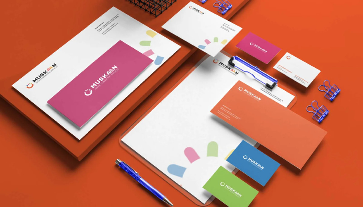
Muskaan Consulting Service is a social consulting firm dedicated to creating impactful solutions for youth and community development. The print design, developed by Creative Nexus, strengthens the organization's identity with a professional yet engaging aesthetic, reinforcing trust and accessibility.
The design utilizes vibrant hues like deep blue, bright orange, and soft pink. These colors create a dynamic and uplifting visual identity, effectively conveying Muskaan’s mission of positivity and empowerment. The contrast between the bright tones and the clean white space ensures that the brand feels modern and welcoming.
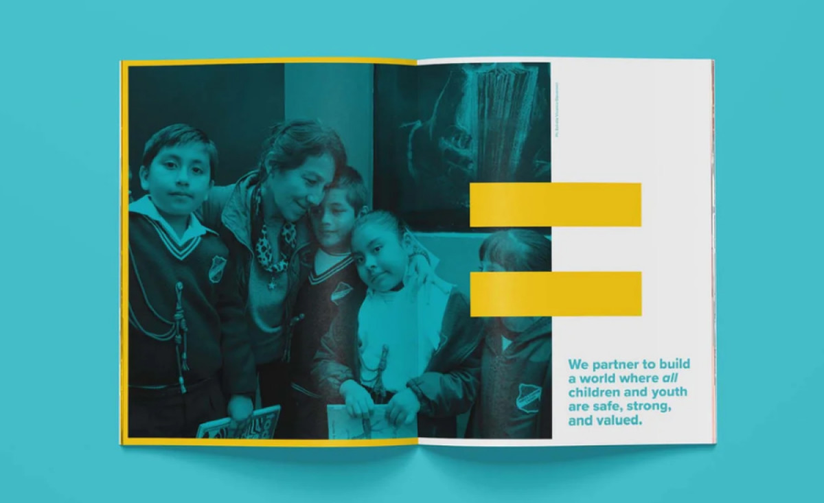
The structured layouts across different print materials enhance readability and information hierarchy. The placement of key elements, such as the mission statement, ensures clarity without overwhelming the viewer. The incorporation of graphic elements, such as the equal sign motif in the editorial design, reinforces Muskaan’s commitment to social equality and inclusion.
Finally, the cohesive stationery design ties all branding materials together, from business cards to letterheads and envelopes. The consistent use of typography, colors, and iconography across all print assets strengthens brand recognition while maintaining a polished, professional appearance.
Through a combination of vibrant visuals, well-structured layouts, and a cohesive brand identity, this professional services print design successfully communicates Muskaan Consulting Service’s mission while maintaining a high level of professionalism and approachability.
-preview.jpg)