Standout Features:
- Clear messaging that addresses client needs
- Simple layout
- Professional aesthetic
With a mission to "restore humanity to insurance," Navy & Sage Benefits tasked Bethany Issler with creating print materials that could help establish its credibility and expertise in simplifying insurance for business leaders. But more importantly, it needed to articulate its goal of morally guiding businesses through the often-tricky world of insurance.
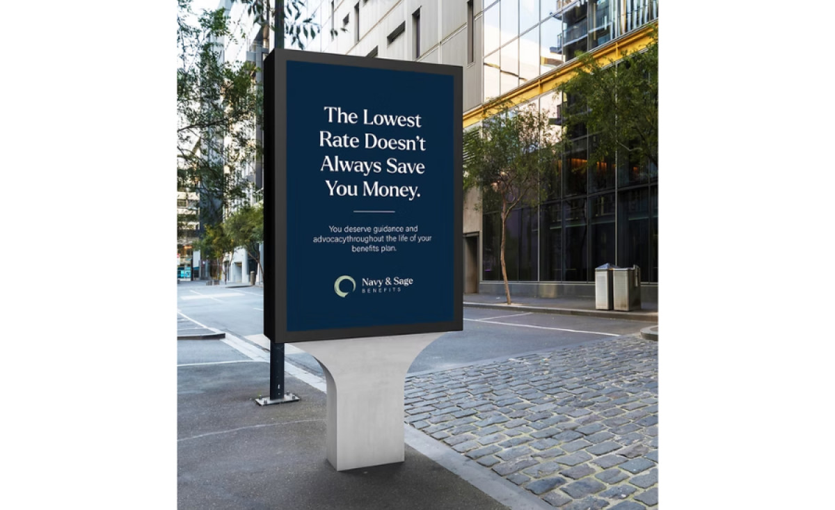
Honest and direct messaging is central to the design's effectiveness. The slogan, "The Lowest Rate Doesn't Always Save You Money," is an almost brutally honest statement that builds trust and positions Navy & Sage Benefits as a client-focused partner. Its examples of candid brand messaging such as this that can position brands as allies to its customers.
On the other hand, Issler achieved design efficiency through a simple layout. By focusing only on the most essential information, the professional services print materials deliver a message that's easily digestible. Oftentimes, a company name, a headline, and some body texts are all you need to improve content accessibility and create a professional look.
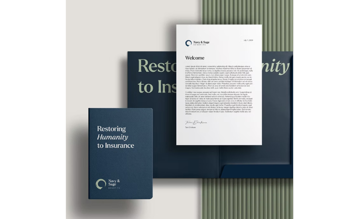
On the same note, visual credibility is further established through the print design's overall professional aesthetic. From its refined color palette of a deep navy blue and sage green, to its professional serif fonts, it establishes a sense of trust — the number one thing a benefits company must first sell its customers.
All in all, these print materials create a space for candid conversation. They establish a commitment to ethical practice within a traditionally opaque industry where confusion often reigns. Because of its design and straightforward messaging, readers can feel a sense of security, a belief in the company’s guiding principles.


