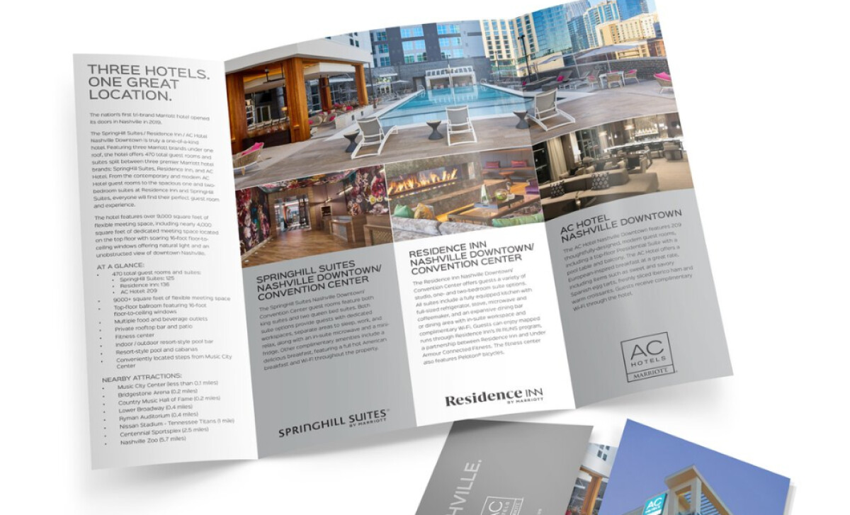
Standout Features:
- Elegant and revealing gatefold design
- High-quality, enticing hotel imagery
- Consistent branding and clear typography
When North Point Hospitality teamed up with Marriott for a pioneering three-brand hotel site in Nashville, they needed a special brochure. QueenPin Design delivered just that. This piece introduces you to Springhill Suites, Residence Inn, and AC Hotel, all under one roof. It’s designed to give event planners and guests a clear, appealing look at all the amenities. You'll appreciate the brochure's elegant gatefold design. Initially, you see a concise introduction to the three hotels. As you unfold it, a larger, more detailed visual story of the properties and their amenities emerges. This interactive element makes the brochure more memorable and perfectly suits the upscale nature of these Marriott hotels. High-quality pictures are used throughout this brochure to great effect. They show off the best parts of each hotel—like inviting pools, modern common areas, and well-decorated rooms. For anyone looking at the brochure, these photos create a strong first impression of comfort and class, which is so important when you're choosing a hotel. Consistent branding is clear in the typography and layout. The brochure uses easy-to-read, modern fonts, and the information is structured with helpful headings. This not only makes the brochure look good but also ensures it reflects the professional quality you'd expect from Marriott, making it easy for you to get the facts. What QueenPin Design achieved with this brochure is an inviting introduction to a unique hotel concept. The mix of an elegant gatefold, high-quality photos, and easy-to-read text creates a premium feel. This piece shows other businesses in the hospitality sector how you can use print to make even a complex offering feel accessible and appealing.


-preview.jpg)