Standout Features:
- Nude-toned ombré color palette
- Editorial typography
- Architectural layout featuring fine line-work grid accents
Ombré, a versatile restaurant concept with a fusion of European cuisine, required a print identity reflecting its core themes of sun, light, and shadow.
Undermyeye's design achieves this with a sophisticated and serene visual system. It elevates the dining experience and appeals to a style-conscious, primarily female audience through its timeless elegance.
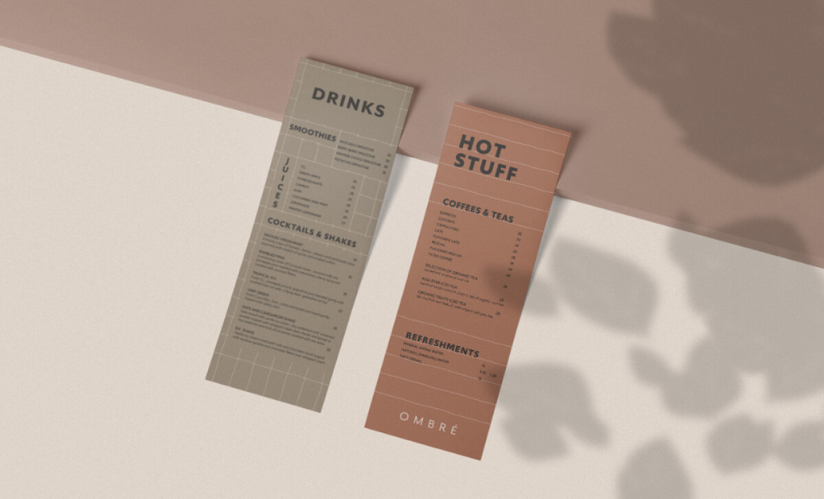
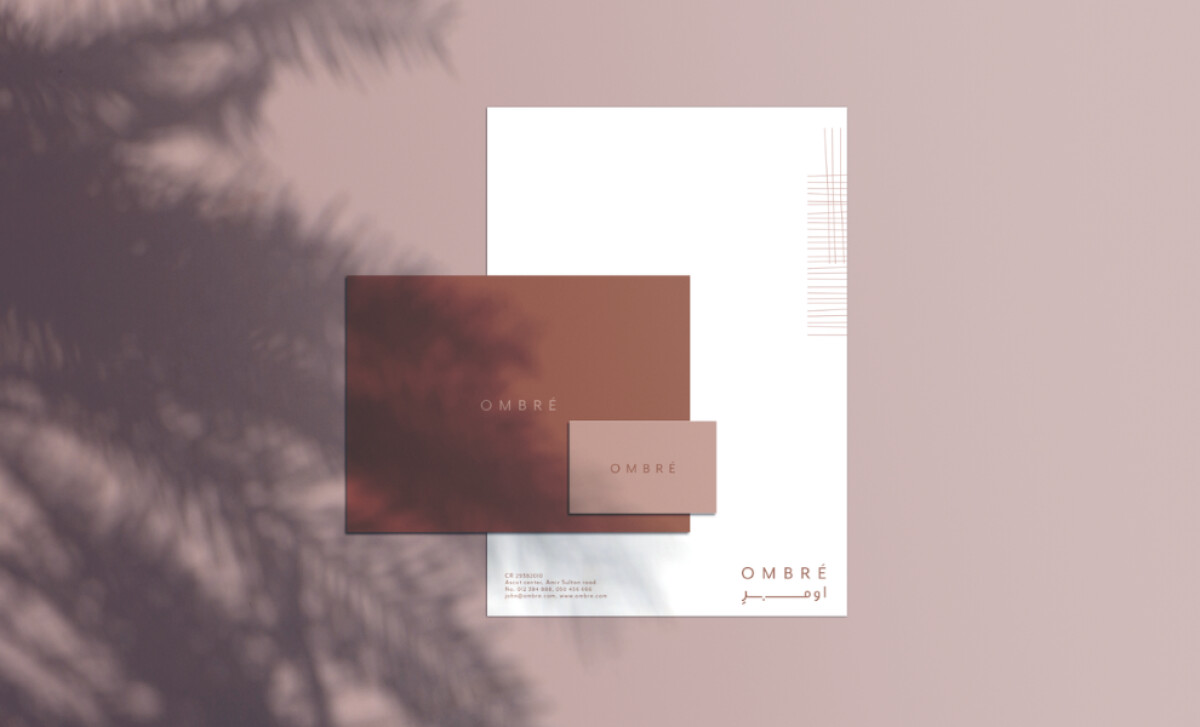
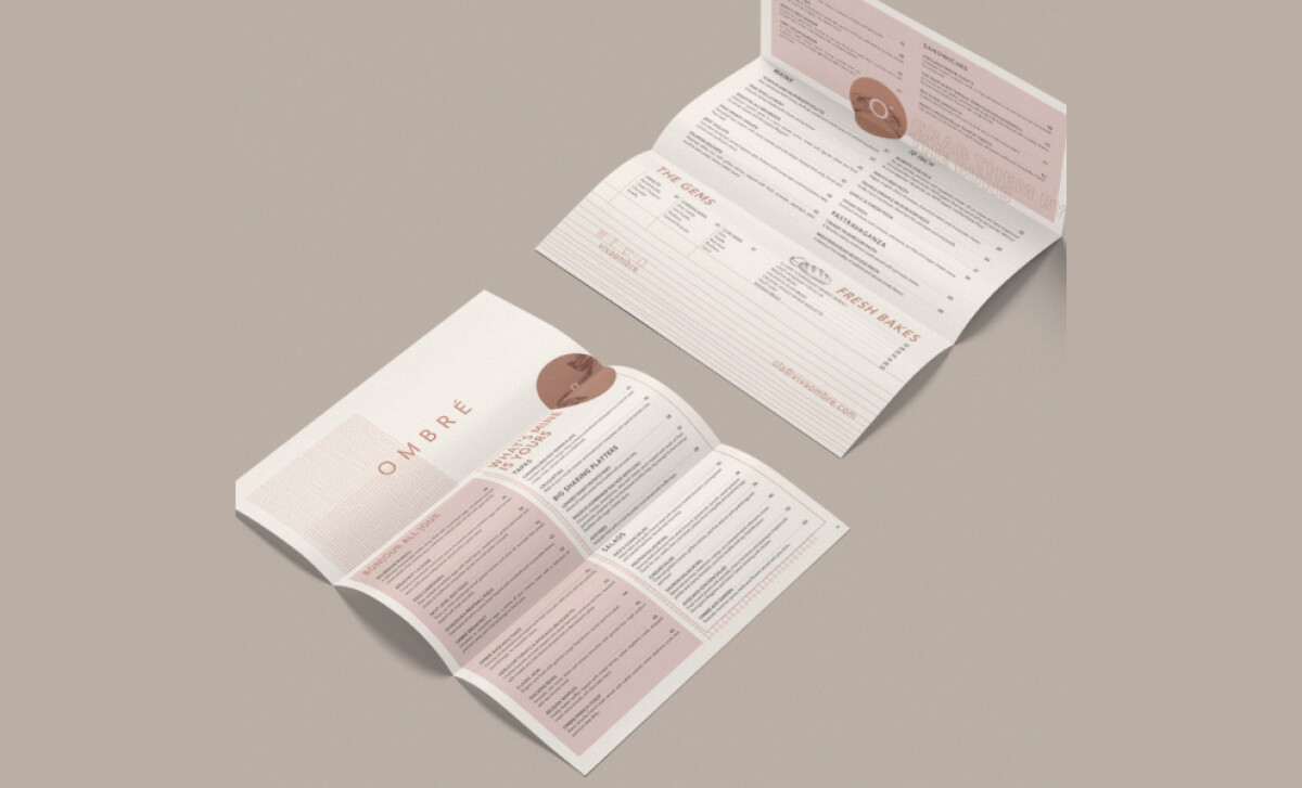
The brand’s entire visual identity is bathed in a nude-toned ombré color palette. Ranging from dusty rose to pale beige, these subdued gradients create a calm, intimate tone.
The impact of the palette is especially significant, as research shows color can influence up to 90% of a customer's initial assessment of a product or brand.
All in all, this color palette reflects the restaurant's emphasis on natural light and elegance, enhancing memorability plus ensuring the colors effect an emotional resonance with its patrons.
The design uses a refined sans-serif with expressive variation in size and weight. Large headlines, like “HOT STUFF,” feature bold, uppercase letters with exaggerated spacing.
This is balanced by quieter, clean body copy. The typographic rhythm feels as stylish as it is readable, reinforcing a confident femininity.
Throughout the food and beverage brand print collateral, fine line grids serve as a visual motif. These linear overlays are designed to echo architectural shadows from sunlight, directly connect to the brand’s theme of “sun, light, and shadow,” differentiating Ombré from other lifestyle cafés.
Undermyeye’s work underscores that a successful hospitality brand is built on a foundation of cohesive and thoughtful details.
The harmonious interplay of the soft palette, the stylish typography, and the architectural accents results in a print identity that perfectly captures the brand’s mission to be a refined and welcoming space.
For a restaurant, cohesive print design — from menus to collateral — is essential for shaping the guest experience and building a memorable brand. That’s why brands need partners who blend design expertise with business insight.
Our team ranks agencies worldwide to help you find a qualified partner. Visit our Agency Directory for the Top Print Design Companies, as well as:
- Top Branding Agencies
- Top Creative Agencies
- Top Design Agencies
- Top Public Relations Firms
- Top Social Media Marketing Agencies
Our design experts also recognize the most innovative design projects across the globe. Visit our Awards section to see the best & latest in print design.