Standout Features:
- Triangular spotlight motif
- Vibrant primary color coding
- Editorial and corporate typography
The Ondot Media identity is a perfect blend of a traditional corporate feel and a fresh, modern aesthetic. As a global technology media company, its print materials are a great example of a brand that understands its place in the market.
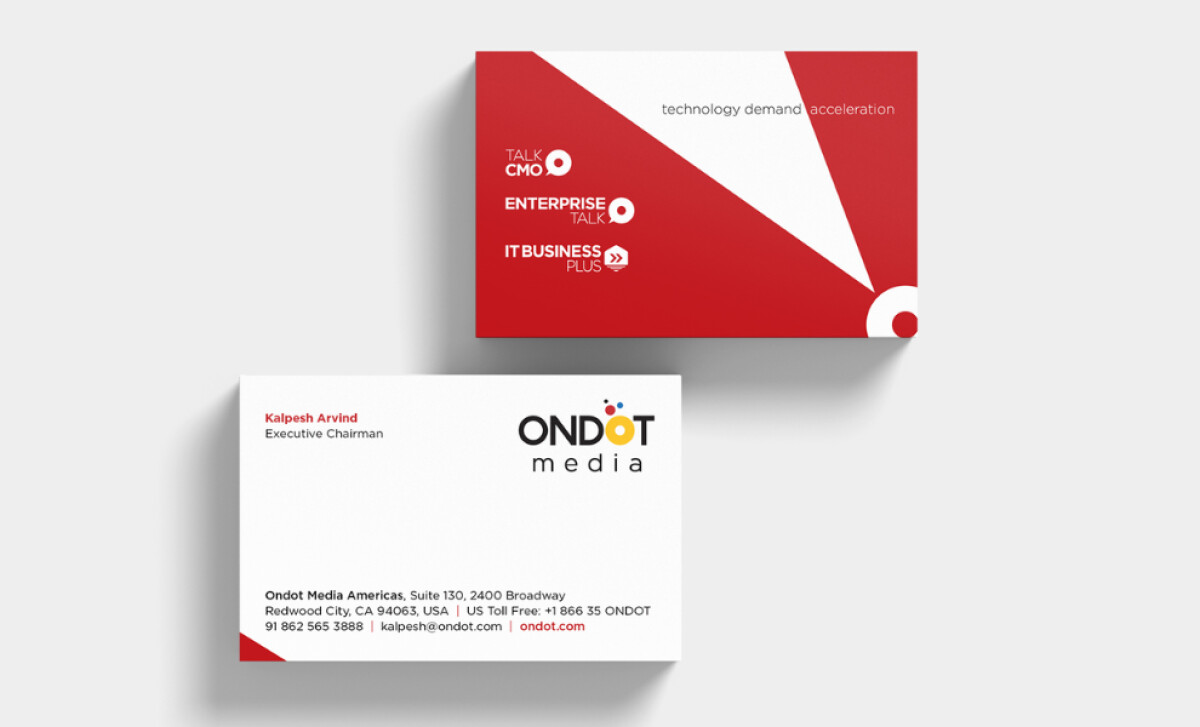
A key part of the design is a recurring triangular spotlight motif. This sharp, geometric form is shown in different colors and angles. It radiates from a central point, which creates a strong sense of movement.
The triangle is a great visual metaphor for the brand’s mission. It evokes a feeling of forward movement, signal transmission (which is perfect for a technology logo), or the illumination of an idea.
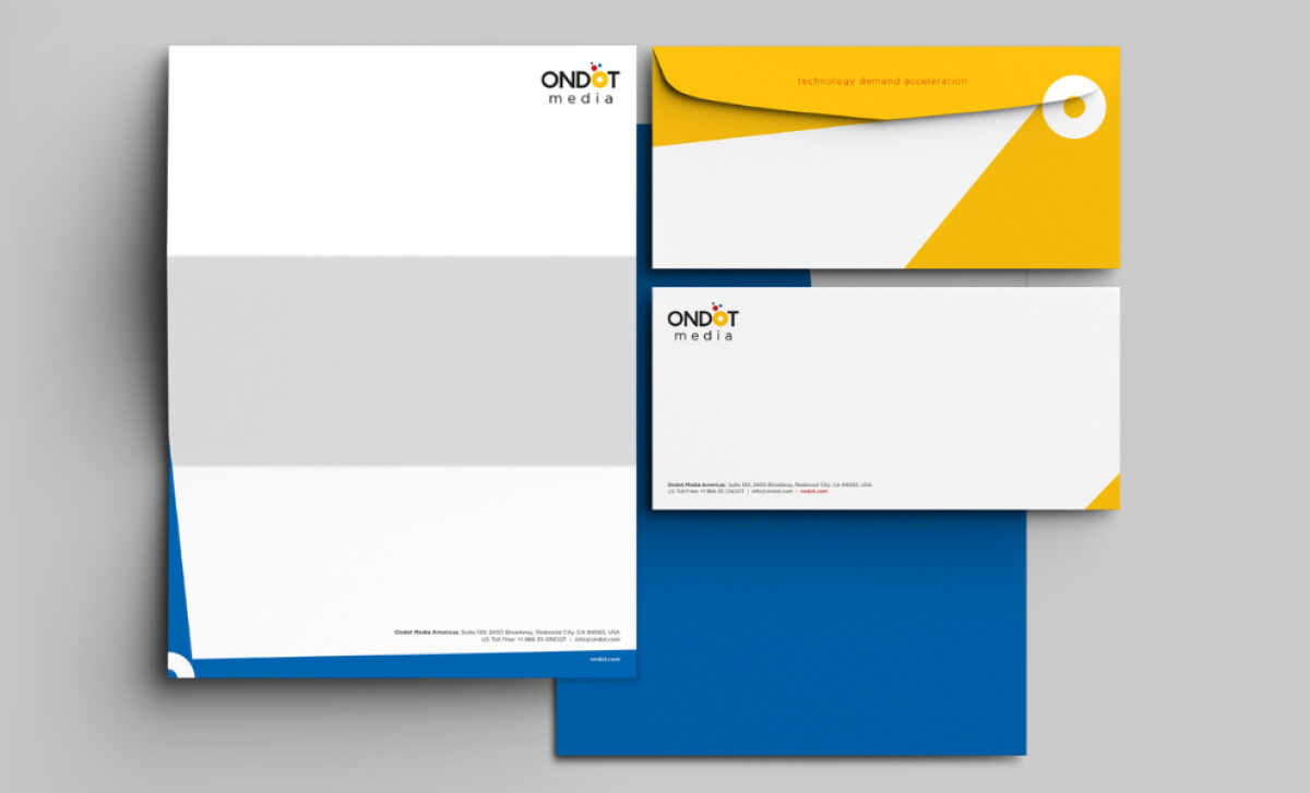
The brand identity is defined by its use of primary colors. The palette of red, yellow, and blue is used in solid blocks. This gives the design a bold and modern feel that is very eye-catching.
According to Verywell mind (2023), red is one of the most visible colors in the color spectrum. So it's only fitting to serve as the brand's primary color.
Additionally, the colors are appropriate for a corporate setting, but they are also full of life. It’s a perfect balance that helps to make the brand feel both established and innovative.
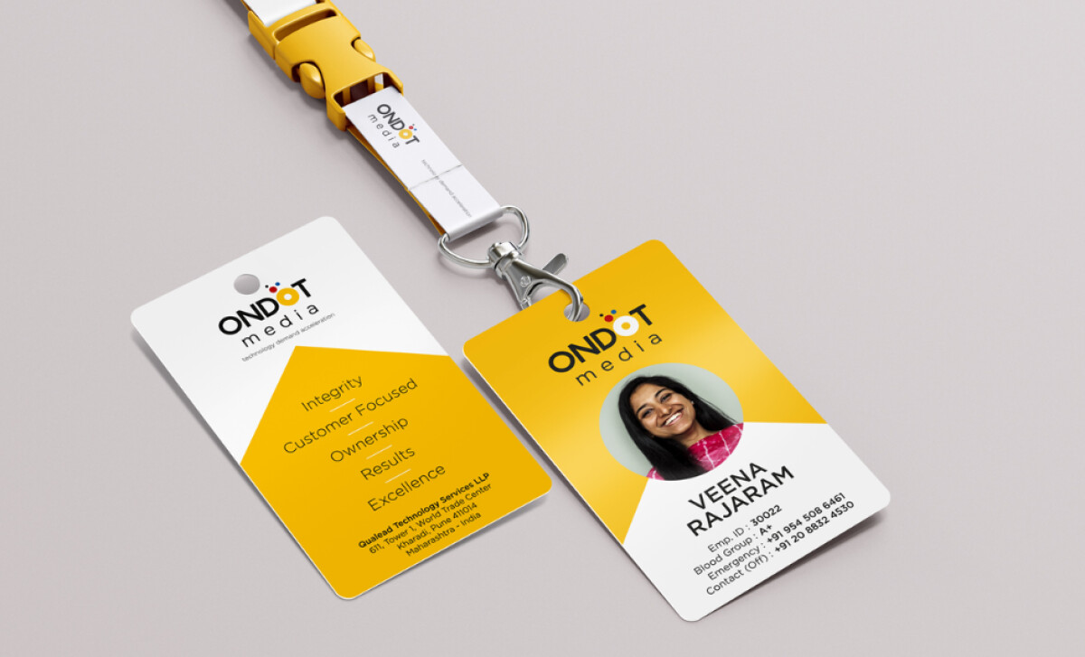
You'll notice that the main wordmark is a clean geometric sans-serif. The small multicolored dots placed above the second “O” are a fun touch, too. The rest of the text on the materials is a lighter, clean sans-serif.
The contrast between the bold main wordmark and the lighter supporting text is a smart choice, as it gives the brand a feeling of being both authoritative and approachable at the same time.
Tricycle’s visual identity for Ondot Media is a confident, color-driven system that bridges corporate professionalism with modern design thinking, proving that a B2B brand can be both serious and full of life.
A great brand identity for a B2B company needs to find the right balance of looking serious and professional without feeling boring or old-fashioned.
That's why brands turn to expert partners, and our team has ranked the best agencies worldwide to make finding them simple.
Visit our Agency Directory for the Top Print Design Companies, as well as:
Our design experts also recognize the most innovative design projects across the globe. Visit our Awards section to see the best & latest in print design.