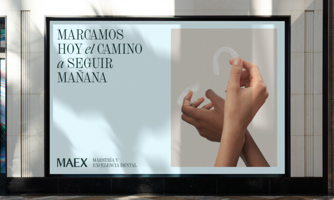
Standout Features:
- High-trust blue color scheme
- Data-driven layout with a clear modular hierarchy
- Professional imagery and leadership headshots
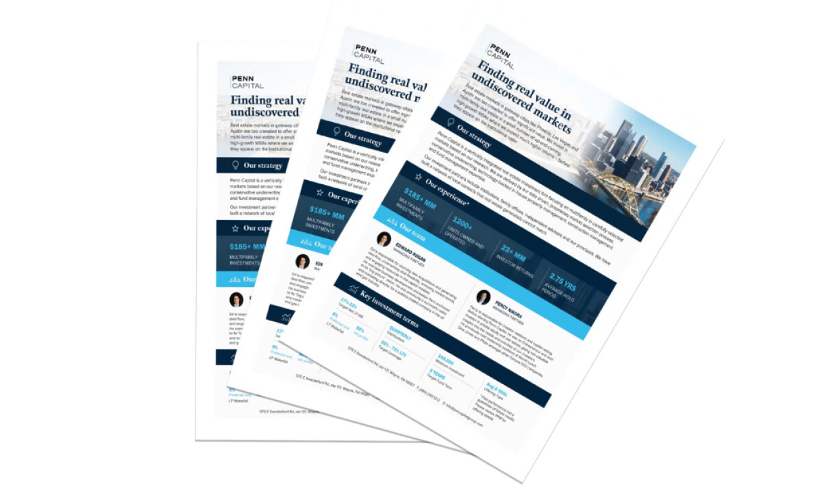
This flyer by Kinetic Slides for Penn Capital, a real estate investment firm, is a strong example of professional B2B communication. Its high-contrast palette and disciplined typography create an immediate sense of trust that’s crucial for engaging investors.
The color scheme is a dual-tone blue system, from deep navy to a lighter sky blue, with white providing contrast. The use of blue is a classic choice in financial design, effectively communicating trust and stability.
This is a data-backed decision, as research from Adobe Express (2025) reveals that a majority of consumers (54%) consider blue to be the most trustworthy brand color.
Plus, the palette ensures the flyer stands out as professional without feeling over-engineered or visually cluttered.
A data-driven layout with a modular hierarchy is a key feature. The flyer uses a grid with specific zones for stats and team information. Then, key metrics are presented in shaded boxes with bold sans-serifs.
This approach makes data immediately digestible, helping prospective investors form quick trust in the firm’s performance.
The strategic use of imagery includes a panoramic city photo for the top banner and professional leadership headshots alongside their bios.
The cityscape photo suggests a tangible market focus. Meanwhile, featuring team members next to performance data fosters a personal connection, boosting investor confidence by putting faces to numbers.
This poster design shows how a single-page flyer can function as a powerful and condensed visual pitch deck. Every design choice here results in a print piece that is informative, highly persuasive, and confidence-inspiring for its target audience.