Standout Features:
- Minimalist yet striking layout design
- Consistent and bold brand identity
- Subtle accents that enhance professionalism
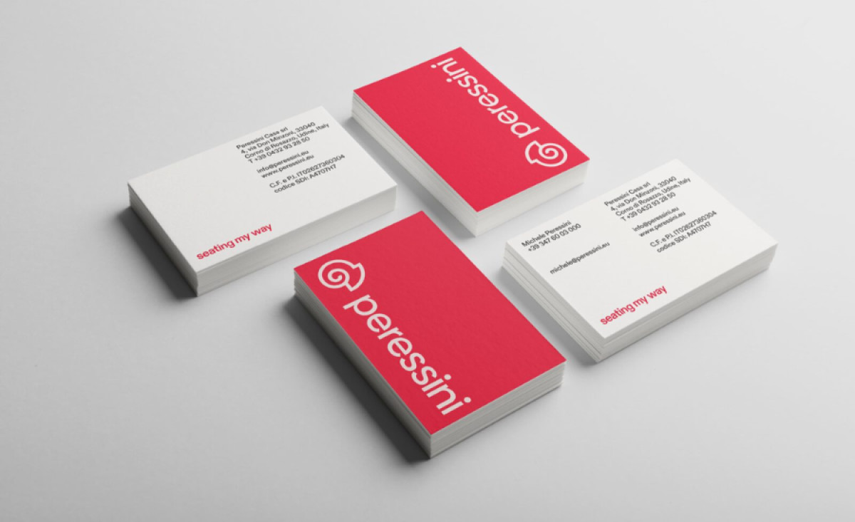
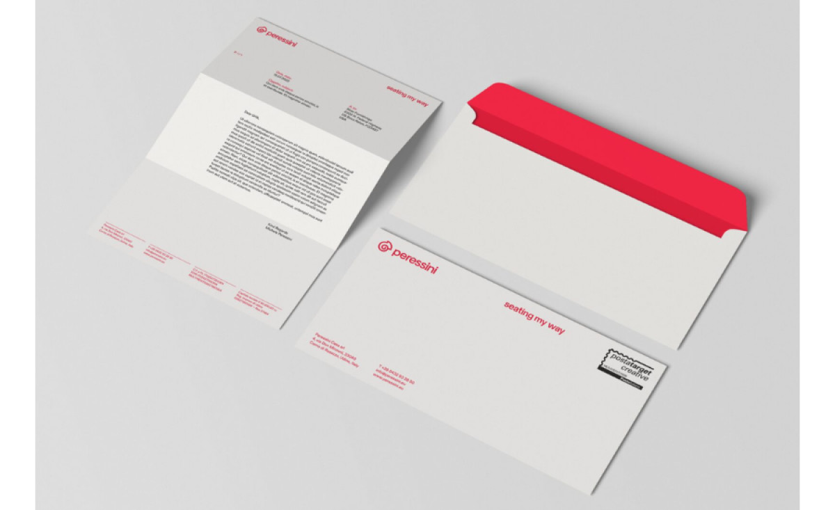
Peressini, an Italian company specializing in premium seating solutions, positions itself as a leader in functional, stylish, and customizable furniture. To reinforce its brand image, Unithink developed a cohesive print design system that reflects Peressini's values of precision, modernity, and professionalism.
The minimalist yet striking layout design is evident in every piece, from business cards to letterheads. The clean white backgrounds create a sense of space and elegance, while the bold signature red brand color adds vibrancy. The simplicity of the design allows critical information — such as contact details — to stand out effortlessly, maintaining both form and function.
Across all materials, the Peressini logo and tagline, “Seating My Way,” are prominently displayed, reinforcing the company’s customer-centric approach. Perfectly balanced by the company’s bright red logo, this consistent layout ensures that every touchpoint — from formal correspondence to in-person networking — delivers a unified message about the brand’s ethos.
Lastly, subtle accents like colored envelope interiors and fine typographic details further enhance professionalism. The refined typography, combined with the strategic placement of red accents, gives these materials a premium feel, aligning with Peressini’s status as a luxury furniture provider. These thoughtful touches make the brand appealing to high-end markets.
Unithink’s catalog print design successfully reflects Peressini’s commitment to quality and customization, translating the brand’s core philosophy into tangible, visually stunning print collateral. It establishes trust and credibility while ensuring the brand remains both functional and unforgettable.