Want to know a characteristic of best print design? Stopping power. It is not enough to expect to draw consumer attention to average ideas. In 2018, you need to demand consumer attention. Your print design must have clarity. It must be simple. And it must be bold.
Enter OkCupid. Their new ads have more stopping power than a twelve gauge. The new campaign bubbled out of the creative minds at Wieden + Kennedy New York, thanks to the talent of Maurizio Cattelan and Pierpaolo Ferrari.
These ads are a call to the modern dating scene. Not a quaint, subtle whisper. They roar. They speak of a dating scene that “treats emotions like a disposable commodity.”
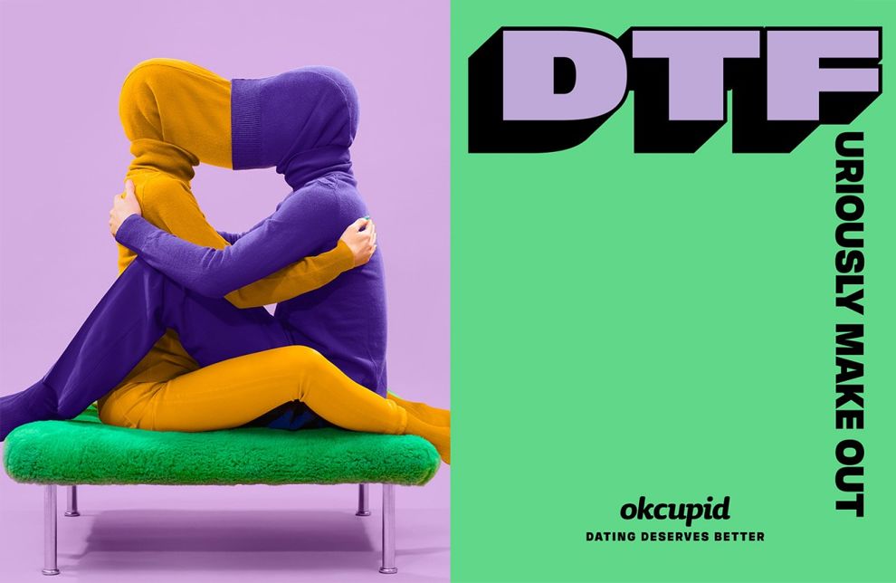
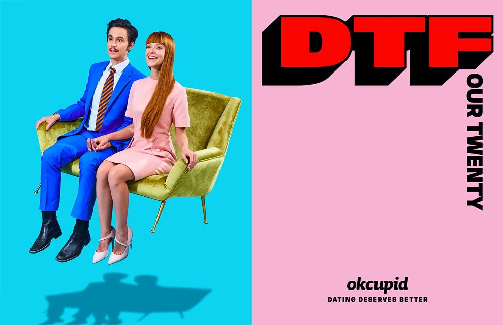
It starts with the in-your-face old acronym “DTF” also known as, “down to f*ck.” That is the centerpiece of this campaign. It is genius.
W + K uses fun headlines and mixes them with colored photographs that are vivacious. Here we see the fun they poke at the “DTF” phrasing with hilarious substitutions. Today’s dating culture is plagued by a dehumanized and binary swipe method (ahem, thank you Tinder).
OkCupid is not Tinder. They are not focused on the cesspool of shallow-minded materialism that Tinder broods. OkCupid is about substance. Depth. Who are you as a person? What are your goals? What drives you? What are your passions? Your fears? These are the dating parameters that lead to compatibility and long-term relationships.

OkCupid thought, well alright, let's look at the current political and social climate. Do we not feel a responsibility to craft an opportunity to change the conversation in modern dating? Do we not have a chance to empower each individual to reclaim and rebrand the meaning of DTF to make it their own meaning?
You bet your balls they had the chance. And they nailed it. Down to fire up the kiln, milady. Down to Fanta. Down to Fabricate a Legendary Lord of The Rings Gandalf Replica Wagon. Ok, I will admit, those were my own creation.
But it goes to show how fun and engaging this ad campaign is. The entire point is to come up with your own interpretation! It is an ingenious method to get consumer attention and grasp their engagement.
On a side note, if you are looking to create an outstanding print design for your next campaign, check out these leading NYC graphic designers.
The difference with OkCupid and Tinder (besides trying to compare two brands akin to Givenchy and Aeropostale...) is the dating method.
OkCupid used discovery to search people by passions and self-interests. Even before that, the user has to go through over a dozen questions that dive deep into their psyche. The result is quality online dating. The result is being down to furiously make out.
Do you want to have a top print design? Create a design that stops viewers in their tracks. Be bold. Jump. Add something crazy without worrying about the opinion of the outside world. Be tasteful.
Empower your target audience. Think about a niche-specific cliché that is holding them back like OkCupid did with DTF.
And flip the tables. Be down to create a stunning print design that redefines color, metaphor, and culture. Be down to flip the table of accepted print design on its head.
Be down to fear not. For it is with zero fear that W+K proceeded and the result is a print design that is astonishing.
OkCupid is a colorful print design in the Advertising and Technology industries.