Standout Features:
- Modern, minimalist design
- Playful use of typography
- Warm, vibrant color palette
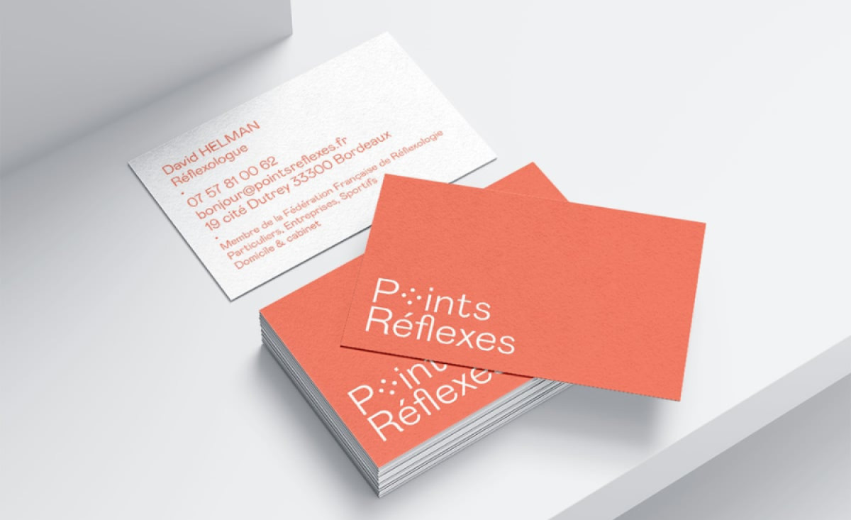
Points Réflexes, a reflexology service offering treatments in Auricular, Plantar, Palmar, and Facial Reflexology, showcases its identity through a thoughtfully designed business card created by Damien Elliott. The design reflects the holistic and modern nature of the service, positioning the brand as both approachable and professional.
The layout is clean and provides clear and easy-to-read contact information. This approach immediately communicates a sense of professionalism and clarity, essential for a service that focuses on relaxation and well-being. This also enhances the legibility of the card while conveying the brand's straightforward, no-nonsense ethos.

The playful typography adds an element of personality and approachability to the design. The “Points” part of the logo is highlighted with circular forms, which are a subtle reference to the acupressure points involved in reflexology. This dynamic touch gives the brand a distinctive and memorable look.
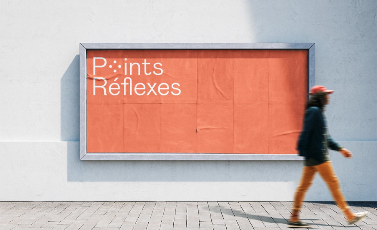
A warm coral-orange background is complemented by crisp white typography, creating a balanced and inviting contrast. This vibrant color brings energy to the design, subtly evoking feelings of warmth and vitality. This combination of vibrant color and clean design elements reflects the brand's modern approach to holistic health services.
The modern, minimalist design paired with playful typography and a vibrant color palette makes the business card print design stand out while remaining professional and approachable. It’s a thoughtful, effective design that represents the brand’s values and mission in a clean, compelling way.