Supreme Torrelavega's Print Designs Are Exciting, Ambitious And Modern
Supreme Torrelavega is a fashion boutique located in Torrelavega, Spain. It’s a multi-brand clothing store with a passion for unique and interesting fashion styles and trends.
The brand was looking to freshen up their look and brand identity, so they turned to Mubien — a studio passionate about helping brands create a compelling brand identity.
The studio began their work and helped turn this brand into one that could better reach its target audience and follow through on strategic campaigns.
CEO David Mubien had this to say about the project:
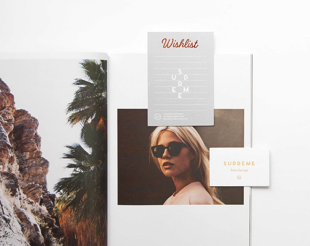
After studying the target audience, we designed and developed a dynamic identity that conveys the values of the project with different logos. In addition we designed all brand applications, like stationery, signage and packaging.And the print designs truly are works of art. These stunning prints are engaging, exciting and in your face. The typography is on point, the color choices and styles are impeccable and the imagery is simply mesmerizing.
There’s no denying that the recent facelift had a profound impact on the look and feel of the brand in its entirety. These designs stand out. They sell. And the beauty of it all is palpable.
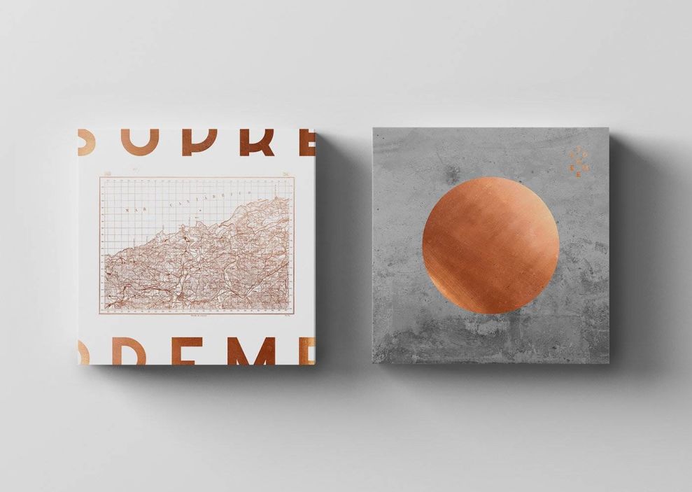
Supreme Torrelavega’s Bold Print Designs Play With Typography In An Exciting And Engaging Way
Typography takes center stage in this design.
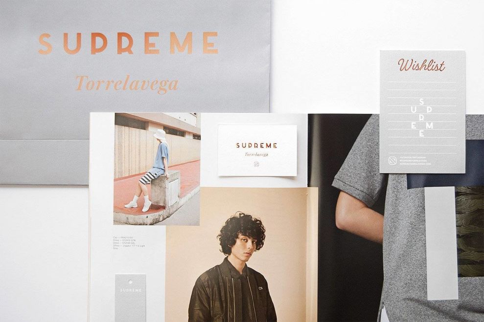
With the use of big and bold fonts, as well as bronze foiling, the words on these prints refuse to be ignored. The name of the brand is included on all printed materials in one way or another. On some designs, it’s written in a cursive, laid back font that emulates serenity and relaxation. In others, it’s written in uppercase, sans-serif.
In any case, however, it stands strong.
The brand wanted to have some fun and show their creativity, and doing so with their typography definitely gave them an edge. They layer their text in a fun, creative and ingenious way that makes the reader take a second glance and learn more.
But they also know not to overwhelm these prints with text. In most instances, al that is written out is the name of the brand itself. No additional information or explanation. This shows that the brand can stand on its own — and it does.
The Supreme Torrelavega Print Designs Capture The Essence Of Torrelavega, Spain Through Stunning Imagery
Supreme Torrelavega pays homage to its roots in its use of imagery. Black and white drawings of the city and popular buildings make up the majority of the designs on these print materials. These intricate illustrations show maps, buildings and other powerful images that call back to the city that this brand calls its home.
These drawings pair beautifully with the stunning photography included in catalogs and other magazines the boutique has to offer. These images are powerful, bold and alluring in their sharpness and high-def quality.
The logo design is also created beautifully, sitting like a work of art on these designs. The brand uses its name and writes it out vertically in a diamond pattern. This modern and playful twist gives shoppers something subtle, minimal and intricate to engage with as well.
In addition to the imagery, there’s a texture to these designs. Matte colors make up most of these prints, and in some, there is a slate-like quality to them — with differing grey colors that add a roughness that shows wear and tear — a history.
These visual elements make these print designs pop.
Supreme Torrelavega’s Captivating Print Designs Use Bold Typography, Eye-Catching Imagery And Modern Elements To Create Prints That Inspire
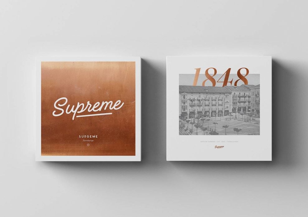
The brand makes a statement with the use of shiny bronze foiling. This design feature immediately catches your eye and pulls you in — whether it’s being used to highlight a logo, make text stand out or just to add a fun and flirty pop of color to the mix.
It was a smart choice using such an appealing color and effect to make otherwise ordinary prints seem extraordinary.
The typography is also exquisite and exciting — big bold lettering line these prints, whether it’s in a curly and cool cursive font, a bronze foiling or a mixture of it all. The typography itself is part of the design and adds another layer of personality and depth to these prints.
But beyond the words, the images and texture that live on these designs is simply breathtaking. Elaborate and beautiful etchings of Torrelavega, Spain add an authenticity to these designs. This brand is obviously well aware of its roots and where it came from, and it wants to pay homage to that.
These black and white etchings are sophisticated, clean and stunning.
And these prints are more than just something to look at — there’s a texture added to them that adds a roughness and wear to them that shows that this brand has been places and knows things that would benefit the consumer.
These print designs for Supreme Torrelavega take your breath away and really align the brand as a leader in fashion and retail.