Team Behind the Design
Print Design Analysis

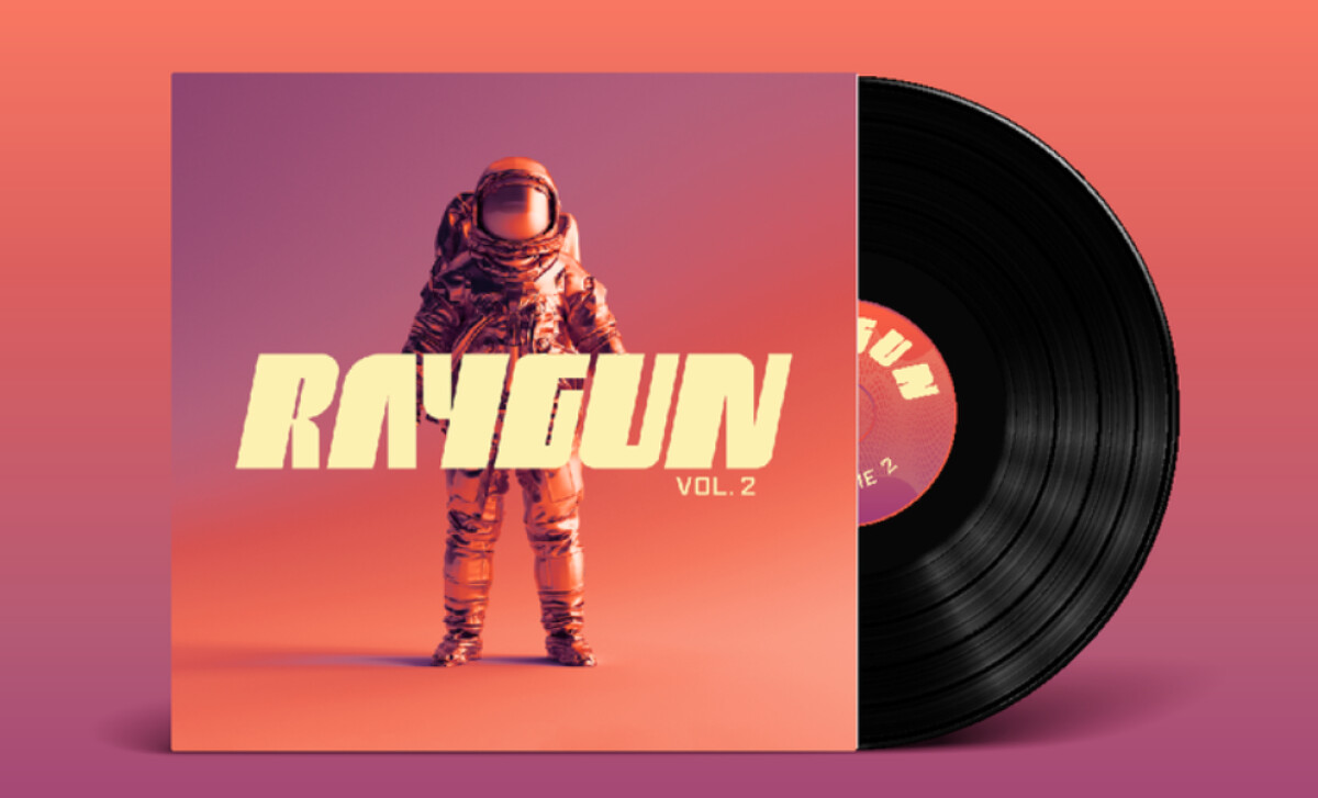
When I review album cover designs, I look for a strong concept. Raygun’s covers make a great impression in this regard.
- Concept: The astronaut motif delivers an adventurous identity. It also pairs well with the brand’s bold sound.
- Typography: The heavy, stylized font feels confident and makes the text stand out against varied backgrounds.
- Color Palette: From my experience, saturated color gradients create a high level of energy. This approach also differentiates each album release.
- Shelf Appeal: The covers demand attention in any format because of their striking imagery. Plus, it makes for a cohesive brand identity.
What Brands & Agencies Can Learn from Raygun
This series of album covers shows how to build a cohesive identity while giving each release its own unique character.
1. Use a Recurring Motif
You can build a recognizable world for your project by using one central visual theme across multiple designs. This consistency helps tie all the separate pieces into a single narrative.
2. Make Type Stand Out
A heavy, stylized typeface ensures your text remains legible when it must compete with a busy background image.
3. Use Color to Differentiate
You can create a visually unified series of products. Keep the core layout and typographic treatment the same for every item. Then, assign a unique, saturated color gradient to each new release to give it a distinct personality.
About DesignRush Featured Designs
From hundreds of projects reviewed, only the most compelling are featured. The designs we feature distinguish themselves through originality, clarity, and strong brand impact.
And often, they go on to earn a place among the winners of the Monthly Design Awards.
You can also explore our awards categories by design type:
- Best Print Designs
- Best Website Designs
- Best App Designs
- Best Logo Designs
- Best Packaging Designs
- Best Video Designs
For a full list of design agencies and related services, see our Agency Directory.
-preview.jpg)