
Roger Burkhard's Grungy Print Designs Showcase Structure
Swiss website development agency Roger Burkhard creates tons of innovative digital destinations for a plethora of clients across several industries.
But when it comes to their own branding, they enlisted creative branding agency Lundgren+Lindqvist to totally revamp their identity -- from logo to stationery to their own website design.
The end result was a unique blend of industrial and minimal, with geometric accents, bold dark business cards, and abrupt fact sheets and print designs that captivate potential clients while simultaneously showcasing the process that Roger Burkhard applies to each project.

The Print Design's Geometric Shapes Are Inspired By Cohesive Logo And Branding
According to Lundgren+ Lindqvist, the refreshed brand identity is structured around a modular system.
"In addition to providing the underlying structure applied to documents and pages on the website, the grid is also visualized in a modular header that is used throughout the identity."
You can see the grid systems clearly reflected in the logo design, monogram and throughout the print designs. Every line is intentional and every symbol placed strategically, creating a methodical set of designs that complement one another.
The responsive logo design found throughout all of the printed collateral is a minimal, abstract monogram of a reversed "R" and "B."

Roger Burkhard's Unexpected Business Cards Enable Employees To Stand Out
Instead of creating run-of-the-mill white business cards, Roger Burkhard now has dark gray business cards to hand out. As expected, they feature clean lines, simple symmetry, and the logo monogram stamped on the front.
The grid structure and minimal organization are continued on each side of the business cards. Just a few lines grace the front, where you can see an employee's name, contact information, and job title.
On the backside, you'll simply see a series of lines -- much like a notebook. Not only does this design decision drive home the new brand identity, but it is extremely functional.
So often, people are handing out business cards at networking events or conferences where a lot of information is discussed -- but not a lot of note-taking collateral is available.
These cards make it even easier for any potential client or professional partner to remember the employee, the company, and the services they offer.
What's curious about the logo monogram is the choice of ink. Instead of a bold metallic or a typical flat ink, they are imprinted with a very subtle sheen that mimics that of the graphite in a no. 2 pencil.
This tiny design element not only adds dimension to a very dark design but also signifies the difficult task of a developer. They will be working and reworking a creation until it's perfect -- thus, the easy to correct pencil instead of a pen -- and will employ intellect and creativity.
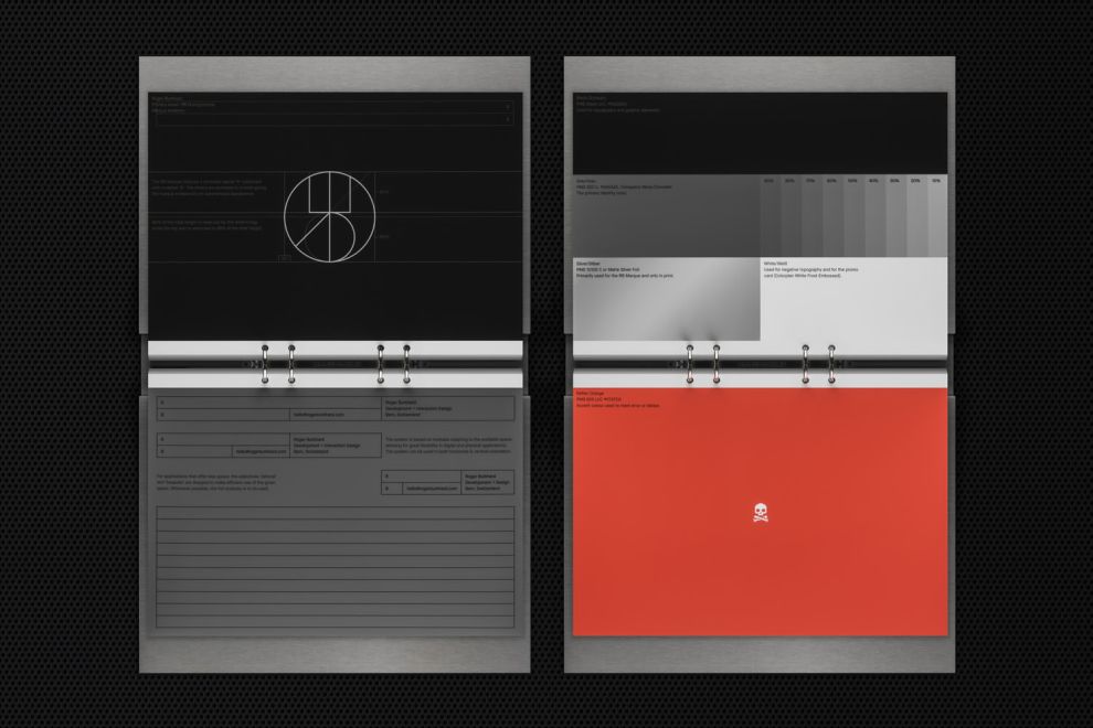
Roger Burkhard's Print Designs Pop With Bold Accents
Just like the other print designs in the branding collection, the pages are branded with the geometric responsive logo design, smack-dab in the middle of the page. Notebook lines fill the pages and simple sans-serif typography conveys information.

And, as anyone can attest to, the tedious task of sending (or receiving) invoices is rarely welcome.
However, Roger Burkhard's new visual identity has made these logistical nightmares a little more pleasing to look at for everyone.
The same structure found in the other prints and business cards is echoed throughout the invoice print design. However, the back of the page is a striking red accent. This adds a splash of bold personality to very straightforward, governmental documents.
The Roger Burkhard Print Designs Are Straightforward, Simple And Resolute
Ultimately, Roger Burkhard's print designs find their success in their understated simplicity. Copious negative space and easy organization make the logistics of client management and website development easier for the agency.
However, this simplicity is contrasted -- and elevated -- through strategic elements such as bold color accents, subtle metallics, and geometric cutouts inspired by the responsive logo design symbol.
All in all, they now have functional print designs that are helpful, memorable and -- most importantly -- represent the agency well.
Looking to grow your brand exposure? These best agencies can help!


