Standout Features:
- Bold typography with playful expression
- Vibrant color palette with artistic experimentation
- Playful illustrations and textures
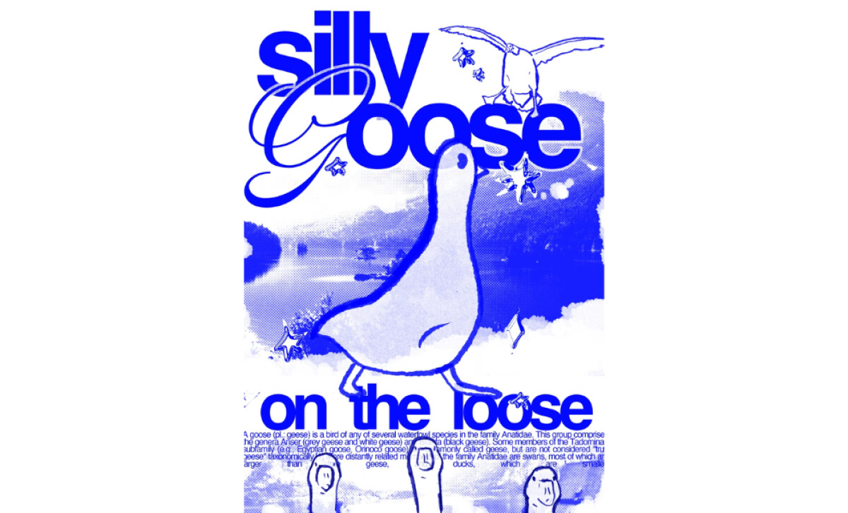
Studio Cheryl created the "Silly Goose" poster to showcase their distinct artistic approach through playful, experimental design. The piece mixes bold typography with vibrant colors and whimsical illustrations. Together, these elements build a fun, humorous theme, matching the idea of a carefree goose "on the loose."
Following this playful theme, the oversized "Silly Goose" typography immediately catches the eye. Its font has specific playful details, like lowercase, all-bold, tight-kerning type and a contrasting script G in “Goose.” Therefore, this type acts as a core design part, injecting dynamic (and silly) energy fitting the poster.
The dominant blue palette then adds a calm yet engaging feel. In the background and type, varying gradients and abstract splatters provide visual depth. This experimental color use reflects the designer's playful freedom, adding texture and vibrancy while keeping the overall mood lighthearted.
Further reinforcing the theme, the abstract goose illustration injects humor. Complementary textures like splatters and stars create a fun, chaotic atmosphere around it. These visuals work alongside the type to convey freedom, effectively balancing artistic expression with the core "on the loose" idea.
In essence, the Silly Goose poster uses experimental design to capture fun and creativity. Its bold type, vibrant blue palette, and playful illustrations combine for an engaging, humorous effect. This work strongly expresses personality, embodying the spirit of creative exploration and boundary-pushing.


