The IDA Print Designs Use A Filmmaker’s Viewfinder As The Focal Point
The International Documentary Association is a dedicated organization that gives documentary filmmakers a community of like-minded individuals to share their work with. It also gives artists a platform to share their nonfiction works with the world.
The IDA has been in business for 35 years now, helping to produce and promote nonfiction films that run the gamut as far as their content.
But in recent years, the documentary film industry has become less exciting and engaging. And the IDA knew that they needed to shake things up in order to raise awareness and bring an enthusiasm back to documentary films.
The solution was a fully-functioning rebranding initiative equipped with a new website and an array of print materials.
The agency behind these designs created business cards, brochures and magazines to bring energy to the IDA brand, but one image ties these designs together in a cohesive and stunning way.
The image of a filmmaker’s viewfinder sits as a creative and impactful image on all of these designs. The four-cornered border surrounds both giant blocks of text as well as single words in a way that adds an authority and brings this content into focus.
It draws attention to these parts of the page, much like on the camera, it brings images into clear and stunning focus.
This gives the brand identity — though one that is flexible, clean and modern. It can be used across mediums and platforms, but the fluidity of its image means that it can take on any form or focus to elevate all designs it sits on. Versatility and adaptability are two important design qualities that professional print designers strive for in order to achieve visual coherence.
And the tie-in with the overall artistic and film-focus of the brand makes this intuitive image one that creates a cohesiveness that also adds context.

Pops Of Color In The Brochures & Magazines Add Vibrancy To The IDA Institution
From the business cards to the brochures, bright flashes of color add a dynamic creativity to the designs, grabbing attention thanks to their vivid nature. Business cards are made up of a variety of different, bold colors in yellows, reds, blues and more.
The second your eyes catch this color, they're locked in. And in a similar fashion, these brochures also infuse exciting coloring that changes from page to page.
This highlights stories in a new and captivating way, giving each page their own time to shine.
Colors grab attention and make an impact on consumers. But here, they are mainly used to highlight certain stories and give the brand as a whole more of a concrete and progressive identity.
The color sits as backgrounds, but also as text in a robust and demanding way. And in each instance, these colors create an urgency. You see these items and you need to interact. You need to find out more. You need to discover what they all mean.
And that’s the power of color — creating an exciting and encouraging action.

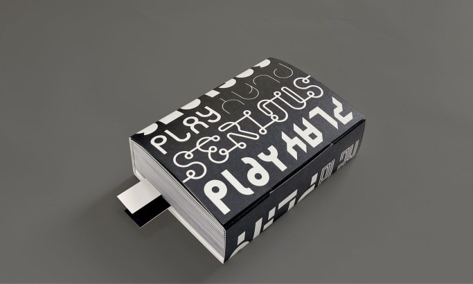
Bold Typography Adds Context And Highlights Key Ideas
The IDA rolled out a host of print designs in the form of brochures and magazines. These pieces highlight specific films, talk about the industry as a whole and offer helpful information for documentary filmmakers and watchers all around the world.
And to highlight key ideas and draw attention to certain sections, designers went with a playful and creative use of typography to make a statement.
Big, bold and uppercase sans-serif font sits on these pages, laid over images and standing as the key focal point of the design. These words and phrases are broken into pieces, situated on the pages in a slightly misaligned way.
This unconventional approach to typography showcases the creativity and artistic vision of experienced graphic artists in engaging the viewer's curiosity.
But this adds character and makes the entire print collection more of a work of art in and of itself — similar to the films that this association promotes.
These phrases are impactful though, not just because of how they look but also because of what they say.
They talk about the “realness” of documentaries and the importance they have on the film industry. They highlight the power of storytelling and encourage all that interact with these designs to tell their own story as well.
This typography makes a visceral impact — one that promotes artistry in a sleek way.

Organized Chaos Brings These Print Designs -- And The Documentary Works -- To Life
One look at these designs and you notice there is a chaos to it. From the photographs that are overlaid with a gritty texture — like the grittiness of documentary film — to the mismatched blocks of text, bolded, key phrases and bright colors, these prints are disorganized and all over the place.
But it’s an organized chaos that matches the scenes these filmmakers capture through their lenses. Your eyes dance from one corner to the next. It’s high-intensity, high-energy and compelling.
The layout of it all tells a story of its own — in this industry, you have to expect the unexpected and celebrate it.
We often steer away from disorganized and multifaceted designs like this one — they tend to look like they’ve got too much going on.
But these capture the essence of the brand that they embody, and it’s a twist that most definitely works.

What Is The IDA?
The International Documentary Association is a nonprofit organization promoting documentary filmmakers.
It also works to increase awareness about the documentary film industry to help promote a positivity about the genre. The association was founded in 1982 and is based in Los Angeles, California.
This is the association’s mission statement:
Documentary storytelling expands our understanding of shared human experience, fostering an informed, compassionate, and connected world. The International Documentary Association (IDA) is dedicated to building and serving the needs of a thriving documentary culture. Through its programs, the IDA provides resources, creates community, and defends rights and freedoms for documentary artists, activists, and journalists.The IDA is a powerful organization for documentary films and the creatives behind them, giving them a powerful community of innovators and progressive artists where they can express their own nonfiction art.
But in recent years, awareness has dwindled. Fewer and fewer people knew what the IDA was or what it stood for. So the team turned to design agency Franklyn to help give their image a facelift.
And the team worked to create a comprehensive and cohesive new identity:
With highly successful programs but little brand awareness, the IDA (International Documentary Association) needed to take control of its image. Inspired by the image of a filmmaker’s viewfinder, Franklyn created a flexible identity system that could extend to each one of the organization’s initiatives. The resulting cohesiveness ensures that every touchpoint, from Documentary magazine to the IDA Awards trophies to Doc U educational collateral, pays back to the mothership. Extending this aesthetic to the web, we designed a fresh and fully responsive documentary.org, working closely with in-house teams to ensure they had the know how to further develop the site autonomously as the IDA continued to expand.
Playful Design Elements Make The IDA Print Designs Stand Out
The print designs for the International Documentary Association are wild, energetic and engaging. Made up of business cards, brochures, magazines and more, these prints all come with their own chaotic personality that jumps from their paper mediums and breathes life into the documentary film industry.
These prints, and this overall identity, were crafted to bring more awareness to nonfiction films and the association as a whole — and with such eclectic and surprising designs, IDA's designs are impossible to ignore. And that, in turn, leads to more awareness and more visibility for the brand overall.
Franklyn used a variety of different elements to bring this vivaciousness to these designs. It uses bold, vivid color to stand out and get noticed. It also uses large, misaligned typography to highlight important words and phrases that embody the documentary film field.
The image of the filmmaker’s viewfinder works as a cohesive element that ties all of these designs together, bringing more context to these designs and reminding viewers what this association is all about.
This, mixed in with photographs that are overlaid in a gritty, rough texture and an overall complex and almost disorganized layout creates a deep and visceral urgency giving the IDA a whole new personality.
There is a lot going on in these magazines, brochures and marketing prints. They all look a little bit different from each other but are tied together with subtle, chaotic and iconic images. And that shows the power of being a little bit playful with your designs — even if you’re in the business of robust and hard-hitting documentaries like the IDA.
For a brand that’s steeped in deep, dark content, going with a playful identity has its risks. But in this situation, it helps to give the association an edge that keeps it alive and fresh in the eyes of its audience.
Roll out a similarly impactful print campaign with the help of these graphic design companies!