_16400464576d-desktop.jpg)
Team Behind the Design
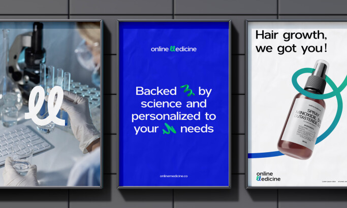
Print Design Analysis
_a854835301aa-desktop.jpg)
When I review a health and wellness print design, I look for its ability to capture attention in seconds.
The Snap Fitness design is a great example of this principle.
_e17b4d70bf07-desktop.jpg)
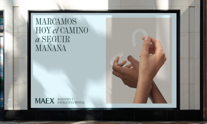
- Typography I think making the oversized “$4” the focal point is a strong choice that ensures the core offer is understood instantly.
Color Palette The red and black scheme projects a feeling of vitality. This high-contrast system mirrors the energy of fitness culture while white text keeps the details clear.
Layout Motion Diagonal red stripes are used to introduce a feeling of movement. They break up static blocks of text and color. This keeps the visuals kinetic and memorable for the viewer.
Photography The selective use of athletes adds a relatable human element. This softens the bold type and connects the message to real fitness experiences.
_00b2f15c8efe-desktop.jpg)
_23118d3870f9-desktop.jpg)
What Brands & Agencies Can Learn from Snap Fitness
This campaign offers a strong lesson in designing for quick, high-impact communication.
1. Make the Offer the Hero
For any promotional material, identify the single most important piece of information. Make that element the largest and most prominent part of your design. This ensures your core message is understood even at a glance.
2. Match Your Palette to the Culture
A high-contrast color scheme like red and black can effectively mirror the high-energy feeling of an industry like fitness, creating an instant connection.
3. Introduce Dynamic Elements
A static print design can be made more kinetic with simple additions. Diagonal lines or angled text blocks can break up a grid and create a feeling of movement.
About DesignRush Featured Designs
At DesignRush, we review hundreds of creative projects each month. The featured works stand out for their execution, clarity, and ability to connect with audiences in impactful ways.
The most compelling designs advance to become Monthly Design Awards winners, marking them as benchmarks of industry creativity.
Explore standout print design projects and more categories:
- Best Print Designs
- Best Website Designs
- Best App Designs
- Best Logo Designs
- Best Packaging Designs
- Best Video Designs
For a full list of design agencies and related services, see our Agency Directory.