Standout Features:
- Illustrations and photography that tell a story
- Strong green branding
- Engaging layouts
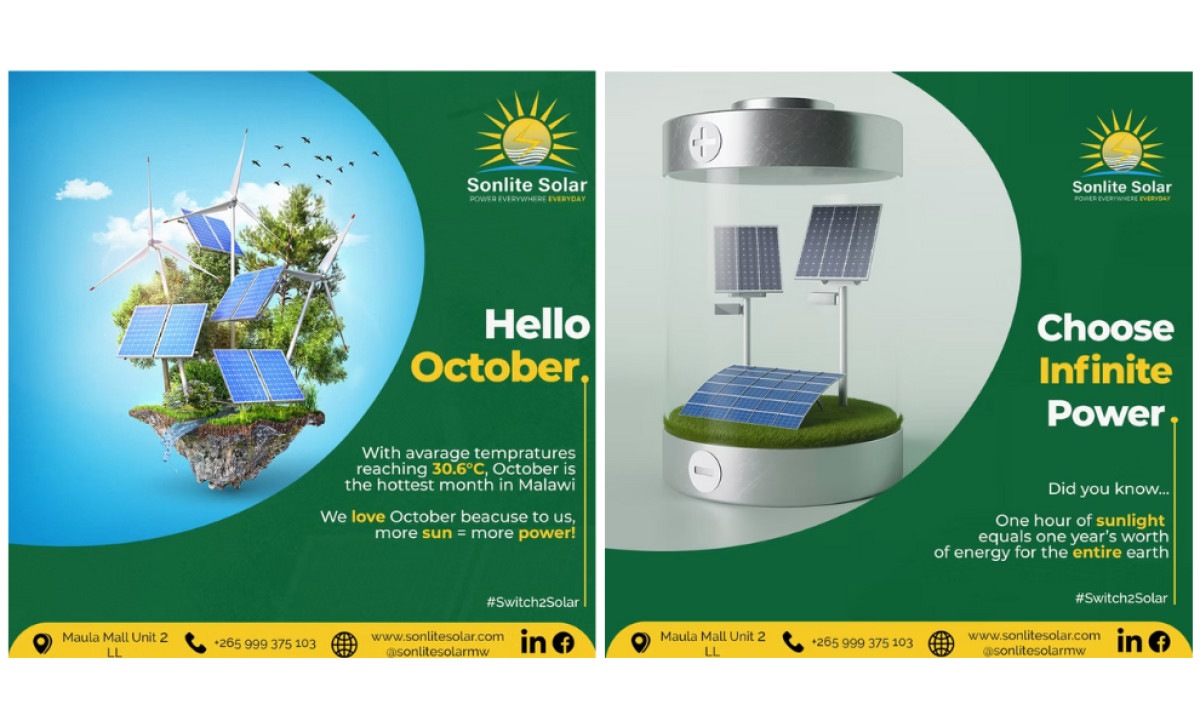
Clearly communicating its expertise in solar energy and highlighting the specific benefits of switching to renewable power was obviously key for Sonlite Solar's marketing materials targeting the Malawi market. So, Mawa Creative Agency developed an art direction for their strongly focused on achieving this communication goal.
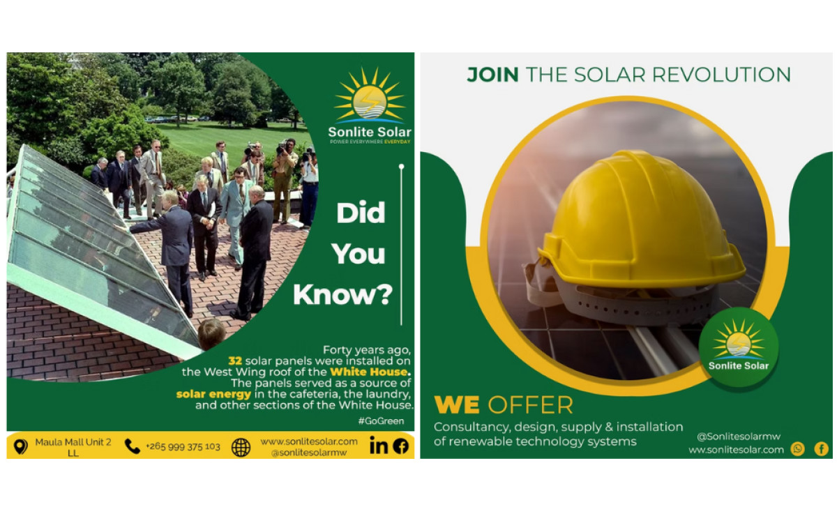
A key strength is the versatile use of visuals, as they clearly pick the right style for the job each time. We either get 3D renderings, personable portraits, or photography of its products depending on what the print demands. Such flexible media standards ensure the visuals always reinforce the point being made, keeping things engaging for the audience.
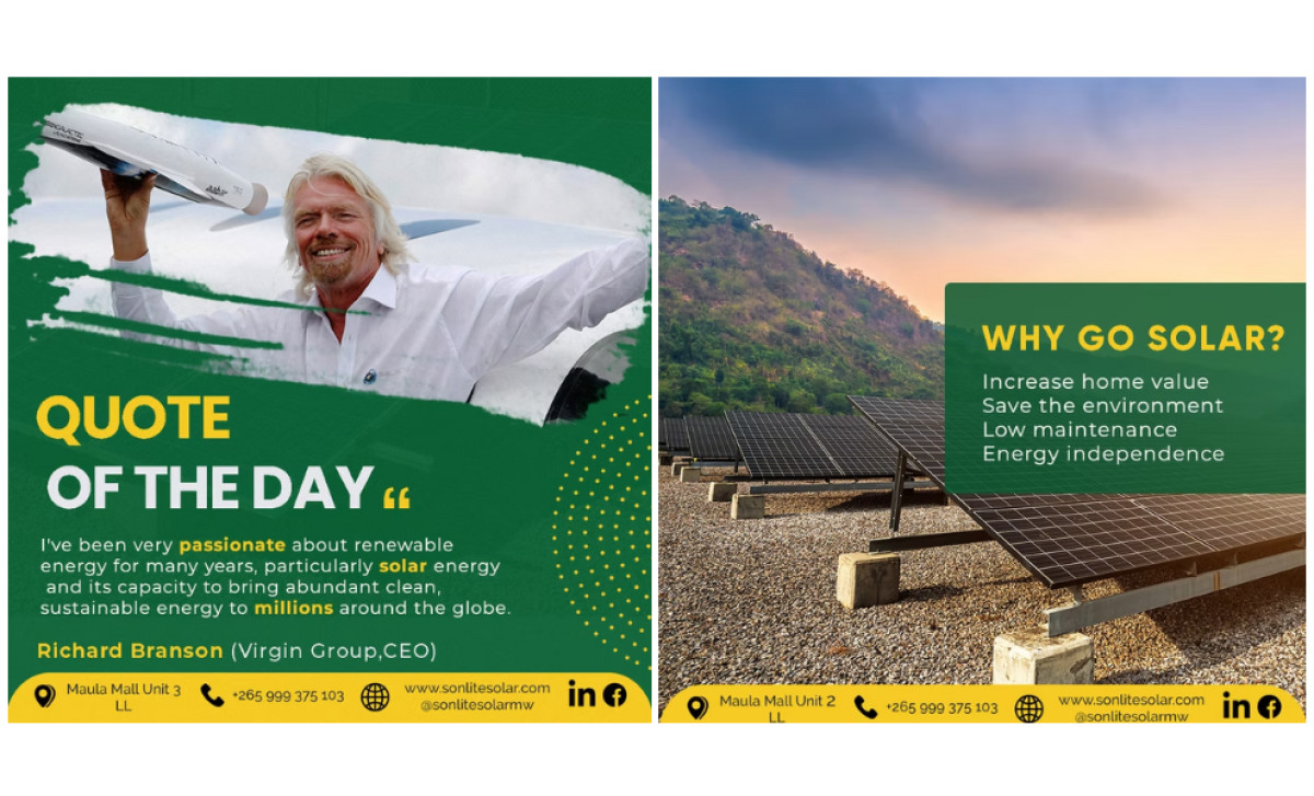
Even with the different types of images used, strong brand consistency ties everything neatly together across the board. You always see the Sonlite Solar logo, the core colors (nature greens, solar yellows/golds, white text), and bold sans-serif headlines that center the brand’s message. A standard footer keeps all its CTAs uniform too.
Let’s not forget how dynamic the layouts are, which are optimized for vertical digital consumption as well. They use things like text overlays, color blocking to structure info, and shapes to frame images. Importantly, visual hierarchy best practices are also applied here to make headlines prominent, so the content is easy to scan and digest online.
The effect here is long-term: Consistently applying your logo, specific brand colors, font styles, even the contact footers across all marketing materials steadily builds recognition with your audience over time. Having such a solid template is what makes your brand known, and your professional services prints immediately recognizable.