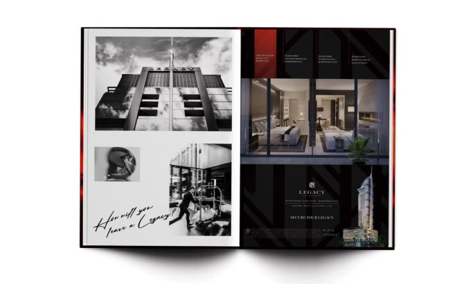
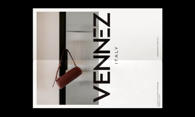
The Brookhill Properties Brochure Emphasizes Sophistication With Black And White Imagery
Brookhill Properties is a real estate investment firm based in New York City. The Brookhill Properties mission is to provide high-quality apartments throughout New York while embracing each area's rich culture and atmosphere.
They emphasize the history and the heritage of the neighborhoods in which they rent out properties, promoting the cultural significance and fortitude of these classic areas across Manhattan.
They’re a prominent name in New York City real estate, but they wanted to engage with a more tangible campaign that would connect even more residents to prospective homes. So they asked Blue Fountain Media to help them design a brochure to highlight the best properties they offer.
And the result was a stunning and sophisticated brochure design that emphasized the regal and exciting qualities of their properties, and the history that comes with them. It’s a simple design with little color and a focus on imagery.
The brochure opens with a trifold design, the pages opening like the doors that sit on the front page. The logo stands strong in a deep blue coloring, but the rest of the design shines in its monochromatic nature.
This black and white imagery adds a dramatic and sophisticated look. The photos inside are black and white, with the only color coming from a keyword or phrase that sits on top to add context.
And by placing just one image on top — one word in that same deep blue coloring — the overall design remains bold without distracting the viewer by too many elements.
There’s also a classic and refined nature to the use of a black and white design. It’s serene, engaging and rich with luxury, emphasizing the regal nature of these properties. And the mixing of blue with the monochromatic background certainly catches your eye immediately.
Get more print design inspiration by checking out our Best Print Design section!
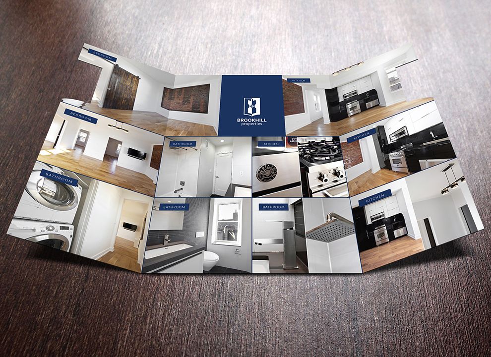
The Brookhill Properties Prints Emphasize Brand Identity With Color And Logo
The use of imagery overlaid with a black and white coloring is rich with class and sophistication. But it also allows for the brand and its identity to shine through in a subtle, clean and enigmatic way.
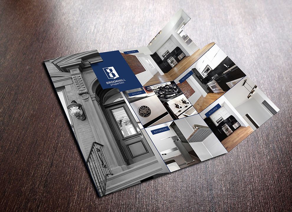
On the front page, you’re welcomed with a brownstone door, the brochure opening much like the double doors do. But what really grabs your attention is the regal, bold blue logo that stands at the center of the design, looming over it like a symbol of honor and authority.
The logo design is encased in a deep, regal blue. It’s a crest that is multicolored — blue and silver, with a creative symbol sitting inside it that captures an honorable and old-world air. The Brookhill Properties Logo is cut out on both sides, adding a cool air of personalization. This also keeps the overall branding consistent and cohesive throughout the design and throughout its existence.
As you unfold the brochure, a grid of images displays the various property interiors. The brochure has a clean and minimal feel without any redundant elements. The overarching blue color creates a sense of trustworthiness and safety -- both of which are incredibly important in real estate.
But the blue is also a signature color for the branding, promoting even further the brand and its identity so viewers don’t forget the real estate firm they’re interacting with. And the trustworthiness of the blue makes you innately aware of the authority and authenticity of the brand.
You can trust these properties and this firm. They wouldn’t steer you wrong, and this coloring proves that. But the mixing of this color with the classic crest design of the logo fosters a sense of industry leadership that makes these properties even more irresistible.
Branding is important, and design plays a major role in it. If you need help, these logo design and branding agencies can help!
This Brochure Puts Simplicity First To Let The Properties Shine
Many times, when you’re confronted with a brochure, it’s jam-packed with information, imagery and words that fill the mind with frustration and confusion. Brands want to pack as much into these pages as possible, which can sometimes have the opposite effect on the intended audience.
But these Brookhill Properties prints do the opposite thanks to a simple, modern design — but that doesn’t mean they’re boring.
The first thing you notice when you see this brochure is the shape and cut of the design. The tri-fold design is a modern spin on a classic brochure, adding a level of classic sophistication and serene reading.
You’re welcomed immediately by the properties that are available. No lengthy text. No unnecessary description of the brand. Just some stunning, eye-catching images that make it very clear right from the getgo what you’re getting yourself into.
This design is image-focused, with the black and white photography stealing the show from the front to the back.
The classic brownstone double doors give you access to the interior, where you get to see images of the interior of the home that’s available for rent or to buy. And each image is matched with a descriptor that lets you know what room the photo was taken in.
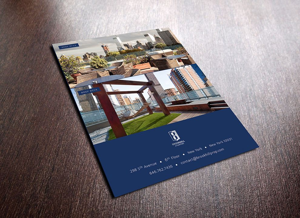
On the back of the brochure, two large and prominent images are complemented by simple company information, which is legible and easy to read. This is where the majority of the text on the design lives, but even here its concise, clean and to the point.
If users want to read it, they can. But if not, they were still able to explore the company and its property offerings so that they can make their decision.
The simplicity here is stunning and engaging — it puts the focus on the properties and not so much on the brand. And these images are compelling enough that they turn heads and change opinions all on their own.
There’s no need for unnecessary text or explanations. They speak for themselves.
Overall, this minimal print design is very on-point, portraying information in beautiful elements to create a successful design.
Culture Takes Center Stage In This Brookhill Property Brochure
There’s an image-heavy emphasis in this print design. And these images embody New York City properties in all of their glory.
The brochure opens up with a pair of doors that leads you throughout the design. And the photography is captivating on impact. It puts the city first, displaying what New York City homes have the potential to look like — what your home could look like if you step through the doors and make a purchase.
But it also embodies the fast-paced and exciting nature of New York City. That’s what the focus is on in this design — the architecture, the design and the personality of these properties. This is a brand that focuses on New York real estate, and they put it on full display immediately.
Also, the overall coloring and decision to go with a black and white theme is telling of the culture in NYC — especially in Manhattan. It’s proud and honorable. It’s sophisticated and classic. It’s regal and authoritative.
And considering the properties keep the integral architectural aspects of these properties intact shows that they care about the history they’ve seen and experienced.

Why Brookhill Properties Focuses Its Marketing And Design Efforts Outside Of The Digital World
For many brands, having an online, active presence is integral. But the Brookhill Properties brand doesn’t have a prominent presence online. Instead, it has chosen to go more lowkey and word-of-mouth in its marketing strategy.
And this is apparent in its decision to put its efforts in print design instead of web design.
This is a very regal and prominent brand. And it works with consumers who appreciate and understand that authority. As a result, they don’t need the wider audience or impact of a digital presence.
They just need to impact the people they’re near and familiar with, which works with word-of-mouth marketing and print campaigns.
For many brands, this could be detrimental. Without an online presence, their brand could go unknown and unheard. But it is obvious through the prominence and prestige of these properties that this brand knows what it’s doing, and would rather reach out on a more personal level through prints.
This also fosters more of a community, engaging with consumers on a personal level and creating an atmosphere of approachability and excellence.
If you’re a brand that wants an online presence, these web design and development agencies can give you the work you need!
Brookhill Properties Went With A Culture-Centric Approach To Entice Home Buyers
With a moody design that emphasizes drama and excellence in its monochromatic color theme, image-focused design and clean branding initiatives — this Brookhill Properties brochure excells.
This design keeps things modern and casual, using photography to put properties first. It’s sleek and creative, and it adds a drama to the NYC real estate market.
And the brand’s decision to keep things simple and old school with its campaign is telling of its reach and priorities.
This brochure is a stunning example of photography and simplicity in action. It’s a clean brochure that instantly pulls you in.
If you need more design insights and advice, sign up for the DesignRush Daily Dose!
Print campaigns can make or break a brand — these graphic design agencies are here to help!


-preview.jpg)
-preview.jpg)