Standout Features:
- Structural and austere geometric serif typography
- Rigid, asymmetrical grid system for layout design
- Stark monochromatic palette with documentary-style photography
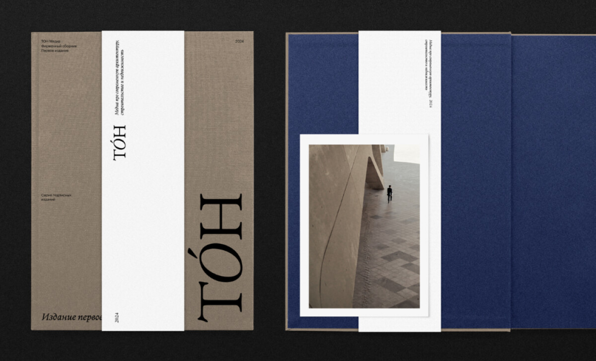
The design for TON Magazine by Project1804 is a study in brutalist minimalism, perfectly suiting its focus on modern architecture and real estate. Reflecting a "clarity over spectacle" philosophy, the identity is structural and intellectually rigorous. This creates a powerful brand that is as compelling as the subjects it documents.
A purely typographic identity is built using a bold, extended geometric serif for the "TON" logotype and all headlines. This austere approach treats letterforms as structural components that define the grid. It aligns with modernist principles, positioning the magazine as an authoritative and confident academic voice in its field.
Additionally, this choice of a serif font is highly appropriate for a print-centric medium, as serifs are widely held to offer superior readability in print, which underscores the importance of context-specific font selection.

The magazine layouts are built on a strict, multi-column grid that provides an underlying order. However, its application is powerfully asymmetrical. A full-bleed photograph on one page might be balanced by generous negative space on the other.
The design is characterized by a stark, monochromatic color scheme. Layouts are a study in black, white, grey, and blue — colors derived from the photographs themselves. This aesthetic choice strips the publication down to its essential components: structure, form, and content, reinforcing the magazine's mission of objective observation.
Project1804’s work for TON Magazine underscores that a publication's design can be a direct extension of its subject matter. The fusion of brutalist-inspired typography, stark photography, and structured layouts creates a cohesive experience that turns the magazine itself into a considered architectural object.