Team Behind the Design
Print Design Analysis
In assessing sports print campaigns, I look at how visual systems carry meaning across public environments while remaining unmistakably bold.
The Nike Siempre Familia print design succeeds by treating culture as a living force rather than a reference point.
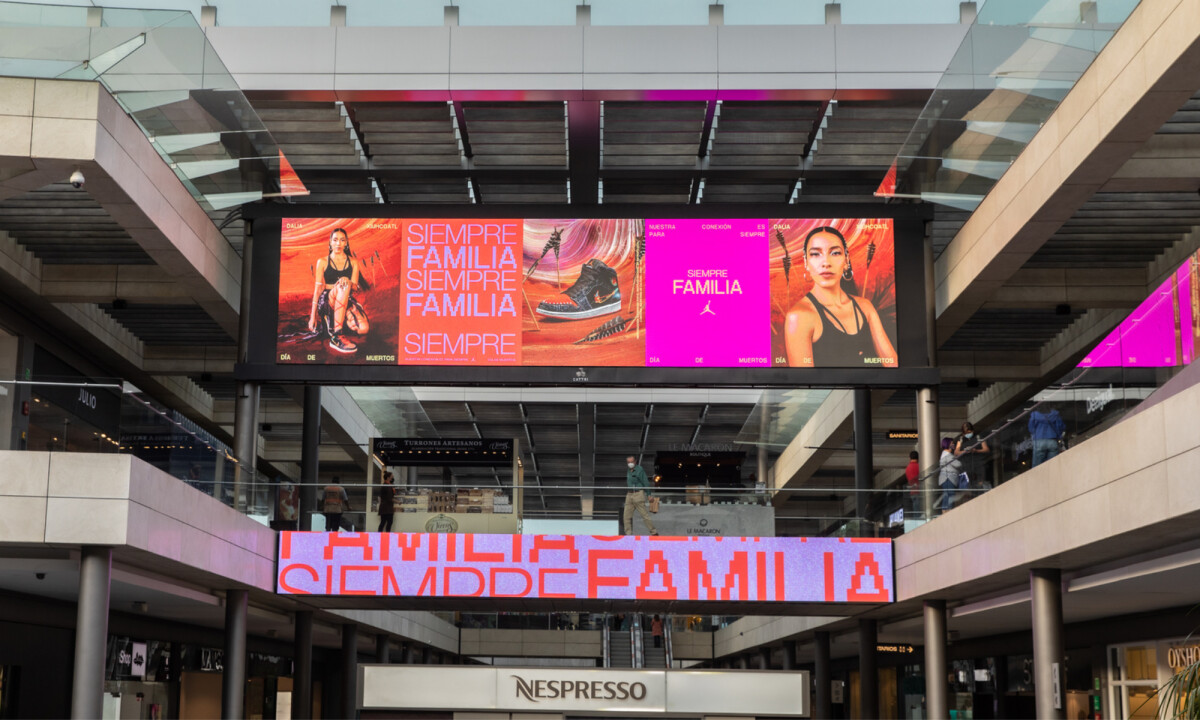
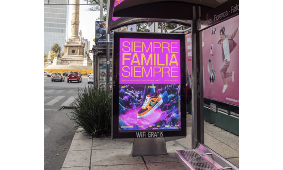
- Color & Atmosphere: I’m struck by the aggressive use of saturated magentas, reds, and oranges. These colors draw directly from Día de los Muertos symbolism, yet they’re pushed into a high-energy, contemporary space that feels distinctly Nike rather than folkloric.
- Typography as Message: The repeated use of “SIEMPRE FAMILIA” transforms language into rhythm. I like how repetition turns the phrase into a visual chant, reinforcing permanence and collective identity even when the words are fragmented or cropped.
- Imagery & Narrative: The layered compositions blending athletes, footwear, and surreal environments blur the line between physical performance and spiritual journey. This approach elevates the product beyond utility, positioning sport as part of cultural and personal continuity.
- System Modularity: The modular grid allows the campaign to adapt across billboards, transit shelters, and print collateral without losing coherence. Even partial views feel intentional, which is critical at urban scale.
- Brand Restraint: Nike’s limited use of the swoosh shows confidence. I appreciate how the brand allows the cultural story to lead, reinforcing authenticity rather than dominance.
What Brands and Agencies Can Learn from Nike Siempre Familia
1. Treat Culture as Living, Not Archival
Cultural narratives resonate more deeply when framed as present and future-facing experiences rather than historical references.
2. Use Repetition to Build Emotional Weight
Repeated typographic phrases can function as mantras, embedding meaning through rhythm and scale rather than explanation.
3. Let Brand Confidence Show Through Restraint
Pulling back logos and overt branding can strengthen credibility, especially when engaging with culturally significant themes.
About DesignRush Featured Designs
At DesignRush, we review hundreds of agency projects each month. The featured selections stand out for clarity, creativity, and execution across digital and brand experiences.
Exceptional works proceed to our Monthly Design Awards, where they’re recognized as leading examples of design craft.
Discover outstanding creative work across industries:
- Best Print Designs
- Best Website Designs
- Best App Designs
- Best Logo Designs
- Best Packaging Designs
- Best Video Designs
For a full list of design agencies and related services, see our Agency Directory.