Standout Features:
- Typographic expressionism
- Color blocking and visual hierarchy through hue
- Adaptive design elements
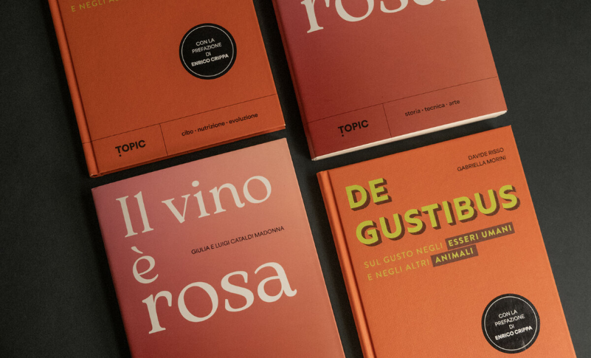
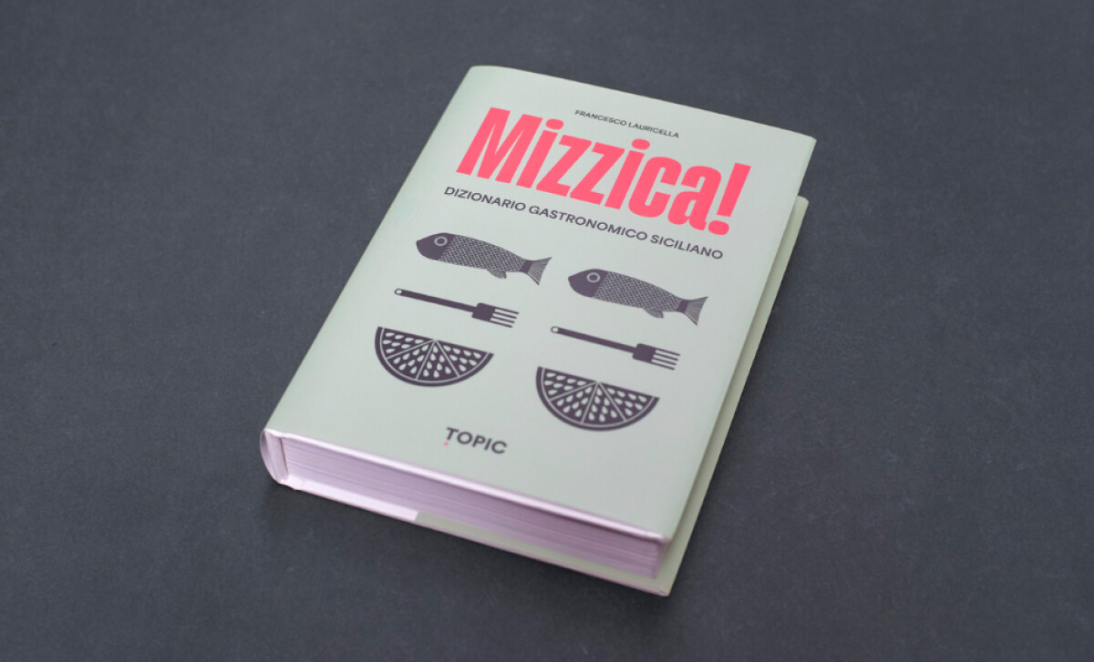
For Topic, a new publishing house offering non-fiction texts designed to inspire, Studio Forward developed a distinctive cover design system. The approach balances typographic expressiveness, vibrant color palettes, and precise grid structures. This creates a visually cohesive brand on the shelf, while giving each individual book its own distinct appeal.
The book cover designs employ a dynamic typographic system where font choices are tailored to the book's theme. Elegant serifs might adorn a title on wine, while bold grotesques suit a piece on taste. Letterforms are often large, with a strong vertical rhythm and playful line breaks, turning each cover into a distinct typographic statement.
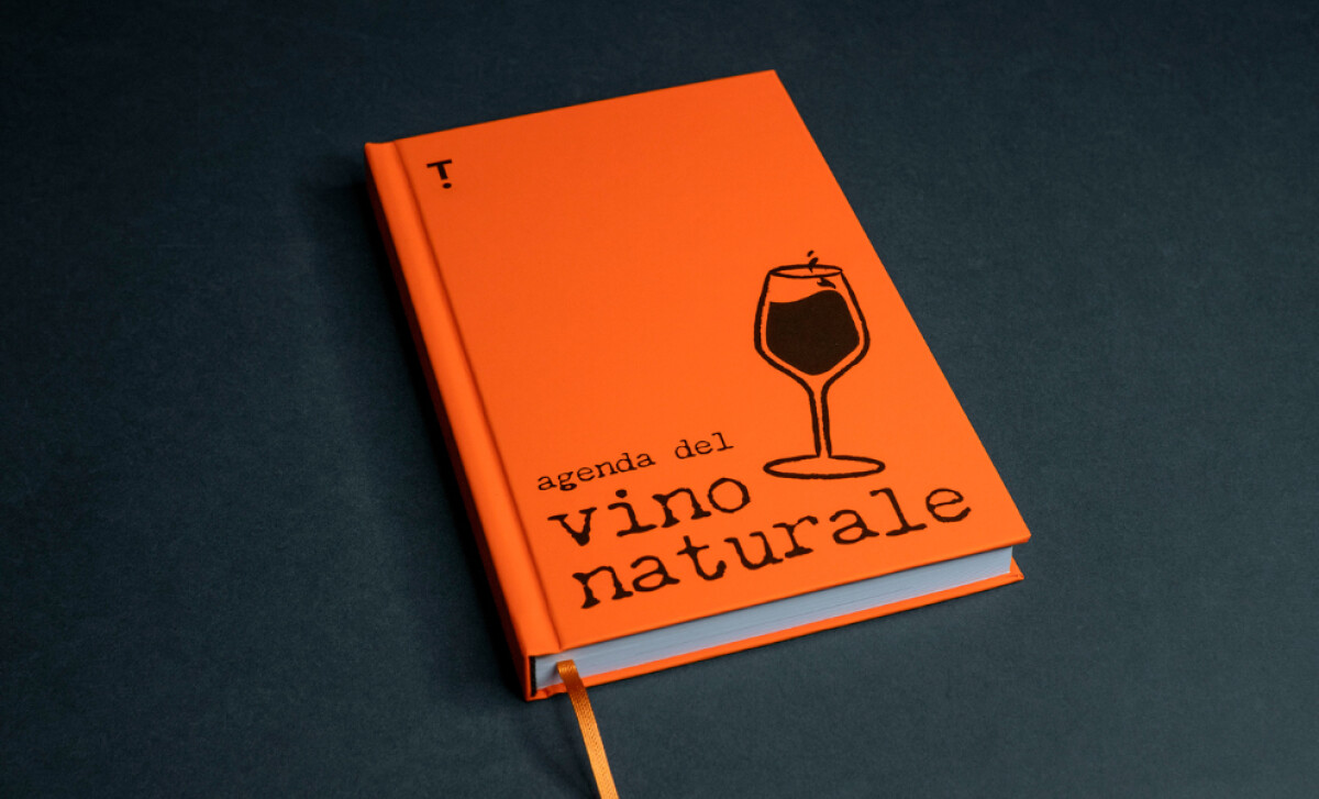
Vivid and strategic color distinguishes each book. Options like matte terracotta or deep saffron provide solid backdrops for contrasting typography. This color system functions as a clear taxonomy for different subjects while also evoking emotional responses tied to the book’s specific content, making its nonfiction subject visually stimulating.
Each book applies consistent micro-details that reinforce the publishing house’s brand. For instance, the “TOPIC” logo always appears on the cover, spine, or footer. Elements like specific icons for certain titles (e.g., "Mizzica!") or round badges and strip labels for special content provide adaptability while reinforcing the publisher's signature.
Cover design significantly sways a consumer's decision to engage with and ultimately buy a book. Studio Forward’s cover designs for Topic powerfully illustrate how non-fiction book presentation can be elevated through bold typography and strategic color.