Standout Features:
- Dynamic gradient branding
- Bold minimalism
- Focus on legacy and innovation
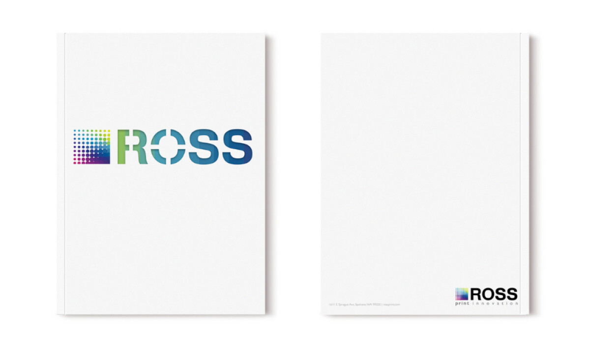
Ross Printing has been at the forefront of the print industry for over a century. To modernize its image while honoring its rich legacy, Jonny Xerox crafted an eye-catching promo package that’s vibrantly innovative yet still timeless. Let’s dive into how their design strategy rejuvenated a 107-year-old brand for today’s fast-evolving print market.
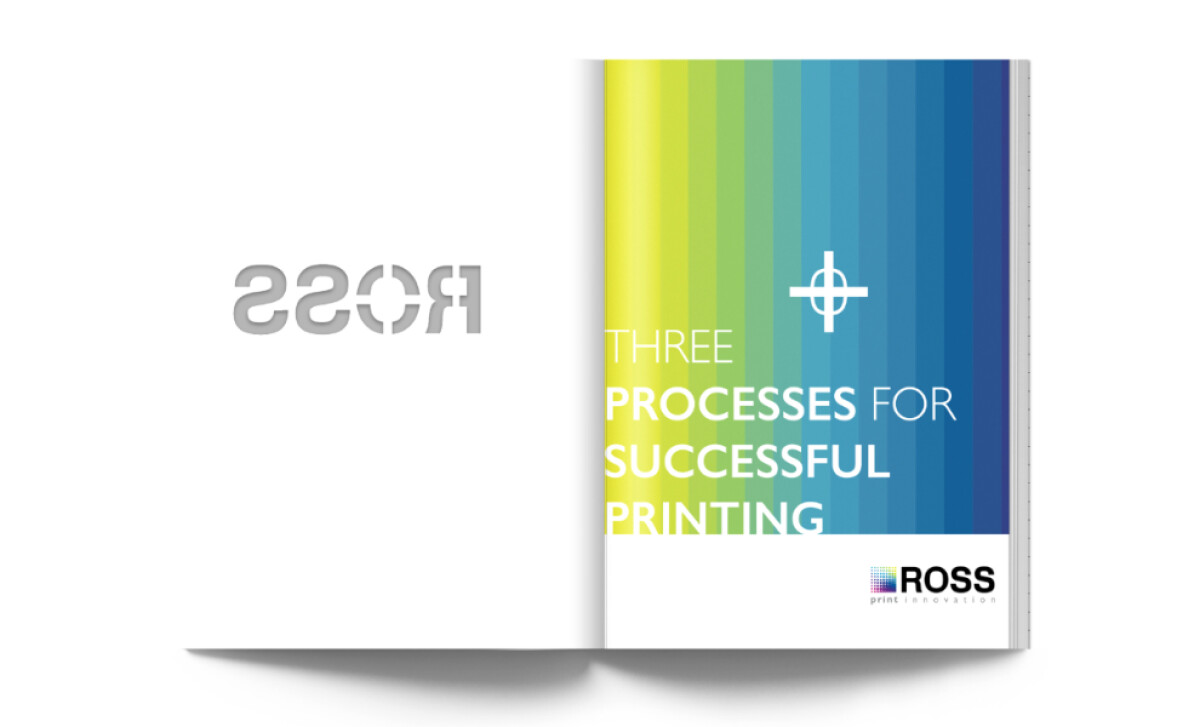
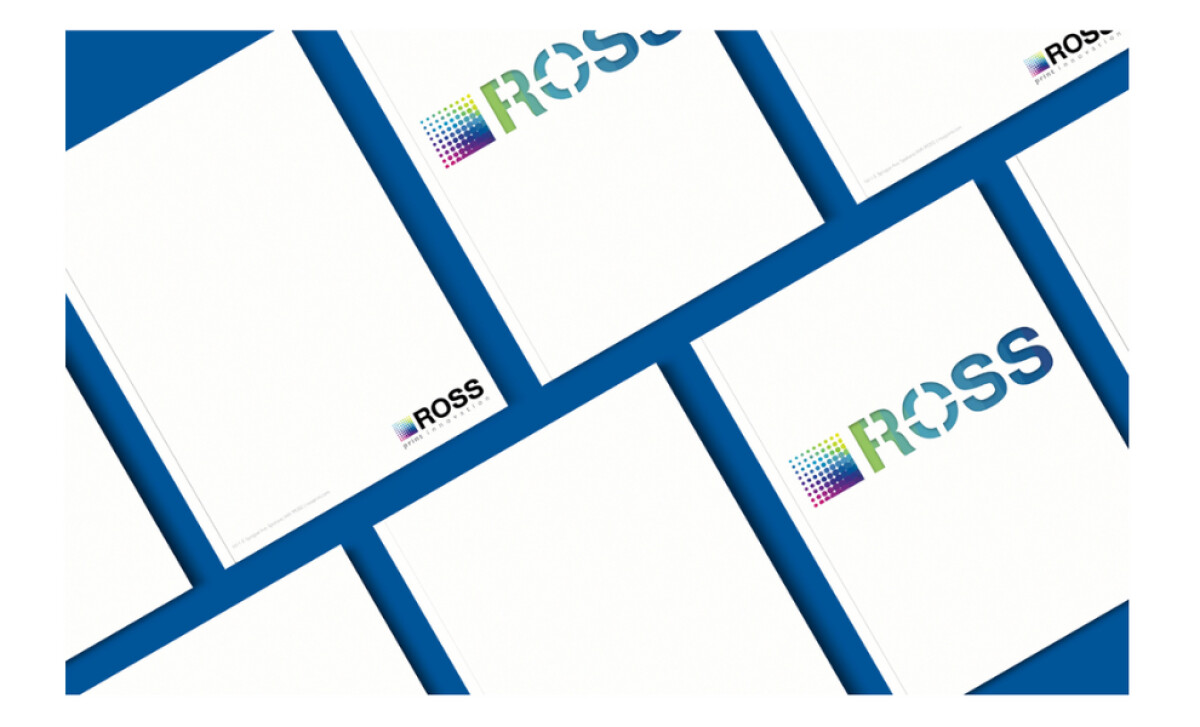
The cover and the content inside grab attention with a stunning multi-color gradient of purple, green, yellow, and blue tones. This reflects both the versatility and modernity of the company’s expanded service offerings. The halftone pattern paired with crisp typography signals precision and innovation — two essential qualities in the print industry.
Throughout the promotional materials, white space dominates, allowing the logo and key messaging to breathe. This bold minimalism directs the viewer’s focus exactly where it’s needed: the brand. The restrained design also signals confidence and clarity, important traits in a saturated corporate service market.
Ross Printing’s materials cleverly weave its history into a forward-thinking narrative. The echo of the logo design inside the booklet, coupled with the phrase “Three Processes for Successful Printing,” bridges traditional values with modern practices. Emphasizing its 107-year legacy, Ross positions itself as a trustworthy yet cutting-edge partner.
Johnny Xerox’s professional services print design revitalizes a long-standing brand without losing sight of its historical strengths. Through vibrant gradient branding, minimalist design, and a strong innovation-forward message, the materials position Ross Printing for continued success in the next century.