Common Lot’s Print Designs Place A Focus On Shared Experiences And Good Conversation
The Common Lot is an upscale, yet down-to-earth modern eatery in Millburn, New Jersey.
It was founded by an Australian couple dedicated to good food and great experiences. And you can see this commitment mirrored in the restaurant’s interior, as well as its delicious, sophisticated yet hearty food.
These two are on the culinary adventure of their lives, learning from past experiences, pulling from international influences and creating an atmosphere of modernity, creativity, and class inside and out.
Here’s what the couple has to say about their restaurant:
Common Lot is a place for family and friends to gather and share great food and conversation. The surroundings are elegant but unpretentious; comfortable but handsome — an expression of our personalities and our commitment to the dining experience. We have created a relaxed, convivial environment with minimalist design, unexpected finishes, natural materials, texture and light.The restaurant puts comfort first, creating a dynamic dining experience that gets everyone at the table involved in one way or another. They want to create experiences and memories that will last longer than the meal itself, and they do so with an effortlessness that is admirable.
And to match this sleek, subtle and sophisticated feel, the brand turned to design studio Perky Bros to bring their values full circle into an all-encompassing brand identity fit with print materials that played the part.
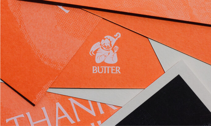
And from menus to to-go bags, the branding is immaculate. It’s modern, edgy and sophisticated while still holding a playful and laid back vibe that is enviable.

The Common Lot Prints Use Color To Capture Its Dedication To All Natural, Hearty Ingredients
The basis of these print designs is textured pieces of paper and cardstock that embody an all-natural feel in their texture, and in their coloring.
These materials all encompass a similar color palette of soft greens, browns, cremes, and blacks with a pop of rustic gold. Overall, this emphasizes a very outdoorsy theme that’s perfect for an eatery that prides itself on natural ingredients and open pastures.
There’s cleanliness in the orientation and layout of these designs. There is a minimal copy, subtle illustrations, and subdued accents. These designs are sleek, modern and clean — but the colors add grit and dirtiness that shows determination, authenticity and experience.
This is a restaurant that means business. This is a brand that’s willing to get its hands dirty — a team that prides itself on this dedication and determination and filling its patrons with an innate trust in the food and its excellence.
These designs are rustic in nature and embody the natural and organic qualities of the restaurant in a subtle, sophisticated way.

Common Lot’s Modern Typography And Illustrations Add A Playful Edge
Beyond the color and orientation, there is a playfulness and an elegance that can be seen through its typography and illustrations.
The words stand bold, tall and large. They are easily visible — whether in a simple black font or embossed in gold. They demand to be seen and add a regalness to the design as a whole.
And this typography is used as an illustrative element as well. Os can be seen on their own — lining napkins, floating across menus and brochures, and highlighted in these materials. They are chaotic and haphazardly strewn about.
There’s almost no logic to it — like they are aimlessly wandering — which is, in a sense, how the founder describes himself. He also describes himself as a kind of black sheep in his family in a joking way and mimics this in the designs through these soft and subtle blobs that can easily be seen as shape grazing along.
These designs are playful and fun, yet simple and refined. There isn’t a lot going on, but enough to keep you engaged and excited.
They beautifully showcase how branding experts can strike the right balance between simplicity and complexity, creating engaging, yet not overwhelming visuals.

Common Lot’s Print Designs Express The Brand’s Sophisticated, Comfortable & Free-Spirited Nature
These print designs match the modern and playful edge of the restaurant beautifully.
There’s a texture to these prints that's tangible, they are equally smooth and rough — pulling from natural and organic elements and emphasizing the brand's dedication to the all-natural products and experiences.
The color scheme also matches this commitment, while also emphasizing the pastoral feel of the brand overall. The greens, browns, and blacks create a feeling of the outdoors which promotes openness — pairing well with the communal dining experience this restaurant fosters.
But there is still a playfulness — from the typography, to the sheep and leaf illustrations, and to the phantom Os that float along these print materials.
The chef described himself as a black sheep in his family, and you can see this mirrored in the design, giving it a playful, almost disorganized edge. But upon closer inspection, you can see that this is all controlled chaos. And it’s enticing.
These print designs are modern, fresh and exciting. They bring a playful personality to the brand while also elevating its core values and objectives. It brings this couple’s visions to life and creates an identity that embodies a lively, free-spirited nature that is contagious.