Standout Features:
- Structured table simplifying complex technology comparison
- Consistent factsheet layout for presenting technologies
- Clean typography
Designing effectively for a genuinely broad audience, ranging from government authorities needing technical specs to local citizens seeking basic understanding in a place like Dhaka, was an essential consideration for this UNICEF guideline focused on sanitation options. Lai Guim's print design directly addresses this challenge in the following ways:
Firstly, data is made accessible through readable charts, like a detailed comparative analysis table. It systematically compares twelve systems against many criteria, utilizing clear labels, icons, and a structured grid, aided with helpful shading. Putting complex data into this scannable format empowers users to compare options in a quick glance.
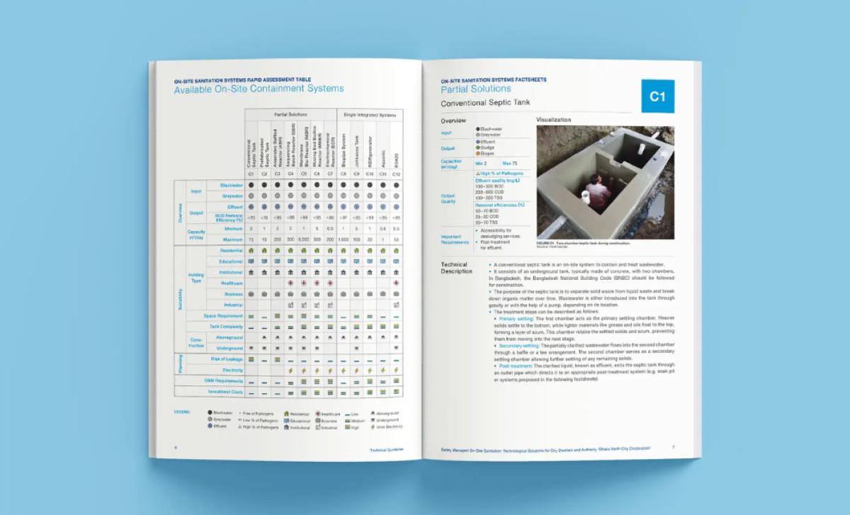
Next, to give detailed information on each sanitation technology clearly, the guide uses a standardized factsheet format. Each one consistently includes key sections like an overview, a photo or visual, and a technical description. This template approach ensures information is presented uniformly across all systems.
Overall, the whole document really prioritizes clarity for the reader, using a very clean design language consistently. An easy-to-read sans-serif font helps with good readability, plus layouts feature generous white space all throughout. Using UNICEF blue for branding also adds credibility, plus adds a user-friendly feel commonly associated with the color.
This effective non-profit print design serves as a powerful reminder that even highly technical or complex information benefits enormously from adopting a truly user-centric design approach. It highlights how thoughtful design makes deep expertise understandable and truly actionable for all who need it.


