Team Behind the Design
Print Design Analysis
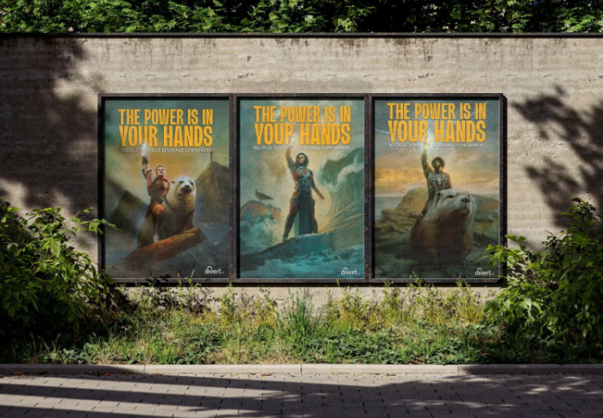
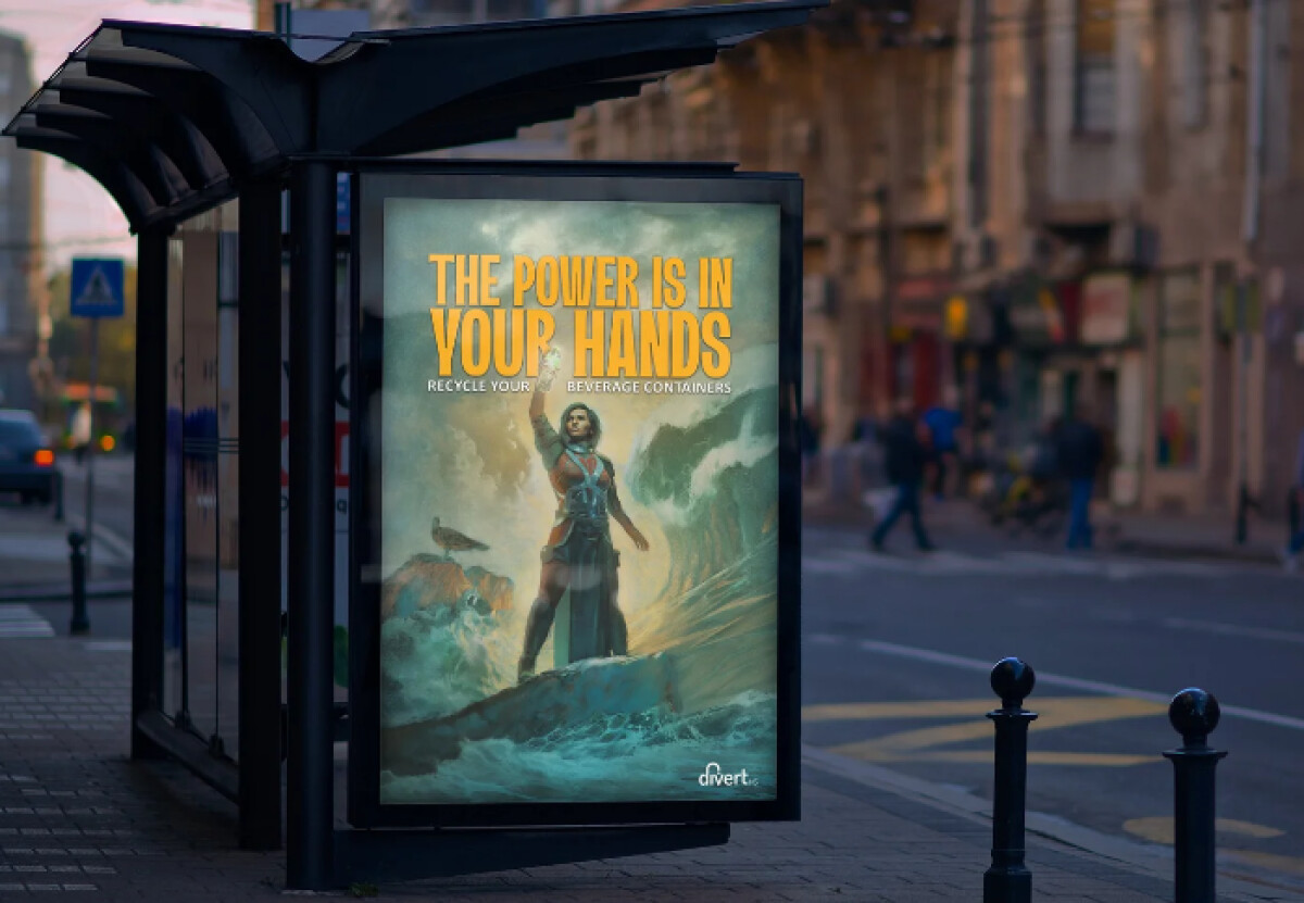
When I look at poster designs, I pay attention to whether the message can cut through indifference and shift behavior on its own.
The Divert Nova Scotia Recycling Campaign works for me because it turns a routine civic task into a heroic narrative, reframing recycling through culture and identity.
- Illustration Style: Painterly, cinematic illustrations show figures in commanding poses, often alongside animal companions. I like how fully the campaign commits to 1980s fantasy visuals, drawing on familiar signals of power and struggle to recast recycling as an act of strength.
- Typography: Bold, condensed, all-caps headlines lead each composition. To me, the tone feels declarative and direct, which suits public spaces where messages need to land fast. Saturated yellow-orange type stays clear against darker scenes, even from a distance.
- Color Strategy: Deep blues, teals, and muted earth tones set a dramatic base, with warm highlights guiding attention. I’m drawn to how the cinematic color treatment builds emotion while still keeping the message easy to follow.
- Composition & Scale: Central framing and exaggerated figure scale establish authority and presence. I like how upward motion and elevated viewpoints subtly lift the act of recycling itself, placing the viewer in the role of the hero.
What Brands & Agencies Can Learn from Divert Nova Scotia Recycling Campaign
1. Reframing Beats Repeating the Message
When audiences resist traditional messaging, changing the cultural framing can be more effective than increasing frequency. Design can reposition behavior by changing what it represents.
2. Commit Fully to the Concept
The campaign works because every element supports the same narrative. Half-measures would have diluted the impact.
3. Use Culture as a Communication Shortcut
Referencing familiar genres allows complex ideas to land quickly. When done thoughtfully, cultural shorthand can carry emotional weight without explanation.
About DesignRush Featured Designs
At DesignRush, we review hundreds of agency projects each month. The featured selections stand out for clarity, creativity, and execution across digital and brand experiences.
Exceptional works proceed to our Monthly Design Awards, where they’re recognized as leading examples of design craft.
Discover outstanding creative work across industries:
- Best Print Designs
- Best Website Designs
- Best App Designs
- Best Logo Designs
- Best Packaging Designs
- Best Video Designs
For a full list of design agencies and related services, see our Agency Directory.


-preview.jpg)
-preview.jpg)
-preview.jpg)
-preview.jpg)