_9fc3d6665b18-desktop.jpg)
Team Behind the Design
Print Design Analysis
_781e6e42b625-desktop.jpg)
When I review professional services print designs, I look at typography, layout consistency, color balance, and integration with brand content.
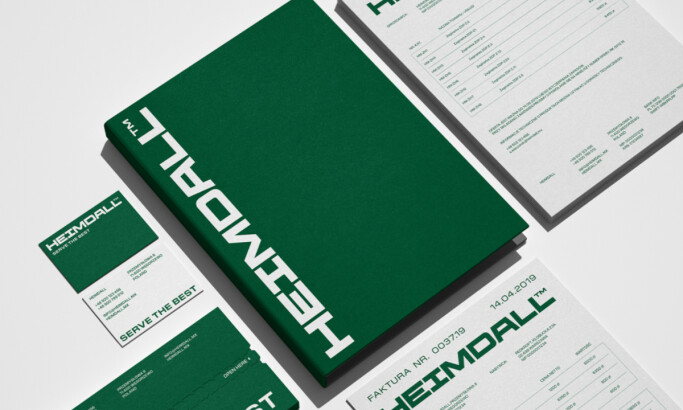
Wendy Hammond Photography’s design by Jimmy Dawson shows how bold geometry and subtle minimalism can work hand in hand.
_2d3c1a7fe652-desktop.jpg)
- Motif: I think the chevron-inspired geometric pattern is a strong choice because its sharp lines create a compelling contrast with the organic flow of the photography.
- Color Palette: The use of coral and forest green strikes a smart balance between bold energy and refined calm. These combinations add a lot of personality without being overpowering.
- Typography: The choice of a clean sans-serif typeface is significant. It feels minimal and professional. This allows the photography and the geometric forms to remain the focus.
- Applications: The system adapts well from cards to posters. It feels cohesive and versatile across all the different touchpoints.
_a368222d4841-desktop.jpg)
What Brands & Agencies Can Learn from Wendy Hammond Photography
_fe46e6af0374-desktop.jpg)
This print system offers a strong lesson in creating a brand that supports, rather than overshadows, a client's work.
1. Create Contrast with a Pattern
If your design will feature organic photography, a geometric pattern can be a great addition. The sharp lines create a dynamic contrast with the images. This makes the entire composition feel more balanced and intentional.
2. Let Your Typography Step Back
When your design already has strong visual elements like photos and patterns, a minimal, clean font is often the best choice to avoid clutter and maintain focus.
3. Design a System, Not a Single Piece
A strong print identity should feel cohesive across all materials. Thinking about how a design will adapt from a business card to a poster from the start ensures a versatile and scalable brand.
About DesignRush Featured Designs
The designs we feature showcase leading creativity and expert delivery. Each stands out for its originality, precision, and ability to move brands forward.
The very best among them are celebrated through the Monthly Design Awards.
Explore standout print design projects and related categories:
- Best Print Designs
- Best Website Designs
- Best App Designs
- Best Logo Designs
- Best Packaging Designs
- Best Video Designs
For a full list of design agencies and related services, see our Agency Directory.