Standout Features:
- Vibrant colors and abstract background shapes
- Approachable custom illustrations
- Dynamic typing animation on key headlines
The main goal driving Aequa-Tech's website design was to communicate that they are an innovative technology company driven by a strong social purpose — specifically, making advanced NLP tools more accessible to everyone. Calibro Zero focused intently on designing a site that conveys this goal to visitors.
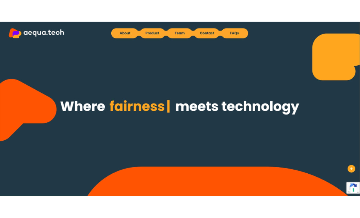
Right away, the website grabs your attention with its striking visual style. A deeply dark blue-green background acts as a professional canvas for vibrant accents like bright orange and warm ochre. Large, abstract organic shapes in these bright hues flow across different sections, adding a touch of creativity and making the site feel a bit more modern.

Custom illustrations work nicely with the bold style here to make the Aequa-Tech brand feel more human and approachable. You see friendly, clean-line team portraits, making the researchers seem relatable. Plus, simple icons used for core values help soften the expected tech focus, emphasizing a human-centered approach.

A nice interactive touch is the typing animation you see on key headlines throughout the site. Simulating text being written feels thematically relevant to Aequa-Tech's coding field. It effectively highlights core messages in a non-static way, making the design feel more dynamic and checks off a box for meeting current expectations for web experiences.
This technology website really demonstrates effectively how modern tech start-ups can project a genuinely approachable feel. Such a move allows them to showcase innovation without causing intimidation, making its complex industry and solutions feel much more human-centered — which is vital for B2B tech brands today.