Two words: “Innovative” and “creative” could sum up Inmarsat's website. The technology-based research company relies heavily on minimalism and imagery to enhance their UX and UI interface. Between their website design and sitemap, it's clear that Inmarsat has made the move from basic HTML code to complex Javascript and CSS programming.
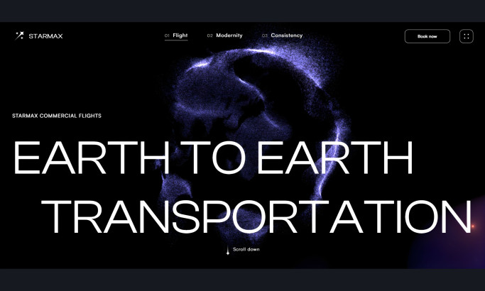
The introductory page is bold, fresh, and uncomplicated. The crystal image of Earth against the black backdrop is a subtle homage to Inmarsat’s global research. Content on this page is like the simplest form of a fraction, purposeful and basic.

The website incorporates a deep scroll and parallax interface to highlight the context of each sub page. What's interesting is that although there's a bit of content, it still uses a minimalist structure that prevents distraction.
This brilliant concept enhances UI interface, allowing users to shift their focus on the company's industry. An example of this how vivid the colors of the pie chart are, even though it's a basic illustration. It sheds lights on other sections of the page such as the content and menu bar.

The white background and typography of the blog makes articles look like a scientific report. Every embedded image is of the highest quality, relatable to the viewer, and relevant to the article. The social media menu on the right is subtle, encouraging users to share the blog on their social media accounts.
The website is the digital version of the smart kid that knows too much, but always gets it right. Inmarsat combined intellectual ingenuity with digital concepts, where users are able to interact with the company's concept.
Inmarsat is a best website design in the Professional Services and Technology industries.