Standout Features:
- A vibrant, reassuring color palette
- Modular card-based layout with an emphasis on personalization
- Approachable and illustrative imagery
GoodNode’s website for Auret Bank bridges nearly a century of institutional history with a fresh, friendly digital interface. After a 2023 rebrand, the site repositions the Polish bank as a modern, customer-first institution through warm, optimistic visuals.
This is a crucial first step in building trust, especially when three-quarters of users report that their judgment of a company's credibility comes from its web design.
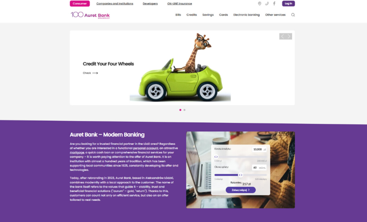
A strategic and reassuring color palette is used, featuring white backgrounds, deep royal purple, and hot pink accents on UI elements. This combination is designed to feel both professional (purple) and approachable (pink). The high-contrast colors ensure memorability and help guide the user's eye to key information and CTAs.
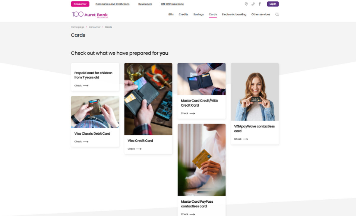
The banking and finance site employs a card-style modular layout for its content, particularly on the homepage and product pages. Each card neatly contains images, text, and a call-to-action. This format maintains coherence and prioritizes clarity, which is essential for users comparing multiple services like loans or credit cards.
Across the site, product visuals are presented with a light-hearted, almost whimsical touch, evident in the playful giraffe-in-a-car image for vehicle loans.
Lifestyle photography complements this with casual, real-world settings — like hands holding a card. This approach creates emotional relatability by reminding users that financial services are personal, everyday matters.
Auret Bank’s combination of a welcoming color system, clear layout logic, and thoughtful imagery results in a digital experience that repositions banking not merely as a transaction, but as an approachable, supportive relationship for its customers.