The Wave Apps Website Helps Businesses Grow Quickly
Look professional, get paid, and build your business one invoice at a time. Wave Apps is the acclaimed financial program for any small business out there, whether you’re just starting up or you’ve been doing your thing for quite a while.
Wave helps business track their finances in an efficient and easy way through award-winning, free financial service software.
By improving cash flow (Payments), delivering money to employees (Payroll), helping businesses get paid (Invoicing), preparing for tax time and providing business insights (Accounting, Receipts), Wave covers the spectrum of a small business owner's financial life, and helps businesses grow and thrive.Wave Apps burst onto the scene in 2010, beginning as a startup committed to shaking up the industry and promoting small business growth. This Toronto-based company aims to solve the problems that most businesses face especially in the early stages of its life.
With the help of Wave, brands can track where their money is coming from, where it's going and where it’s needed in the meantime. The brand offers aid in four categories through its products — accounting, invoicing, payment and payroll. Whatever financial services your brand needs, Wave can help you bridge that gap.
This brand cares about business growth and wants to not only help businesses overcome financial obstacles but teach them valuable money management skills that they can use going forward.
It’s a brand that is very business-focused, and you can see that in the corporate feel of the overall design. Wave offers technical service, but it also does so in a way that is approachable and friendly.
The website design, as a result, matches that persona and seamlessly connects businesses with the financial services that will help them take that next big step.

Wave Apps’ Clean Interface Encourages Fast And Effective Engagement With Users
The Wave Apps site is bright, bold and exciting — but there’s a subtlety to it that is equally pleasing and calming. It’s a sleek and sophisticated platform that cleverly displays its services and products in a clean and crisp way to promote engagement and interactivity.
The site is simple in its design — there aren’t a variety of exciting and innovative design elements. There is no parallax scrolling or dynamic video or creative experimentation. But that’s because this brand doesn’t need it. This design doesn’t need it. The brand works in financial services and it works with small businesses. Therefore, the design as a whole is a sophisticated, modern and streamlined site that offers all the necessary information in a digestible way that’s clear, focused and determined.
There’s no need for fantastical or mesmerizing bells and whistles. The content itself is enough to dazzle and engage.
From the moment you hit the Wave Apps homepage, you know they’re confident in how they’re going to be able to improve the functionality of your business. How so?
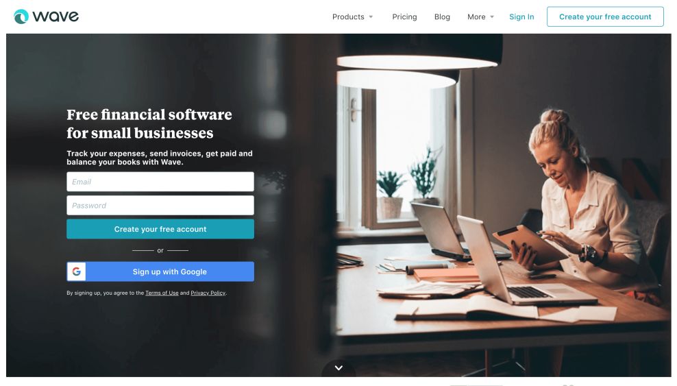
Well, they work to sign you up for your free account right there! Settled on a clear photograph, the company employs a plugin sign up form as the very first thing you see. It’s a bold choice, but an effective tool to immediately engage you as it builds your impulse and makes you want to know what exactly has them so confident. The choice keeps you scrolling.
Illustrations zig-zag down the page in an alternating pattern that creates visual diversity, but that’s not all they do! Stay with each illustration for a moment and watch as it comes to life, depicting the point behind the function you’re exploring--from money management to invoicing! It’s the perfect way to visually stimulate, ultimately keeping you engaged and moving through the page.
This determined and straightforward content structure is just enough to entice. And it shows that this brand knows its audience and what they’re looking for. This web design excels because it shows the brand as a leader in its industry, with products and services that work.
But it also excels because it proves in its modern simplicity that it is innately tuned into what its audience wants and needs, and gives it to them directly.

The Wave Apps Site Balances Illustrations And Text Pleasantly
Right from the start, you can see that the Wave App site is a clean, corporate platform that promotes the brand and its services in a clean-cut, straightforward way. There is plenty of white space to allow for images and text to pop. But it does so in a crisp and modern way that creates a seamless and intuitive user experience from the home page to the product pages and even right into the blog.
All you have to do is start scrolling.
Learn just a little bit about what makes Wave Apps fantastic by scrolling down the page. You’ll find a fun combination of illustrations and text that works with your growing interest.
The cleanliness of the design is compelling, and the layout keeps you engaged as you move down the platform.
These illustrations and animations move. They go from static to dynamic as you watch, with images sliding in and content shifting slightly. Similarly, the illustrative icons add a playful and professional edge to the design that helps users understand the information they’re being presented with quicker than if they were to read about it in a large block of text.
Running a business can be stressful, but Wave Apps website goes above and beyond their own program to help bring their clients' ease of mind by creating a blog consisting of a little bit of everything you might want to know about running a business. Bright imagery is plastered on the majority of the page, building a vibrant platform over the plain white background. It’s an easy way to draw your eyes down the length of the blog.
Posts are well organized in a simplified row, forcing your attention on one dynamic post a time. The choice creates a unified front that also makes you slow down and take in each blog post for what it is and how it could affect you. It’s a smart way for Wave Apps to make sure you get the most out of their blog.
Wave Apps offers essential services, but that doesn’t mean that every business owner will be able to innately understand what they’re being presented with. And these illustrations and animations help to bridge that gap, offering a visual element that they can absorb, paired with just enough text to give them context.
Wave Apps uses vivid colors and animations to bring fun to their website. The organization is the subtle way the company pulls users through each section, forcing them to slow down to focus or speed up through exciting engagement in a user-friendly experience.
It’s bright, engaging and intuitive. It knows how to interact with its audience and leads them throughout the site. It gives businesses all the information they need in a peaceful, creative format.
Organization, imagery, and text all work together in a clean and clear way to elevate this design and encourage its audience to interact.

Wave Apps Is A Sophisticated Tool For Promoting Business Growth Through Financial Tracking
Wave Apps makes tracking your small business finances a breeze. And its web design follows this intuitive, engaging and helpful vibe. It’s a corporate website that perfectly balances technical copy and creative illustration.
Navigating through this website is seamless thanks to the pairing of clean text with dynamic and engaging animations. Images move and change, and an emphasis on product photography gives this site an extremely professional feel.
The organization is clean — with a bright white background offering a clear path as you scroll. The text is kept to a minimum, images are engaging yet simple and each section is separated in a distinct way making it obvious where one thought ends and another begins.
The menu bar at the top sits at the top of the page and offers users a seamless path throughout the site. Illustrations in the toolbar also add an intuitive nature that makes it easy for businesses to look through its service offerings and decide on the financial services that they need the more help with.
This web design, much like the brand itself, puts businesses first. It offers them all the information necessary in a simple and clean layout, with an organization system that is crisp, fresh and straightforward.
Subtle illustrations and dynamic animations add a playfulness that further promotes the brand and its services. It makes it just a little bit easier for brands to understand the impact of Wave Apps on their finances and, ultimately, business growth as a whole.
This is a financial services brand, but the design doesn’t feel too technical or unapproachable. It strikes the perfect balance between corporate and friendly. And it knows its audience intimately, providing them with the content in a way that they can effectively interact with it.
This clean, corporate inline platform is stunning and sleek, effortless connecting small businesses with the financial services that will help them thrive.

-preview.jpg)