Team Behind the Design
Web Design Analysis
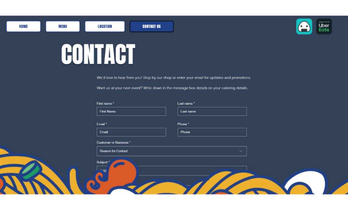
Looking at a website, I start by examining how the visual language sets expectations, how the interface guides users, and how each section supports discovery.
That’s the lens I used in reviewing Chloe’s Convenience.
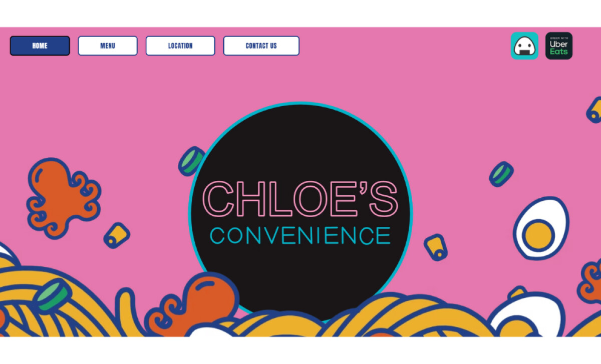
- UI Creativity: AQRedited leans into bright color fields, thick outlines, and noodle-inspired illustrations. The mix of pink, teal, and deep navy gives the interface an upbeat personality that fits the brand’s snack-culture roots. Buttons stay uniform across pages, which helps maintain visual order.
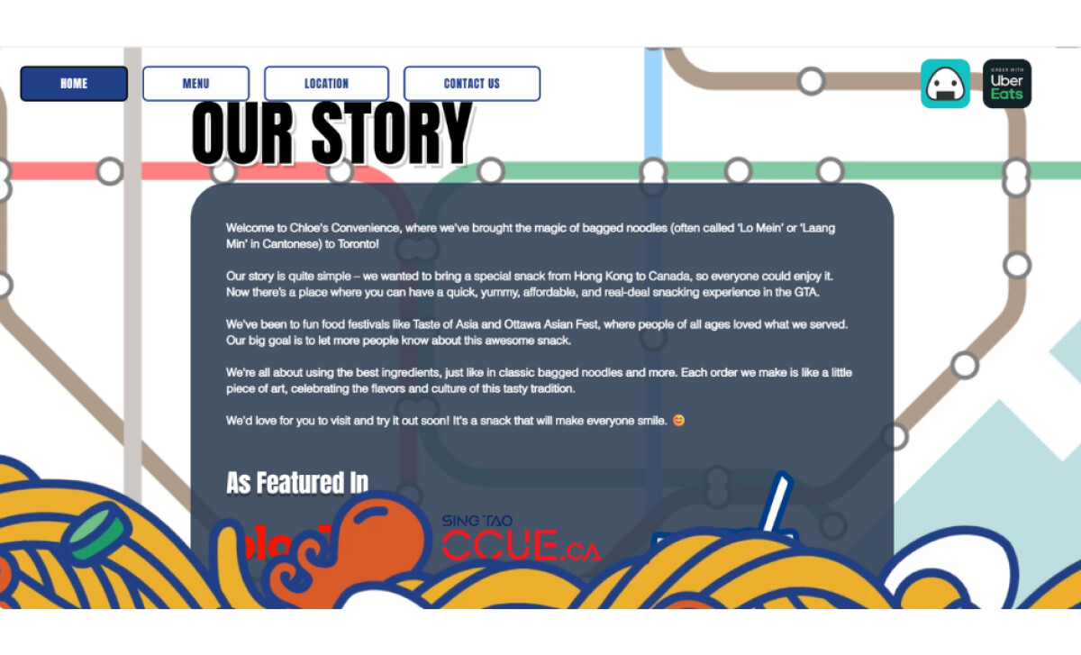
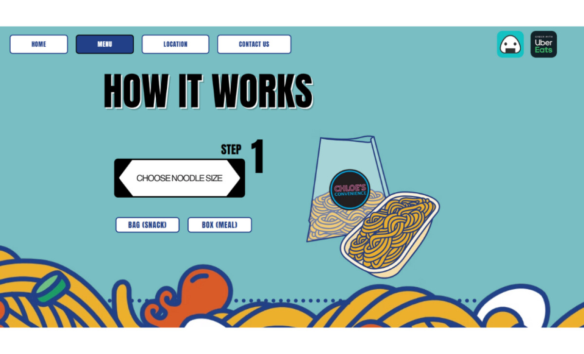
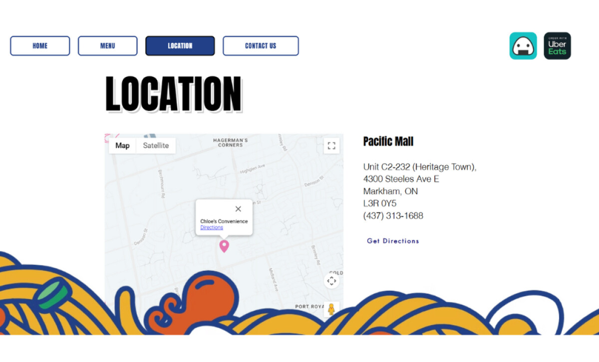
- UX Direction: The navigation is straightforward and keeps visitors oriented. Key pages—Menu, Location, Contact—sit right where users expect. Sections like “How It Works” break information into simple steps, making it easy for first-time visitors to understand the ordering process.
- Branding: The illustrated ingredients circling the layout create an identity that feels energetic and unmistakably Chloe’s. The bold headline typography reinforces this tone, setting the stage for a fun, food-driven experience rooted in Hong Kong’s bagged noodle culture.
- Creativity: I like how AQRedited uses playful visuals without losing clarity. The illustrations support the story rather than overwhelm it. Even in high-color sections, the layout stays readable and balanced.
What Brands & Agencies Can Learn from Chloe’s Convenience
AQRedited’s work on Chloe’s Convenience shows how playful visual storytelling can coexist with clarity and conversion. It’s a smart example of how personality-driven brands can stay fun without losing usability.
1. Use Illustration to Build Identity, Not Distraction
The bold, noodle-inspired artwork adds flavor and energy, but the layouts stay clean. This demonstrates how illustration can enhance recognition and mood when it’s used with intention.
2. Keep Navigation Simple Even When the Brand Is Loud
Despite bright colors and expressive visuals, the core pages remain easy to find. Clear menus and step-based explanations prove that a lively aesthetic should never complicate the user journey.
3. Anchor Playfulness With Consistent UI Elements
Uniform buttons, steady spacing, and predictable layouts help the vibrant color palette feel structured rather than chaotic. Brands can learn that consistency is the key to balancing personality with usability.
About DesignRush Featured Designs
At DesignRush, we review hundreds of agency projects each month. The featured designs stand out for creativity, relevance, and execution.
Many go on to be recognized as winners of our Monthly Design Awards.
Explore more here:
- Best Website Designs
- Best App Designs
- Best Logo Designs
- Best Print Designs
- Best Packaging Designs
- Best Video Designs
For a full list of design agencies and related services, see our Agency Directory.