Standout Features:
- Simple and transparent
- CTA in the header
- Legible, uniform typography
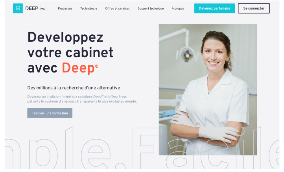
The next best dental web design on our list is DEEP Company. The clean design was built by Kernix.
With a legible, uniform typographic choice, the website relies only on a single font style to communicate headers and body text. The keywords in the content, like the buttons, are emphasized through a bright shade of orange that stands out from the white and grey canvas. One of the said buttons marks a distinctive CTA and it’s easy to spot in the header.
Overall, the design is simple and transparent. While there’s an array of colors in the palette, they’re cleverly distributed so that they don’t obstruct the browsing experience.
If you like simple solutions, you’ll enjoy looking at these best simple web designs.
Get a chance to become the next Design Award winner.
SUBMIT YOUR DESIGN


-preview.jpg)