- Agency: eSEOspace
- Client: YoungerMeMD
- Category: Website Design (Medical)
- Location: San Diego, California
- Project Brief: Redesign the YoungerMeMD website to clearly communicate complex medical offerings, improve navigation, support new services, and drive patient education and conversions through a highly SEO-optimized structure.
Analyzing medical web design requires balancing information hierarchy, educational depth, and conversion pathways.
YoungerMeMD illustrates how structured content and search-optimized layouts can successfully host complex medical services while remaining approachable for a broad audience.
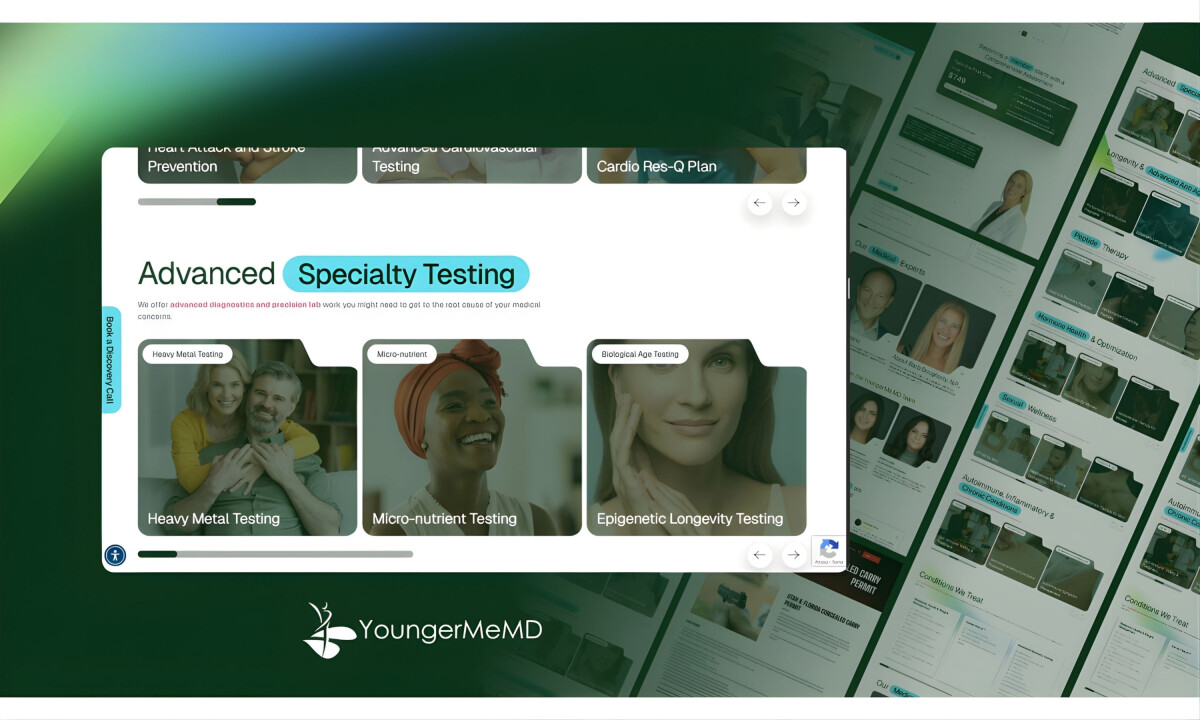
- Navigation & Information Structure: The navigation is built around patient intent, making it easy to move between conditions, services, and educational content. I find the layered structure supports quick scanning and deeper research without overwhelming users.
- Content Organization & Educational Design: Complex medical topics are divided into modular sections using tables of contents, cards, and visual groupings. I appreciate how this makes long-form content more approachable while reinforcing expertise.
- Visual System & Interface Design: A clean layout, soft gradients, and a restrained palette prioritize readability and clarity. From my perspective, the visual system reinforces professionalism without relying on unnecessary decoration.
- Conversion Strategy & SEO Integration: Calls to action are consistently present without disrupting the learning experience. For me, the SEO-driven structure balances organic visibility with clear pathways to booking and engagement.
Word from the Agency
Beyond design decisions, the agency reflects on how the new website is already impacting performance, visibility, and user engagement.
“We have significantly improved conversions as well as organic traffic. As this site was recently launched, we are waiting to see more concrete results; however, feedback from users, leads, and traffic is trending strongly in a positive direction.”
— eSEOspace
What Brands & Designers Can Learn from the YoungerMeMD
This project illustrates how healthcare websites can balance education, trust, and performance without overwhelming patients. Here are three key lessons from the YoungerMeMD redesign:
1. Structure Complex Information Around Patient Intent
Organizing navigation by conditions, services, and education helps users quickly find what matters to them. Clear hierarchy supports both quick answers and deeper medical research.
2. Design Education as a Guided Experience
Breaking medical content into modular sections improves comprehension and credibility. Thoughtful content structure makes advanced healthcare topics feel approachable rather than intimidating.
3. Integrate SEO and Conversion Seamlessly
Educational content, booking actions, and assessments coexist without disrupting flow. When SEO structure and UX are aligned, sites can grow traffic while still driving meaningful patient engagement.