When it comes to financial compliance, few things matter more than trust — time. That’s what made EdgarAgents’ redesign challenge so critical.
A leader in SEC filings, EdgarAgents aimed for a digital extension that’s powerful enough to win over skeptical finance executives, compel clicks at trade shows, and deliver real leads.
All in one screen’s worth of space.
Enter eDesign Interactive. Tasked with compressing a complex, multi-service operation into a high-converting single-page experience, the team built a site that’s as bold as it is believable.
Industry Insight: High-performing landing pages are designed around a single goal: encouraging fast, decisive user action. This is especially critical in B2B sectors, such as finance, where attention is fleeting and trust is earned quickly.
Let’s break down how this page rewrites the rules of financial services marketing.
Key Findings for Brands:
- Sharp, simple messaging builds instant credibility in complex industries
- Visual cues and color psychology influence perception of trust
- Persuasive UX is as much about tone as it is about design
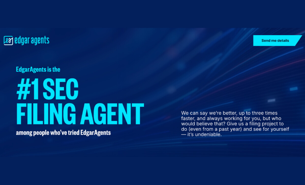
Headlines Command Attention With Bold, Data-Backed Messaging
The very first words users see on the page send a bold message: “#1 SEC Filing Agent.”
This messaging approach is big, bright, and confident. The kind of copy that doesn’t wait for you to believe it; it just dares you to challenge it.
And instead of opening with a wall of jargon, the page delivers a clear point of differentiation upfront: speed.
According to CXL, messaging determines 80% of a brand’s conversion rate, so this opening move is both strategic and effective.
EdgarAgents also leans into this by pairing its headline with real-world validation and a deadpan kicker: “among people who’ve tried EdgarAgents.”
It’s precise, convincing, and best of all, it feels human. A rare mix for the fintech space.
Visual Identity Signals Authority Without Losing Energy
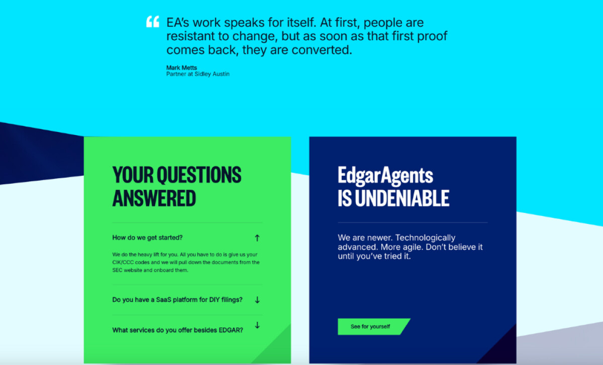
Most financial service websites err on the side of gray and conservative. EdgarAgents flips that.
The design plays with motion cues and energetic gradients:
- Deep blues for stability
- Vibrant cyans and greens for action
With this visual approach alone, the landing page feels faster. And that’s the point.
eDesign Interactive built the design around the concept of “undeniability.” That meant designing for both speed and clarity, without sacrificing polish.
Visual hierarchies are clean, modular, and responsive. Even the CTA buttons (“Send me details”) are shaped to subtly suggest forward motion.
This is how the site balances financial trust with modern digital energy.
Service Cards Simplify Complexity With Readability Benefits
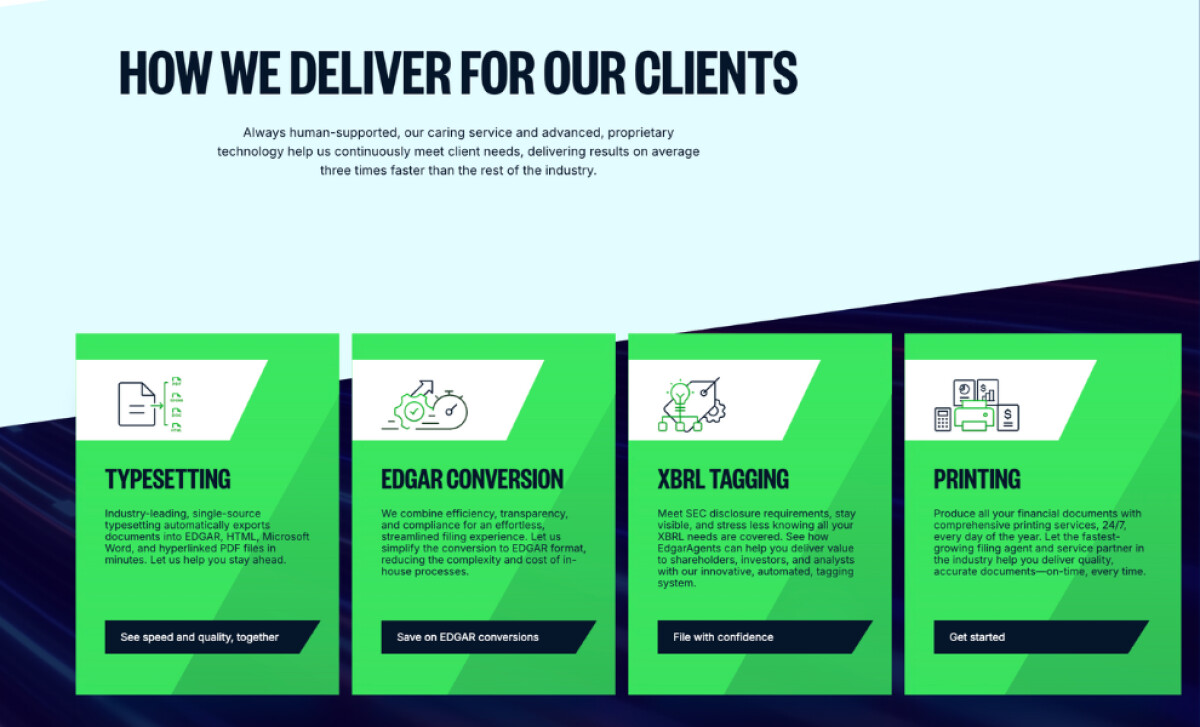
One of the page’s biggest design feats? Making compliance services feel comprehensible.
The content strategy simplifies EdgarAgents’ multifaceted service suite (typesetting, EDGAR conversion, XBRL tagging, printing) into a scrollable card layout. One that’s punchy, benefit-first, and skim-friendly.
Each section:
- Names the service in bold, legible font
- Offers a quick value-focused blurb
- Ends with a clear CTA like “See speed and quality, together”
This service presentation equally informs and sells. Replacing long blocks of complicated terms with structured storytelling makes EdgarAgents understandable and enticing.
Lead Form Boosts Conversions by Flipping Doubt Into a Challenge

Right beneath the hero banner sits a form, but it’s not your average “Sign up for more” experience.
Instead, it’s paired with a challenge: “See for yourself, for free.”
That single line flips the power dynamic by turning lead capture into an offer. Instead of asking users to trust EdgarAgents, it invites them to test the speed claim head-on.
It’s a smart psychological shift that’s rooted in proof over persuasion. Paired with minimal required fields and clear conditions, the form reduces friction while increasing confidence.
And that matters a lot, considering 22% of users abandon purchases because the checkout process is too long or complicated. This redesign removes that obstacle with precision.
What Agencies Can Learn from EdgarAgents
This single-page experience shows us that even the most technical industries can benefit from the right mix of creativity and conversion science.
Key takeaways:
- Establish differentiation: “#1 SEC Filing Agent” says more in five words than most headlines do in 50.
- Design for trust and speed: Color, spacing, and motion cues shape perception before content even loads.
- Turn skepticism into a challenge: Letting users test the claim flips doubt into action.
- Streamline complexity: When you need to say a lot, say less, but say it better.
When scroll-stopping experience meets fintech excellence and startup energy, even the most technical industries can win with simplicity.
eDesign Interactive’s single-page site for EdgarAgents is proof that great UX doesn’t need a thousand pages. Just the right message told well.
Looking to collaborate with creatives who bring the same level of clarity to complexity? Explore our Agency Directory to find the best partners in:
Our design experts also recognize the most innovative design projects across the globe. Visit our Awards section to see the best & latest in website design.
-preview.jpg)
-preview.jpg)
