Standout Features:
- Nostalgic glitch art and retro UI
- Vibrant accents with pixel-style typography
- Hover-based animations and fragmented layout
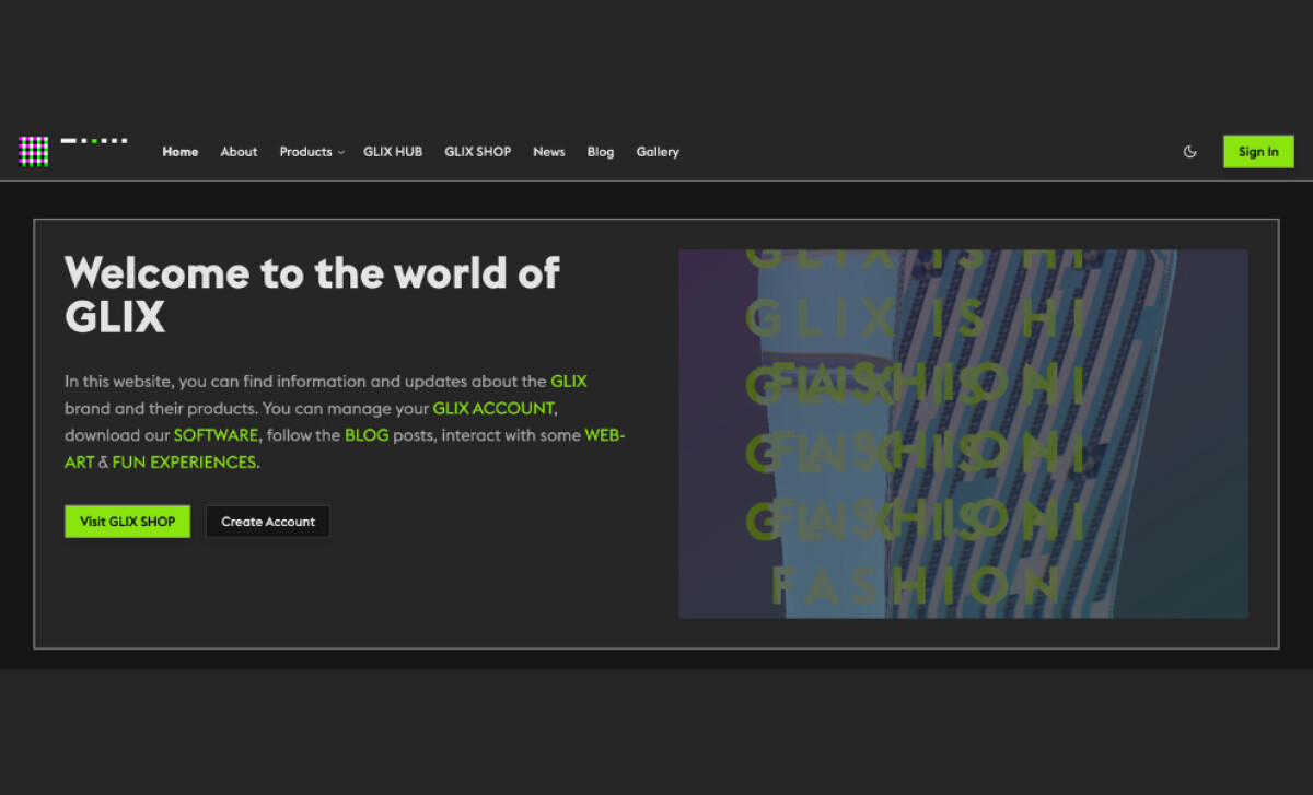
More than a digital platform, GLIX STUDIO’s website is a stunning provocation. Designed by Nockta, the experience pushes against conventional design norms in favor of something far more experimental and reflective of the studio’s cross-disciplinary identity.
With a clear nod to early internet aesthetics and glitch art, the site functions less like a polished portfolio and more like a living installation piece. Neon greens, heavy drop shadows, and pixelated graphics channel the aesthetic of Windows 98 interfaces. Distorted typography and hovering glitches also add a raw, almost analog tactility.
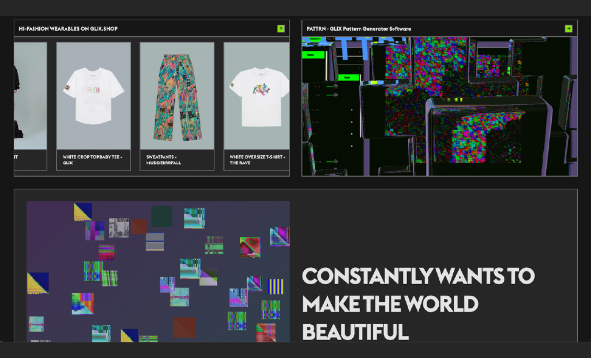
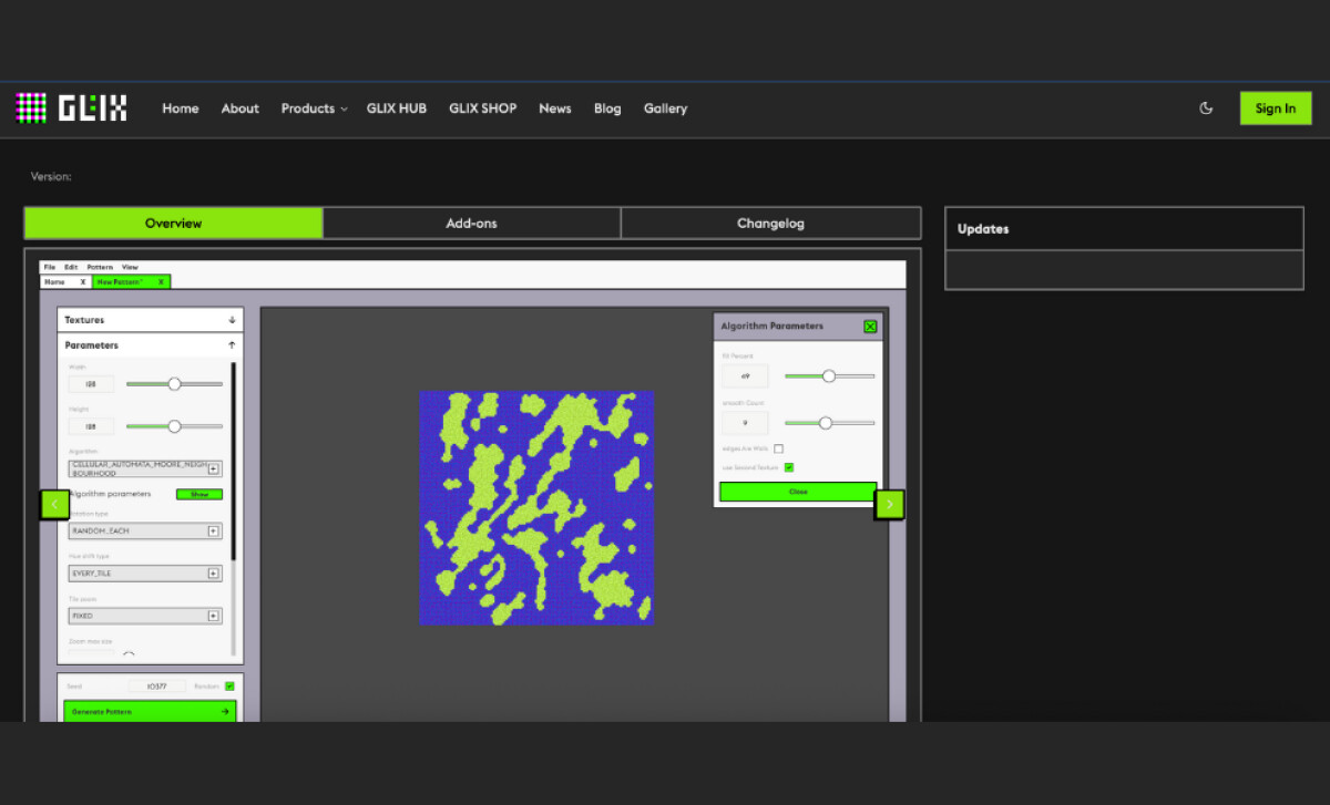
What’s more, navigation here is deliberately fractured. Pages lead to modules, modules loop into galleries, and galleries morph into software tools. There is no expected path; users are encouraged to explore, click, scroll, and interact. Despite its intentionally “broken” look, the website is surprisingly stable and usable.
This paradox of designing chaos within a functional framework is where Nockta’s craft shines. The UI might appear fragmented, but each transition, hover state, and content panel is meticulously choreographed to maintain a seamless (if unpredictable) experience. It perfectly houses everything from fashion lookbooks to art tools, all stitched together by a shared aesthetic that’s equal parts cyberpunk, net art, and web 1.0 remix.
At its core, the GLIX STUDIO site functions as a post-digital playground. It celebrates imperfection, rejects linear UX, and proves websites can still feel like discoveries. It’s a bold example of how exceptional web design can merge art, commerce, and code without losing its eccentric soul.