Standout Features:
- Soothing color palette and visuals
- Friendly and professional typography
- Clear, supportive navigation
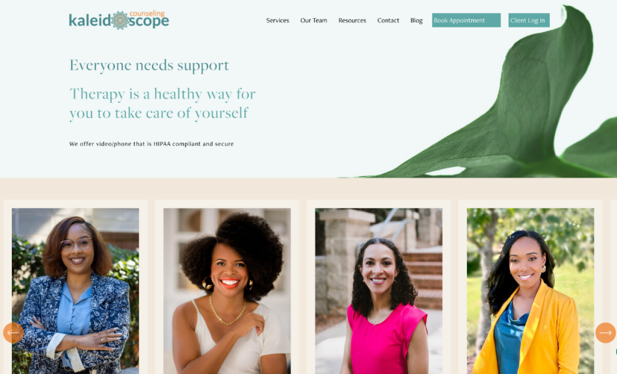
Kaleidoscope Counseling’s website, created by Nadia Mousa Design, immediately sets a tone of warmth, safety, and professionalism. Gentle colors, inviting photography, and thoughtful layout all work together to make therapy feel more approachable and supportive for visitors.
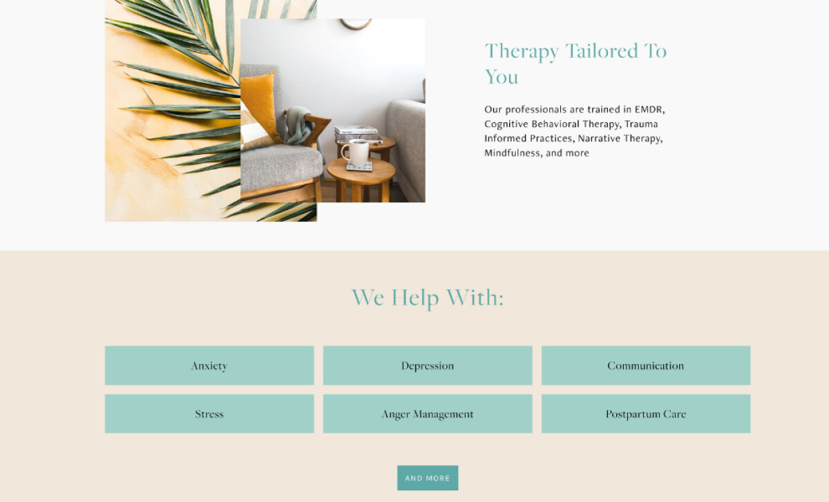
Calming greens, soft beige, and muted teal act like a visual exhale, easing visitors into the experience. Combined with natural photography of cozy spaces, the design uses color psychology to build comfort, trust, and emotional safety from the start.
Typography plays a quiet but crucial role in reinforcing approachability. Clean, lightly rounded fonts paired with open spacing make information easy to absorb. Large, reassuring headlines offer encouragement without feeling heavy or clinical.
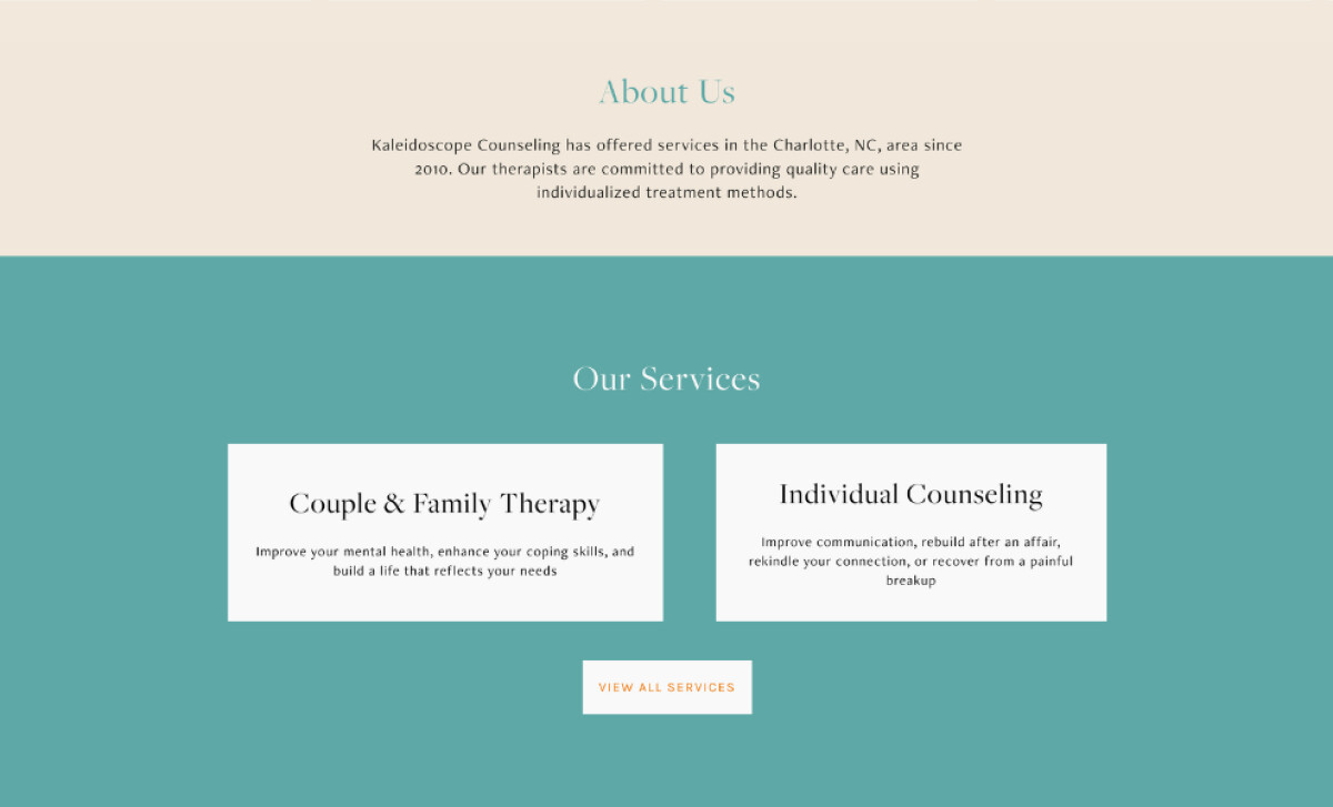
Navigation keeps the user experience simple and stress-free. Clear headings, well-placed CTAs like “Book Appointment,” and labeled service sections guide visitors quickly to the help they need, reinforcing a feeling of being supported throughout.
By blending calming visuals, friendly typography, and easy navigation, this professional services site helps lower emotional barriers and builds immediate trust. It’s a reminder that the best website design isn’t just about aesthetics — it’s about creating a feeling people can believe in.