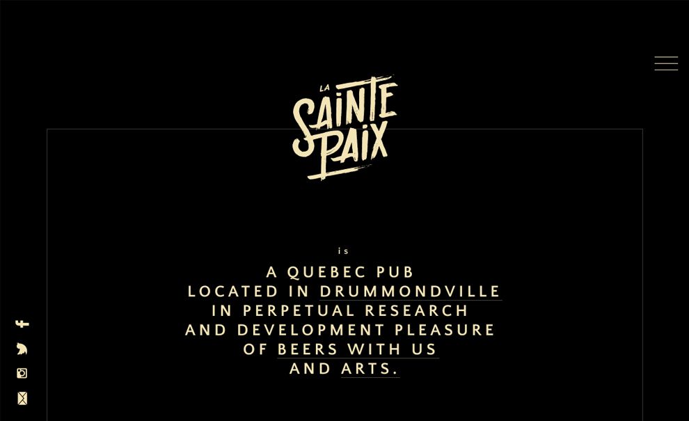
La Sainte Paix is a Quebec pub of diversified artistic backgrounds. The pub specializes in the distribution of Quebec malting products, and the enthusiasts from their hometown are thirsty to reinvent themselves to make pub-goers taste their talent.
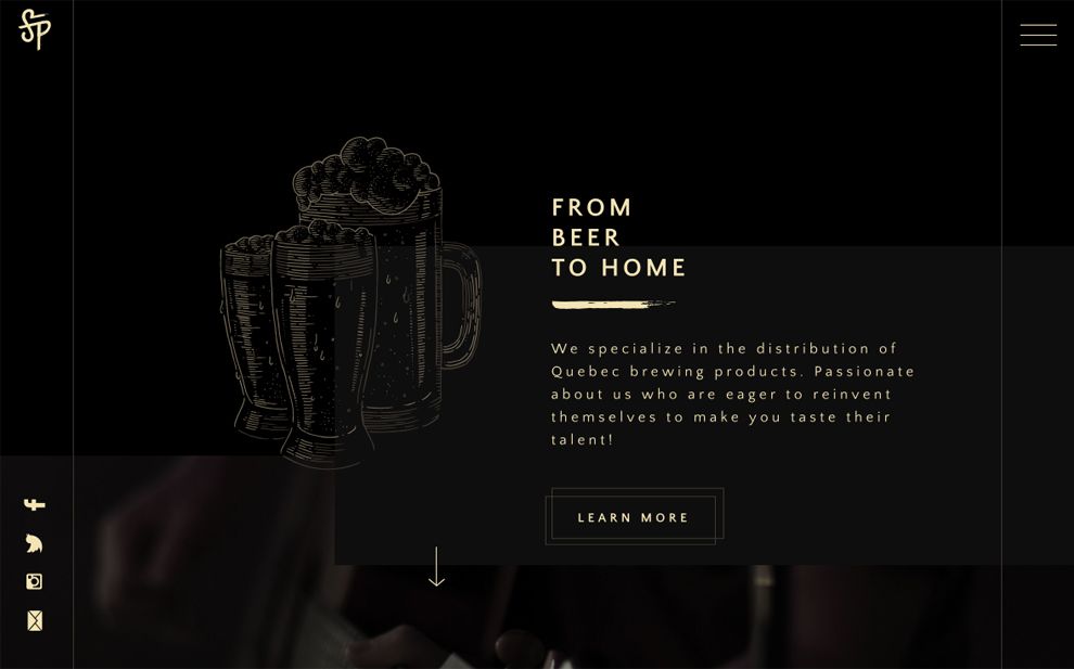
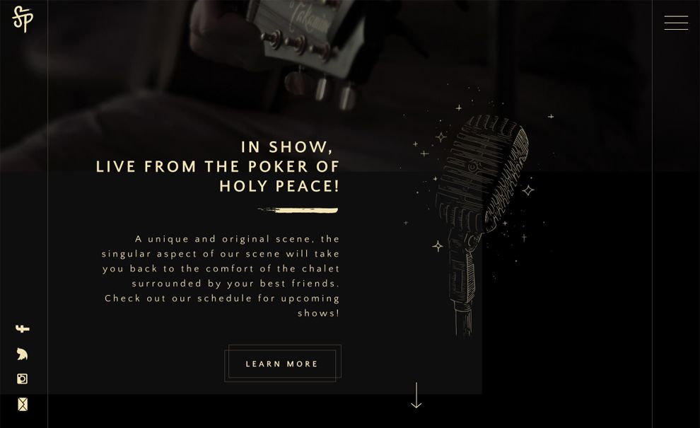
On the homepage, the messaging is loud and clear by the contrast of bold typography with thin-lined design elements in addition to the colors. The micro-animation of the illustrations jazzes up the atmosphere, making the experience fun and interactive.
Three features of the pub -- the beer, the show, and the food -- are addressed one-by-one. Plus, the events and news encourage the visitors to explore the site more. The site is simple for users due to its deep-scrolling page design with sticky hamburger menu on the top-right corner. As the user scrolls down, a simplified logo appears on the top-left as a home button and playfully rotating social media share icons appear on the bottom-left when a mouse hovers. However, if the website could offer at least one more language option - English, the usability would improve for non-native speakers.
The hover effects take a "less is more" approach, and the monochromatic appearance is fantastic -- the images have even been toned down to compliment the look. Accordian menus are house additional content and de-clutter the site as a whole.
The contest page -- meant for musicians -- has a clean, sophisticated approach with a subtle design touches. The content is organized within a 1 pixel border the content is clean and organized.

La Sainte Paix offers strong characters with a warm, welcoming, and urban feel. The dark background points out the nature of the nightlife business, while ivory-colored texts and illustrations indicate the malting products. The overall design is minimal and the font is modern.
La Sainte Paix is a minimal website design in the Food & Beverage industry.


-preview.jpg)