Team Behind the Design
Web Design Analysis
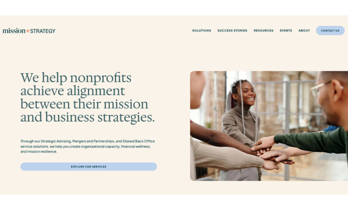
When I review a non-profit website, I look for a design that balances expertise with approachability. Rachel Fisher Creative’s work for Mission + Strategy is a great example of this principle.
- Color Palette: I think the creamy beige background with muted accents like coral and sage green avoids a stark corporate feel, which makes visitors feel supported.
- Editorial-Style Typography: Serif headlines are used to communicate authority. The underlined keyword highlights also add a conversational touch that builds an empathetic brand voice.
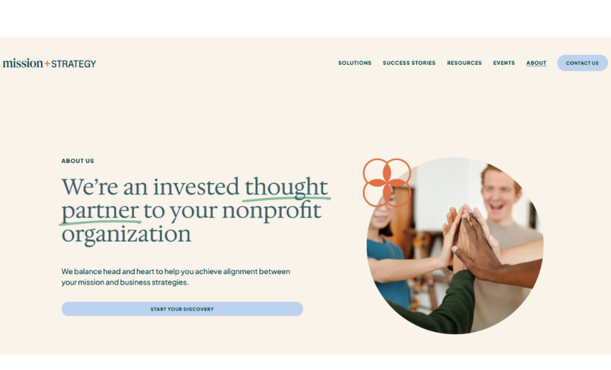
- Imagery: The photography is a key element of the design. Diverse and candid photos are framed in rounded shapes to reflect the collaborative nonprofit sector. This choice strengthens trust for nonprofit leaders.
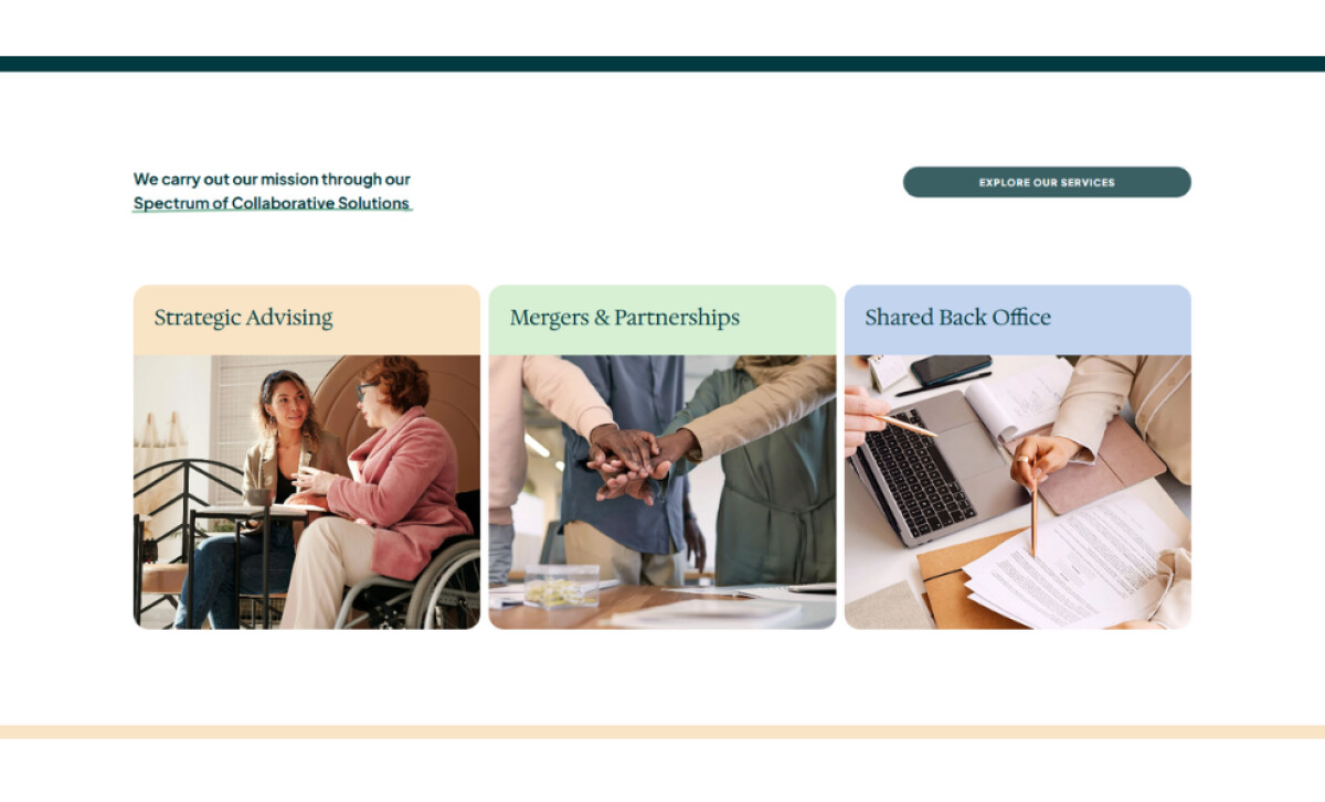
- Service Presentation: The three-column service blocks use distinct background colors. This structure transforms complex offerings into scannable categories.
- UI Elements: Pill-shaped buttons with subtle hover states keep user interactions friendly and align with the supportive brand identity.
What Brands & Agencies Can Learn from Mission + Strategy
This website offers a strong model for any service-based business aiming to build trust.
1. Use Color to Set the Tone
Your color palette is one of the first things a user notices. Softer, neutral tones can create a welcoming and supportive atmosphere. This is often more effective than traditional corporate colors for a service-based business.
2. Define Your Voice with Type
Small typographic details, like a simple underline or a shift in font style, can transform an authoritative voice into one that also feels conversational and approachable.
3. Reinforce Your Message with Shapes
The shapes of your UI elements should align with your brand's personality. Softer, rounded buttons and containers can make a digital experience feel more human and less intimidating.
About DesignRush Featured Designs
The designs we feature showcase leading creativity and expert delivery. Each stands out for its originality, precision, and ability to move brands forward.
The very best among them are celebrated through the Monthly Design Awards.
Browse more design showcases across industries:
- Best Website Designs
- Best App Designs
- Best Logo Designs
- Best Print Designs
- Best Packaging Designs
- Best Video Designs
For a full list of design agencies and related services, see our Agency Directory.