Team Behind the Design
The Maven Collaborative is a nonprofit organization advancing racial and gender economic equity through advocacy, research, and storytelling. Storm Brain created a website that reflects this mission with warmth and authenticity, using vibrant colors, expressive illustrations, and thoughtful structure.
Built to educate and inspire, the site highlights the organization’s programs while celebrating community, connection, and joy.
Web Design Analysis
A standout nonprofit website balances empathy, clarity, and education.
The Maven Collaborative’s website achieves that beautifully. It shows how thoughtful design can communicate purpose and inspire participation without losing warmth or accessibility.
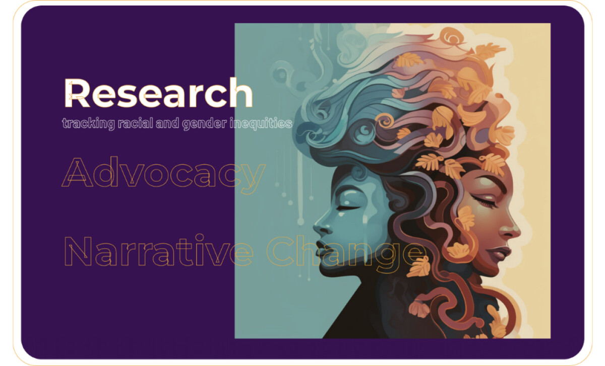
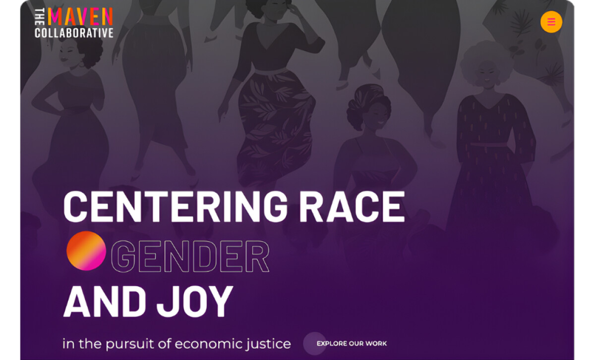
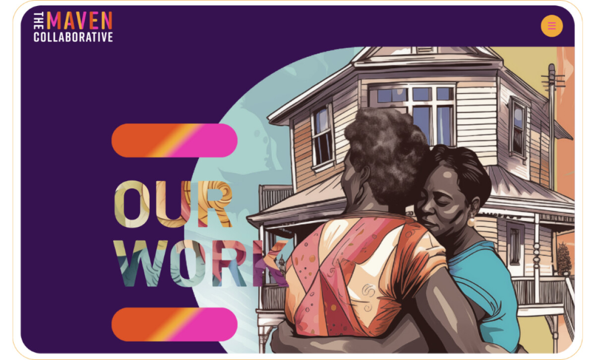
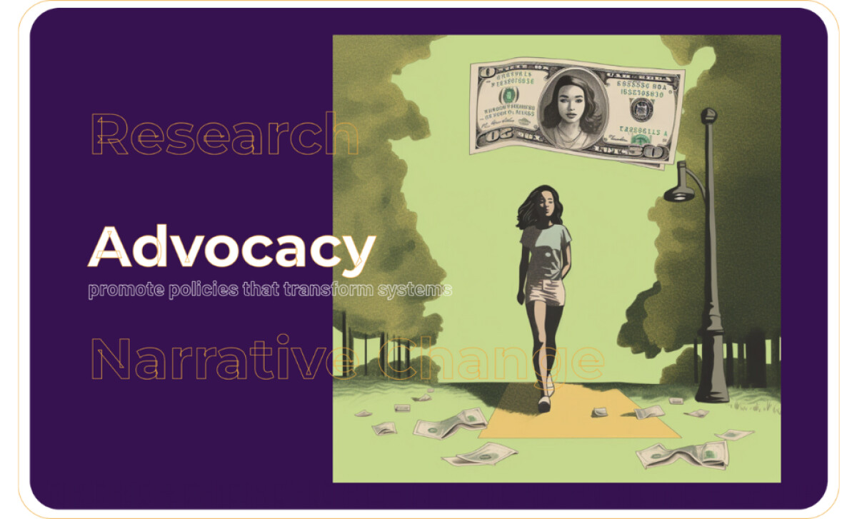
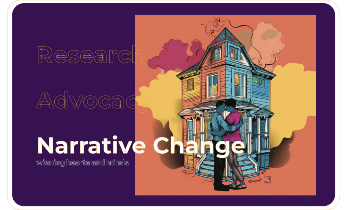
- Visual Identity: The site uses expressive illustration, radiant gradients, and deep purples to convey optimism and strength. Each image highlights Black women and community, placing joy and connection at the center of the design. The visuals invite users in with sincerity rather than formality.
- Typography and Layout: The typography feels confident but approachable. Bold headlines introduce ideas with clarity, while smaller body text maintains rhythm and readability. The layout moves naturally between storytelling and data, creating a steady flow that supports comprehension.
- Structure and Navigation: The three key pillars — Research, Advocacy, and Narrative Change — each have clear sections with distinct visuals and concise explanations. This organization helps users quickly understand the scope of The Maven Collaborative’s work while encouraging deeper exploration.
- Accessibility and Tone:High-contrast colors, large touch targets, and calm transitions make the experience inclusive and comfortable to browse. The tone of the writing and visuals together communicates compassion and determination, reinforcing the organization’s mission in every interaction.
What Brands & Agencies Can Learn from The Maven Collaborative
Storm Brain’s design for The Maven Collaborative shows how visual storytelling and thoughtful structure can carry a nonprofit’s mission with both clarity and warmth. The site feels like a community space, not just an informational hub.
1. Lead with Humanity
Every design choice puts people first. The illustrations, colors, and photography bring joy and presence to topics that are often discussed in academic or policy-heavy ways. This approach invites empathy while maintaining authority.
2. Build Structure Around Clarity
The site’s organization into Research, Advocacy, and Narrative Change gives users a clear sense of direction. Each section stands on its own while reinforcing the larger mission. This balance of focus and flow keeps visitors engaged and informed.
3. Make Accessibility Part of the Design, Not an Afterthought
From color contrast to navigation, inclusivity is built into the experience. The interface feels calm and approachable, showing that accessibility and elegance can coexist naturally.
About DesignRush Featured Designs
At DesignRush, we review hundreds of agency projects each month. The featured designs stand out for creativity, relevance, and execution.
Many go on to be recognized as winners of our Monthly Design Awards.
Explore more here:
- Best Website Designs
- Best App Designs
- Best Logo Designs
- Best Print Designs
- Best Packaging Designs
- Best Video Designs
For a full list of design agencies and related services, see our Agency Directory.