There is a moment, familiar to almost anyone with a Netflix account, where you open the app without a plan. You are not looking for anything specific. You are just looking. And yet, within a few minutes, something catches your eye, and you are watching. You did not search for it. The platform found you first.
That is not an accident. It is the product of one of the most studied, tested, and refined user experience systems in the history of digital media.
As of the close of 2025, Netflix reported approximately 325 million paid subscribers worldwide — nearly tenfold growth from 35 million in 2013. The catalog helped get it there. The interface is what keeps people.
And understanding how that interface works reveals something worth paying attention to, whether you design software for a living or simply wonder why you always end up watching one more episode.
Netflix Website UX Overview
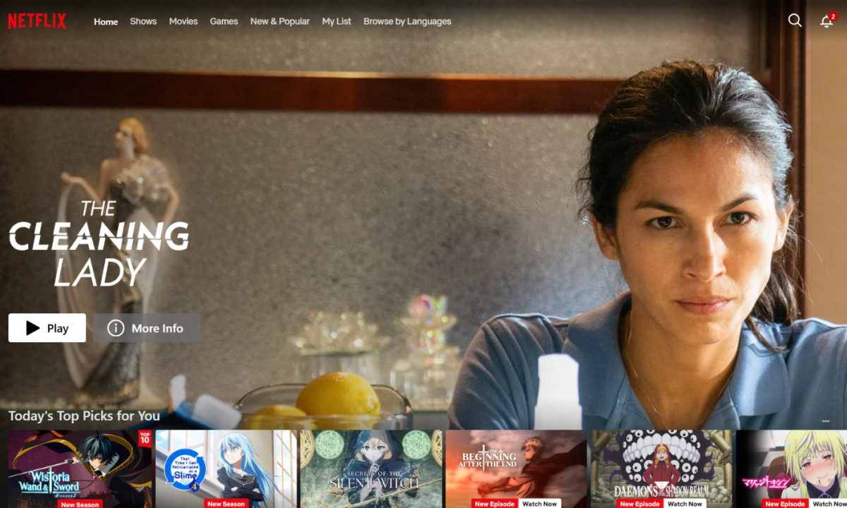
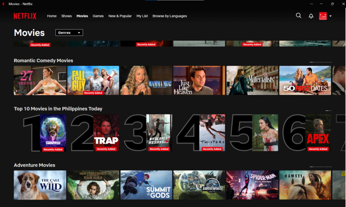
Open Netflix and you are looking at what appears, on the surface, to be a simple grid. Rows of thumbnails, organized into categories, extending down the page. Nothing flashy. Nothing that announces itself as clever design.
That restraint is the design.
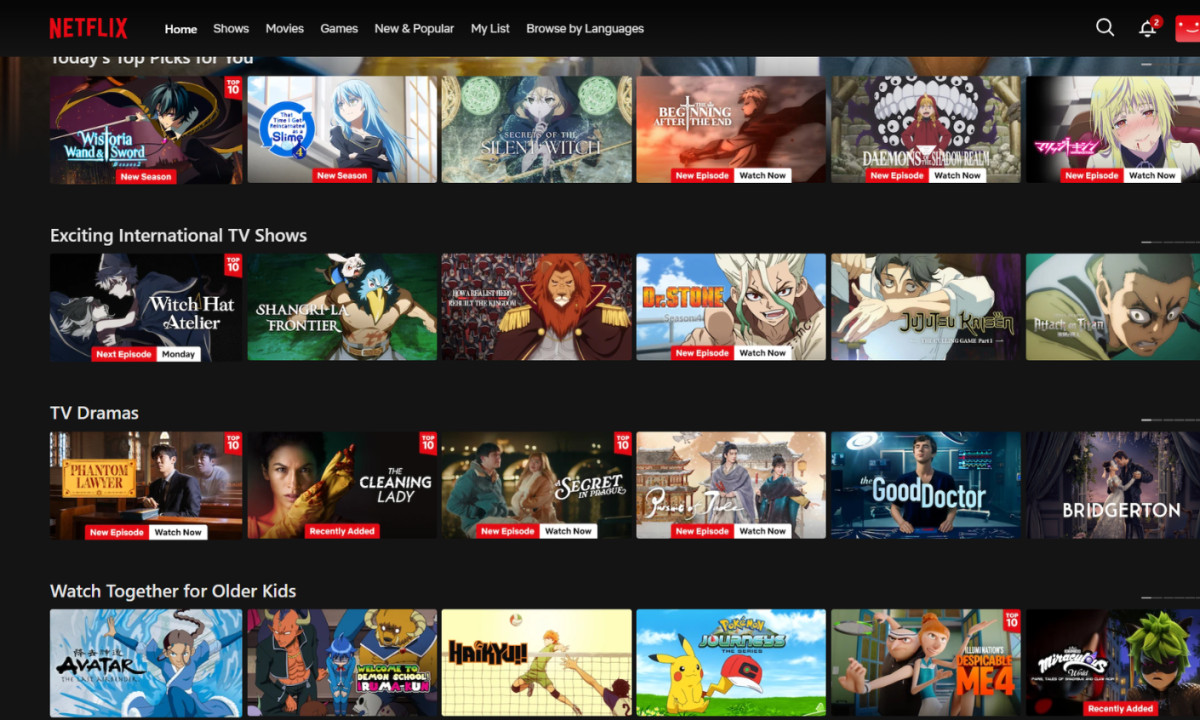
The card-based layout breaks a library of thousands of titles into horizontal rows, each representing a genre, mood, or algorithmically generated grouping.
It turns an overwhelming catalog into something scannable — a series of small decisions rather than one enormous one. The cognitive load is distributed across the scroll rather than dumped on the user at once.
The first rows you encounter after logging in are yours. They are built from your viewing history and shaped around your behavior.
Further down the page, the rows shift to editorial picks and trending content — the same titles that surface for everyone. Netflix places the personal before the general, which tells you exactly what the platform's priorities are.
At the very top sits a hero unit: a full-width feature that auto-plays a trailer or clip for a title Netflix wants in front of you. It is the loudest thing on the page, designed to anchor attention while the rest of the interface operates at a lower visual register.
Above it all, a spare navigation bar offers access to categories and your account, doing its job without competing for attention with the content itself.
The interface does not perform. It delivers.
Personalization and Recommendation Design
Here is the number that reframes everything: over 80% of content viewed on Netflix is surfaced through personalized recommendations, not manual search.
Four out of every five hours watched on the platform came from something the algorithm put in front of a viewer, not something they went looking for.
That single figure explains the entire design philosophy. Netflix is not a search engine dressed up as a streaming service. It is a recommendation engine dressed up as a library.
The system behind this is called the Personalized Video Ranker, or PVR. At any given moment, a Netflix homepage displays roughly 40 rows of content, with up to 75 titles per row.
Every row, every position within a row, and every piece of thumbnail artwork is ranked and arranged based on the individual user's viewing history, rating behavior, and signals drawn from users whose taste profiles resemble theirs.
No two homepages look identical. The platform you see is not the platform your neighbor sees.
The personalization runs deeper than most users realize. The thumbnail image displayed for a particular title is not fixed — it is chosen by the algorithm.
A viewer whose history leans toward drama might see a character's face in shadow; a viewer who gravitates toward comedy might see a wide grin.
Netflix began personalizing artwork at scale in 2017, using different image variants for the same title depending on predicted viewer preference. The goal is to increase click-through rate by matching the visual entry point to the person being invited in.
Even row labels are personalized. A row that reads "Because You Watched [Title]" is generated only for users who have actually watched that title.
The "Trending Now" row is not a single global list — it is filtered based on what similar user profiles are currently engaging with.
This machinery is not cheap to build or run. But Netflix's own research estimates the recommendation engine saves the company over $1 billion annually by reducing subscriber churn and extending account lifetime value.
Personalization is not a feature added on top of the product. It is the structural foundation the product is built on.
Content Discovery and Navigation
There is a well-documented friction in streaming: the gap between opening an app and actually watching something. Netflix users spend an average of 18 minutes browsing before committing to a title.
Eighteen minutes is a long time to spend doing nothing, and it is the precise problem the entire interface is engineered to solve.
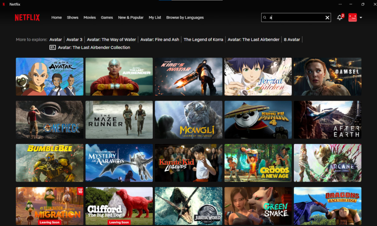
Netflix approaches content discovery in two distinct modes. The first is passive browsing, where the algorithm does most of the curatorial work and the user reacts.
The second is active search, where the user knows what they want and goes to find it. The platform's design allocates most of its UX effort to the first mode, because that is where the majority of viewing decisions actually happen.
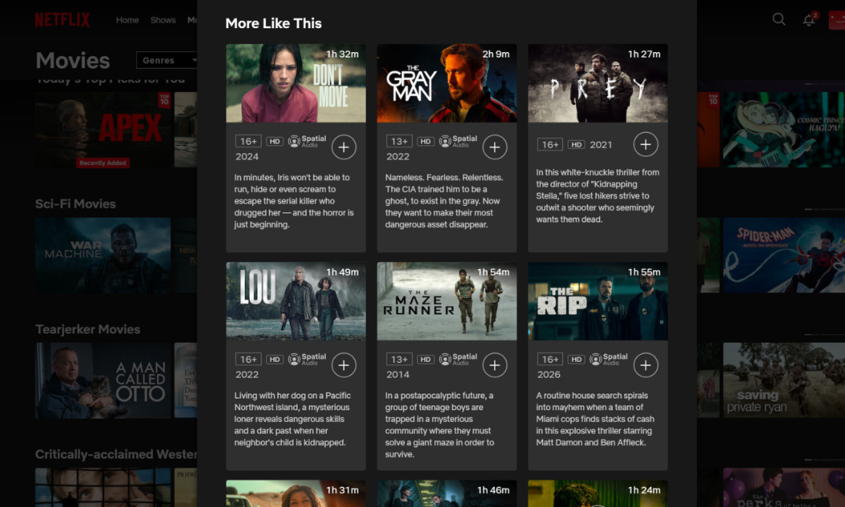
The hover interaction is where passive browsing becomes active engagement. Hovering over a thumbnail on desktop expands it into a preview card — metadata, a brief autoplay clip, play button, and save option — without pulling the user away from the browse context. Information is delivered without navigation.
The user stays in the stream of options rather than committing to a full title page before they are ready.
Two persistent features address a different kind of friction: re-entry friction. "Continue Watching" resurfaces incomplete content, removing the overhead of remembering where you left off.
"My List" holds saved titles for future sessions, functioning as a personal queue the user builds over time. Both features reduce the decision work required of a returning user, getting them back to watching faster.
Visual Design and Color System
The dark background is the first thing most people notice about Netflix, and the last thing they think critically about. It reads as aesthetic — moody, cinematic, appropriate for a streaming service. But the visual logic behind it is more precise than atmosphere.
Setting content thumbnails against a near-black canvas eliminates competing visual elements. Artwork becomes the primary layer.
The foreground-to-background contrast is high enough that even thumbnails with busy, colorful compositions read clearly without the interface adding noise around them. The screen becomes a display surface, not a designed object competing with what it displays.
White typography handles category labels and UI text. It is readable without demanding attention, which is the correct function for navigation text in an interface where the goal is to get users looking at content, not at menus. Netflix uses its signature red sparingly: it’s the punch of color in the logo, the thin line tracking your progress, and the glow of a selected button. By keeping the rest of the interface dark, the red acts as a functional signal rather than a decorative wash.
There is also a physiological logic to the dark color system that aligns with how people actually use the platform. Netflix is watched in long sessions, often in low-light environments. A dark interface reduces the visual intensity of extended screen use. The design meets the context instead of working against it.
Netflix Brand Identity System
By 2015, Netflix had a problem that success creates. The platform was operating across dozens of countries, working with hundreds of partner agencies to produce ads, trailers, billboards, social content, and digital placements. The brand looked different everywhere it showed up. The logo was consistent. Everything around it was not.
Netflix brought in New York-based design agency Gretel to solve this. What Gretel developed over the course of roughly a year was a global brand identity system called "The Stack."
The Stack is a modular framework built from three cards used in combination: an image card featuring a character or scene from Netflix content, a color card in Netflix red or white, and a text card carrying a title or tagline. The cards can be layered, stacked, and weighted differently depending on context. A billboard in Times Square might lean heavily on the image card. A banner ad might lead with text. The system introduces what Gretel called "brand volume" — the ability to dial Netflix's branding presence up or down without breaking the underlying visual logic.
What made this solution work at scale was its flexibility by design. Rather than issuing comprehensive rules that no global network of agencies could consistently follow, Gretel established guiding principles and tested them with real-world executions across different markets. The system was refined in response to how actual designers interpreted and applied it — a living framework rather than a locked specification.
Gretel also developed Netflix's brand voice guidelines and produced the platform's first external tagline: "See What's Next." That phrase captures something essential about the product — not what Netflix is, but what it does for the people who use it.
It is worth noting that The Stack's card-based modularity echoes the card-based architecture of the Netflix interface itself. The same logic of layered, interchangeable visual units runs through both the brand system and the product UI, giving the two a coherence that feels intentional because it is.
Evolution of Netflix's Digital Platform
Netflix did not begin as a streaming company. It began in 1997 as a DVD-by-mail service, built on the insight that people would rather browse a catalog online and receive movies at home than drive to a video rental store. That insight was correct. By the mid-2000s, its subscriber base had climbed from 700,000 to 3.6 million. Blockbuster was its primary competitor, and it was losing ground to a company that was, at heart, a logistics and catalog design operation.
The more consequential decision came in 2007, when Netflix announced a streaming service. The timing was deliberate — that same year, the company shipped its billionth DVD. It was a moment of maximum leverage, and Netflix used it to pivot toward a future it had been watching approach for years. Streaming launched in the United States first, then expanded to Canada and Latin America in 2010, then continued rolling out internationally through the early 2010s.
With streaming came an entirely different UX challenge. A DVD-by-mail service requires a functional catalog interface. A streaming service requires an interface people want to live inside. The investment in personalization, content discovery, and visual design that defines Netflix today is a direct consequence of that transition.
The originals program followed. House of Cards launched in 2013 as one of the first high-profile Netflix Originals, and the library has grown continuously since. As of 2026, Netflix's originals catalog is estimated at approximately 4,400 titles, with 597 new originals released in 2025 alone.
The subscriber growth tells the story in numbers. Netflix crossed 100 million subscribers in 2017, 200 million in 2020, and reached 301.6 million paid subscribers by the end of 2024, including a record quarterly gain of 18.9 million in Q4 alone. By the close of 2025, that figure reached approximately 325 million. In Q1 2025, Netflix stopped disclosing quarterly subscriber counts, citing revenue as a more meaningful measure of business health. The company posted $45.2 billion in revenue for the full year 2025, a 15.84% year-over-year increase.
How Netflix's Interface Compares to Competitors
Spend time across the major streaming platforms and a pattern emerges quickly. Dark backgrounds. Card-based row layouts. A hero unit at the top. These are now genre conventions, and Netflix wrote most of them.
But surface similarity obscures meaningful differences.
Amazon Prime Video and Disney+ both generate recommendation rows, but their homepages give more prominent space to editorial curation and promotional placements — content the platform wants you to watch, foregrounded above content the platform predicts you will watch. Netflix reverses that priority. The algorithmically generated, user-specific rows come first. Promotion comes later, if at all.
Apple TV+ operates with a substantially smaller library and an interface that reflects it. The discovery surface is leaner, with less reliance on algorithmic row generation and more dependence on editorial selection. For a catalog of Apple TV+'s current scale, that approach is appropriate. At Netflix's scale, it would collapse.
Hulu and Max carry the structural weight of live TV and linear programming integrations, which introduces navigational complexity that Netflix's on-demand-only architecture avoids entirely. There is nothing on Netflix that requires you to think about channels, schedules, or live feeds. The interface has a single mode: choose something and watch it.
The deepest competitive differentiator, however, is thumbnail personalization. Netflix serves different artwork for the same title to different users, optimizing the visual invitation based on predicted preference. Most competitors have not implemented this at comparable scale. It is a small thing that is also, at the level of first impressions and click-through behavior, a large thing.
Why the Netflix UX Works

The answer is less mysterious than the experience suggests.
The dark interface reduces visual noise, leaving thumbnail artwork as the primary design element on every screen. The card-based row layout converts a library of thousands into a series of small, low-stakes choices, each contained within a horizontal scroll. The PVR recommendation system generates a homepage that is unique to each user, which means returning to the platform never feels like returning to a place you have already exhausted.
The hover interaction on desktop gives users enough information to make a viewing decision without committing to a full title page — a small UX decision with a measurable effect on how quickly browsing converts to watching. The "Continue Watching" and "My List" features handle session continuity, reducing the overhead of returning after a break.
Underneath all of it is the recommendation engine, doing work that most users attribute to the catalog and most designers attribute to the interface. Over 80% of content viewed on Netflix arrives through recommendations, not search. The interface is designed to make passive discovery feel natural because the algorithm is doing the active work of finding content on the user's behalf.
The result, measured in behavior, is approximately 63 minutes of viewing per user per day, globally. That is not a number generated by content quality alone. It is a number generated by a user experience that removes almost every reason to stop.
There is a version of this story where Netflix is simply a technology company that got the algorithm right. That version is incomplete.
What Netflix built is a design system where personalization, visual hierarchy, brand identity, and content discovery reinforce each other at every layer — from the color of the background to the specific thumbnail a particular user sees for a title they have never heard of. None of those decisions exist in isolation. They form a coherent user experience that accounts for how people actually behave when they sit down to watch something: uncertain, browsable, and easier to guide than most companies bother to understand.
The 325 million subscribers are the outcome. The design is the reason.


