- Agency: eSEOspace
- Client: Nuvie
- Category: Website — Health and Wellness
- Project Brief: To create a compelling digital home for Nuvie’s aromatherapy patch, introduce the product to a broader consumer market, communicate its dual benefits of relaxation and revitalization, and deliver a clean, engaging, and easy-to-navigate experience.
Most wellness websites try too hard. Nuvie does the opposite. The layout is unhurried, content surfaces progressively and the visual tone stays consistent from the hero section down to the product detail. There is no moment where the site pivots into hard sell. It stays in one register throughout, which is exactly right for a product that asks users to slow down.
This approach aligns with the standards of leading health and wellness website design, where experience leads and understanding follows.
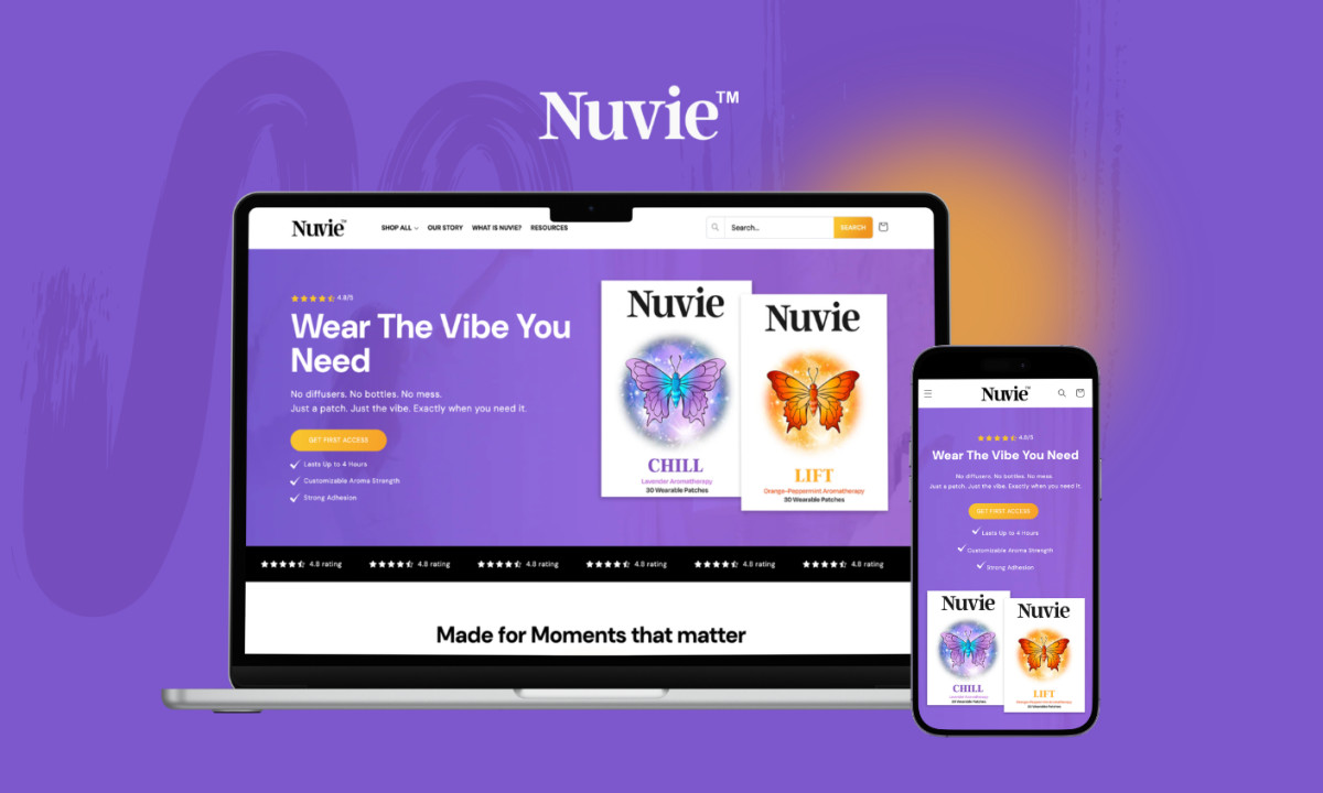
The dual-purpose positioning, relaxation and energy, is a harder sell than it looks. Most consumers associate those two states as opposites. The site handles this by separating them visually rather than arguing for them simultaneously, giving each benefit its own space and letting the user connect the dots. The result is clarity without oversimplification.
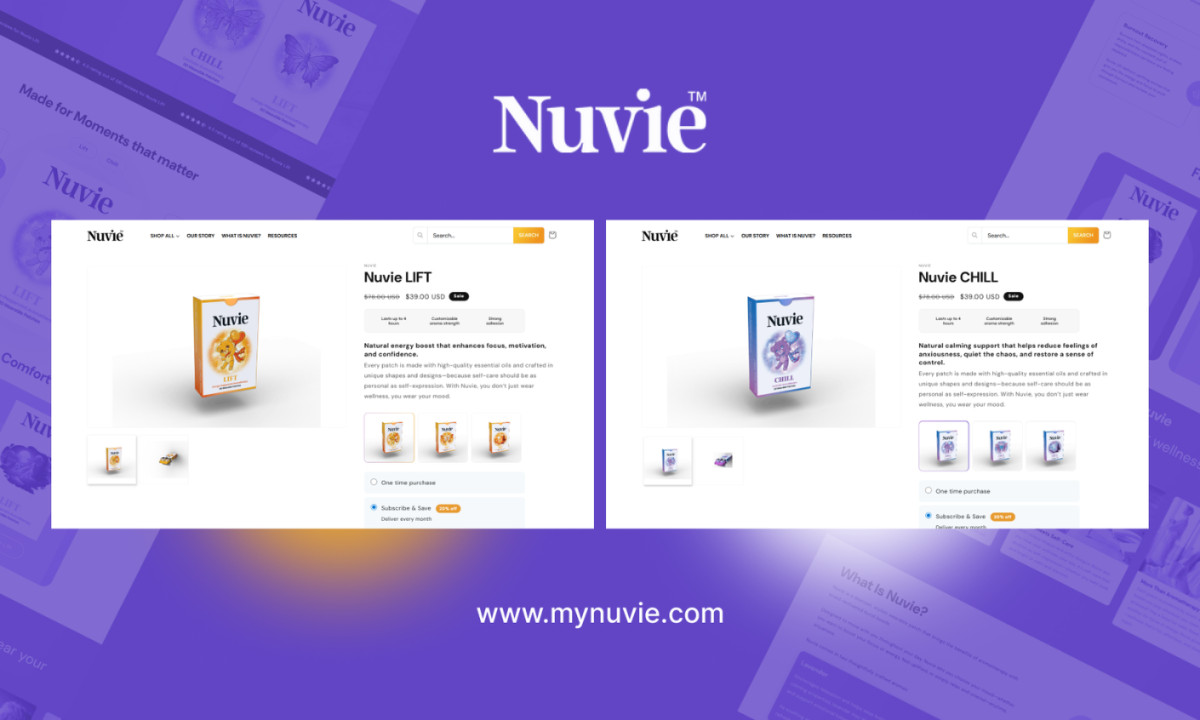
The color split does the product education before a single word of copy is read. Purple signals calm. Orange signals energy. The two-product structure is visible from the first scroll, which solves the brand's biggest communication challenge upfront: explaining that one patch relaxes and another energizes without making either feel like a compromise.
Purple, as a main color, was a deliberate bet. In a wellness category dominated by clean whites and sage greens, Nuvie chose a color that reads as bold, slightly unexpected and impossible to mistake for anything else on the shelf.
Every section follows through on that confidence, but none more so than the Lift/Chill toggle, which reframes product selection as self-diagnosis at the exact moment most e-commerce sites lose people. Pick your problem, meet your patch. The site never wavers from that clarity, and that is what makes it work.