The Sands Investment Group website transforms commercial real estate expertise into a modern, scalable digital platform. As one of the fastest-growing brokerages in the US, the brand needed a site that reflected its brand evolution and growing service offerings. Bilberrry created a clean, professional experience built for growth, automation, and high-value user engagement.
Key Insights for Brands:
- Use a clear visual hierarchy to prioritize listings and key actions
- Create modular, reusable layout components to support scalability
- Apply restrained color palettes to establish trust and professionalism
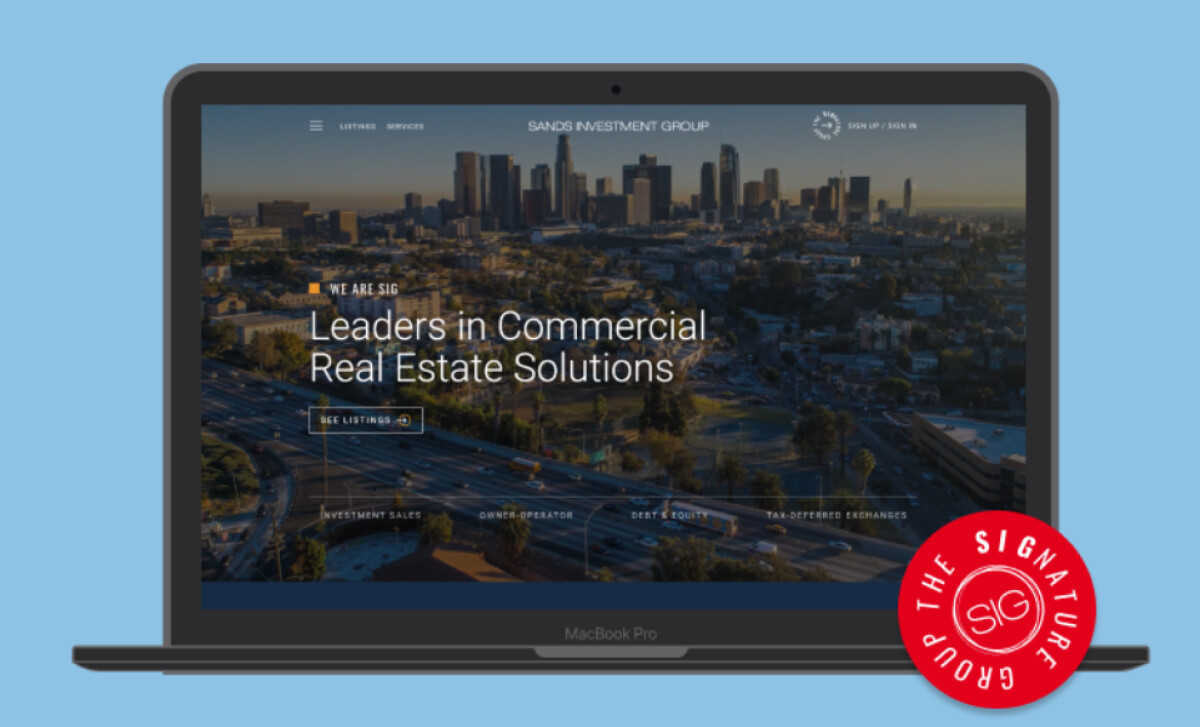
Visual Hierarchy Brings Structure to Complex Content
With a wide range of content, including listings, services, team profiles, and investor resources, the Sands Investment Group (SIG) site can easily feel overwhelming.
The solution? The designers at Bilberrry used a clean visual hierarchy to make the experience feel spacious and navigable.
Headlines are bold and logically sized, so users can scan and orient themselves quickly. Secondary text is clear and well-aligned, never competing for attention.
Properties are arranged with plenty of margin and breathing room, making even dense listing blocks feel manageable. Visual weight is assigned intentionally, so users always know where to look next.
This kind of structure is especially important in real estate, where clarity builds confidence and trust. SIG’s content-heavy platform becomes easy to navigate because every element knows its place.
Explore more clean web designs to inspire your next digital project.
Modular Layouts Make the Platform Scalable and Brand-Consistent
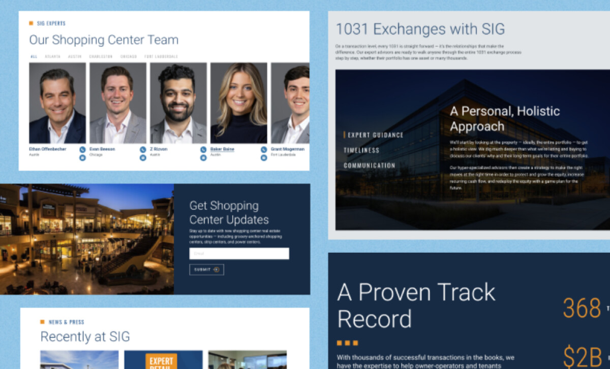
Instead of building static pages, Bilberrry designed flexible, modular components that can be reused and rearranged across the site. This ensures that the platform remains cohesive as SIG’s services grow or shift.
From listing tiles and team blocks to grid-based content sections, every layout follows a clear rhythm. This simplifies updates and reinforces consistency, which is key to brand recognition.
In fact, a Lucidpress report found that consistent branding contributes 10–20% to revenue growth. By building a scalable system of visual components, SIG can maintain that consistency across every listing, page, and user interaction. That, without sacrificing speed or usability.
Whether users are browsing case studies, insights, reports, or a broker profile, the experience feels seamless. That’s the power of good system design: flexibility without fragmentation.
A Restrained Color Palette Communicates Confidence
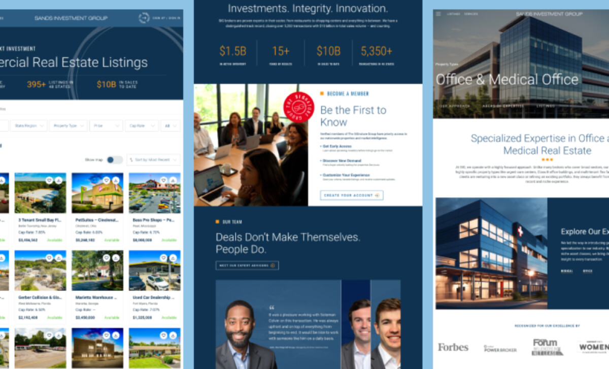
According to a Science Direct article, color is crucial in how users perceive brand trustworthiness. For a real estate brand, color choices can make or break its credibility.
Instead of going bold or trendy, the SIG site relies on a restrained palette of navy, white, and subtle greys, occasionally punctuated by warm neutrals or muted accents.
This choice reinforces the brand's professional tone while making interactive elements like buttons or links easy to spot. It also supports content legibility, especially for listings that contain dense financial information.
By avoiding visual noise, the palette helps users focus. This is a subtle but powerful UX move that keeps the attention where it belongs: on the listings and calls to action.
Check out other outstanding examples of limited-color website designs.
Responsiveness Across Devices Elevates the Experience
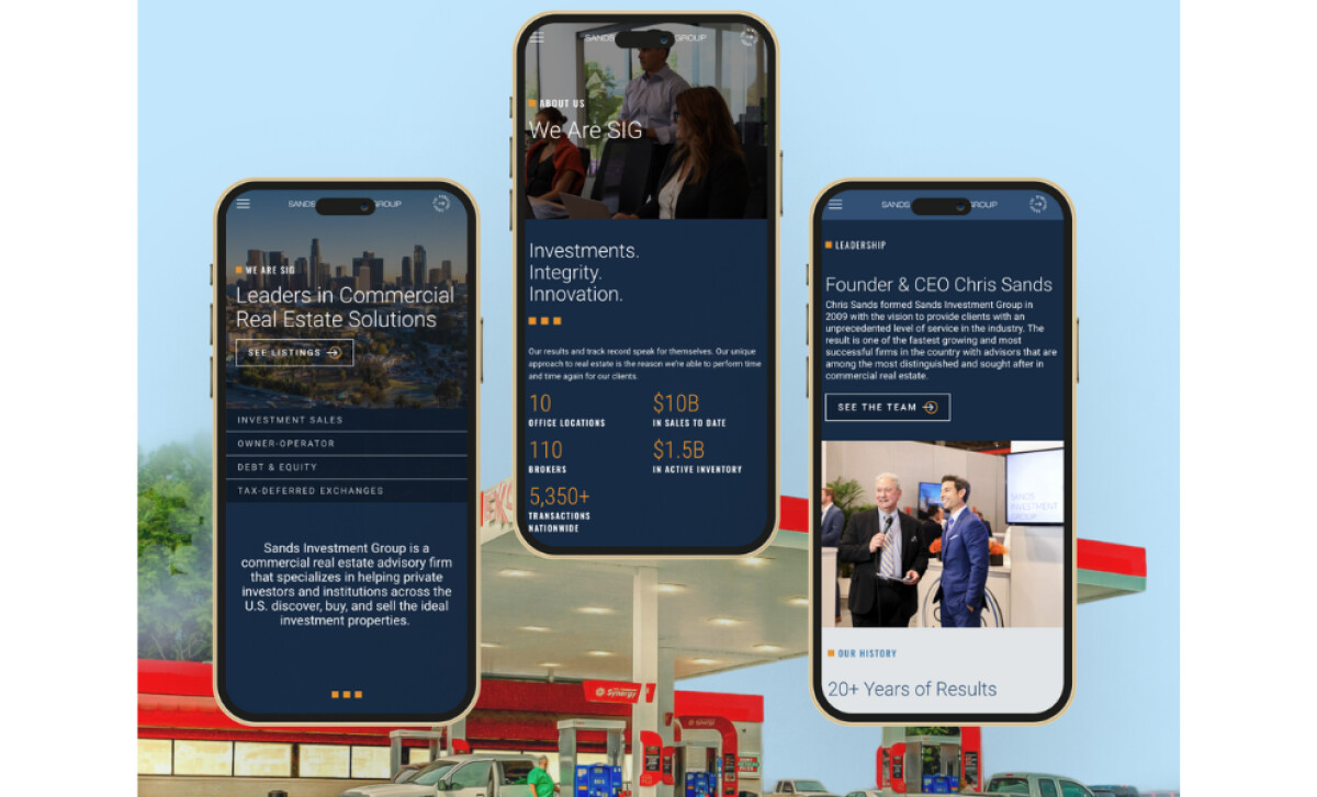
One of the site's most impressive design achievements is how polished it feels across breakpoints.
On desktop, tablet, or mobile, the layout never loses its structure. Font sizes adapt cleanly, image grids reflow smoothly, and spacing remains consistent.
This discipline allows web designers to ensure the brand shows up professionally, no matter how a user accesses the site. Especially in a mobile-first landscape, where real estate investors and brokers often browse on the go, great functionality makes a lasting impression.
Sands Investment Group’s website stands out not because of flashy effects but because of thoughtful, scalable, brand-driven design. Bilberrry brought strategy to every element, from layout systems to color choices, resulting in a platform that’s intuitive and entirely on-brand.
For a fast-growing brokerage in a high-stakes industry, this site delivers a seamless digital experience that raises the bar for real estate web design.
This work exemplifies why brands seek out expert partners to ensure their digital platforms are clear, well-structured, and scalable. Our team has ranked the best agencies worldwide to make finding them simple.
Visit our Agency Directory for the Top Web Design Companies, as well as:
Our design experts also recognize the most innovative and inspiring design projects across the globe. Visit our Design Awards section to see the best and latest in website design.


