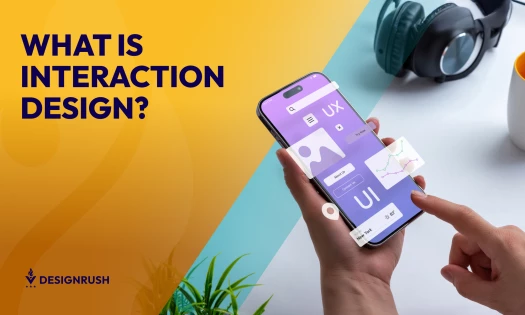
We are living in the era of minimalism – a time in history which puts cleanliness and ergonomics in the highest regard and ultimately improves user experience on digital platforms. When the focus of digital design shifts from the creator towards the consumer, we get a whole new artistic concept that makes users' lives easier -- which, arguably, is the greatest joy for businesses.
On the other hand, expressing the ideas behind a brand through simple and clean website designs is difficult. Headache-inducing, almost. Intricate details must be omitted, and only the bare skeleton of the brand should remain. But how we strip unnecessary information and what we choose to show instead is exactly what will build the picture that our customers have for the brand. After all, the website is the very first thing many customers see about the company. Often, it is also the sole item responsible for their decision whether to choose this company to purchase from or bring their business elsewhere.
Best Clean Website Designs
- Everlane
- Eurovet
- I Like Tofu
- Mazda
- Brave People
- ToyFight
- Maaemo
- NTN
- Nua Bikes
- Crop The Block
- Mikiya Kobayashi
- Tinker
- LLI Design
- Squarespace
- Soul Chocolate
- Simone Marcarino
- Victoire Boutique
- The Knot
- Jack Daniel’s
- Bar Isabel
It’s on the designers and the brands they represent to create a strong, beautiful and intuitive online destination to showcase the company accurately. The following 20 websites, being among the most successful ones, should prove to be quite inspirational!
1. Everlane

What if you could make a paperwhite website look elegant and sophisticated using only two fonts and plenty of negative space? Well, Everlane, a clothing retail store, managed to pull it off. The balanced, clean design entices potential customers to explore the e-commerce site without using many special effects.
The white negative space is complemented by two shades of gray text and harmonious pictures. The copy of the website is presented in a combination of two fonts – a serif from the Georgia font family, and a sans-serif akin to Helvetica. Everything on the website is extremely structured. Although the white space is copious, it allows visitors to focus on the products Everlane offers, ultimately making the e-commerce shopping experience more valuable.

We would definitely recommend taking a look at this website if you’re looking for stylish e-commerce design ideas -- especially if you need inspiration for a sleek About page. Everlane's features high-resolution videos that auto-play, large and easy-to-read font, and a simple narrative that is easy for users to follow.
1. Eurovet

This superb website design is so unique, we simply had to talk about it again. This veterinary technology and supplement giant went with a high-tech theme throughout their design, which subtly mirrors their industry and services. To set the clinical and authoritative mood, a stark background of negative space and bright green hue -- which represents health and nature, according to color psychology -- permeates the entire website.
A brilliant interactive illustration makes the brand and area of specialization of the company clear while also engaging the visitor from the very beginning. Meanwhile, two sans-serif fonts carry the copy of the whole website design. A thin line running across the page and a faint border grid are definitely distinctive cues of the website.
This modern design elicits an informed emotional response via Eurovet's elaborate and innovative, yet simple and clean design. It is sure to make any visitor associate the brand with the state-of-the-art technologies the company develops. Check out some of the best veterinary website designs here.
3. I Like Tofu

I Like Tofu is a young Slovenian brand with a brilliant, engaging website that redefines the term "clean." The bones of the design are simple and intuitive. However, the website is also comprised of an array of delightful colors and hand-drawn illustrations that add personality without distracting the visitor. While many different colors are used to represent the wide variety of tofu flavors the company offers, the design remains consistent. Hence, a strong brand identity is built up throughout the website.
The website is not short on pretty yet minimal effects either. Parallax scrolling and hover effects add a nice touch to the overall user experience. Still, navigating the site doesn’t feel cluttered or complex. Judging from the website, visitors can determine that I Like Tofu is an approachable and fun brand. !
4. Mazda

The automotive industry is always swarming with beautiful, elegant designs. However, Mazda's site, in particular, took our breath away.
Though photo-heavy, Mazda’s website remains sophisticated and clean -- even the large list of subpages this website includes is smartly tackled. Not all pages are listed in the navigation bar, but rather, most pages are accessed via intuitive navigation paths throughout the site. Still, the many pages contained in the traditional menu are well-organized and easy to sift through.
The Japanese spirit and deep devotion to their product are felt strongly in this online presentation. Mazda further encourages strong brand identity using one single sans typeface throughout the website.
5. Brave People

Brave People is a digital marketing agency comprised of young, passionate advertising specialists and creative souls with a clean, refreshing website.
Bold statements, photographs, and videos set a professional tone. The site also uses some fancy interactive graphics to show off their personality, such as parallax scrolling -- especially on the page devoted to their strategy. Can’t see a traditional navigation bar? Think: Simplicity. You’ll actually find the navigation in the top left corner -- the place our eye automatically starts reading the page from.
Overall, the periodic use of design elements and clean layout work together to create a strong harmony across the website.
6. ToyFight

Among the top digital agencies, ToyFight is a peculiar one with a delightful website design. Throughout the site, a common theme is followed – the two plastic dolls, each a model of one of the two creative souls of ToyFight, go through adventures together. While the toys stay gray, they appear in lively, colorful settings, making the website color scheme bold and playful. Furthermore, the perspective of the pictures tilts as the visitor moves their cursor around the page. This makes the website feel extraordinarily interactive. But despite these innovative effects, the website maintains a clean, simple aesthetic.
Throughout the website, compositions shift between two diagonal directions. This is best demonstrated on the Work page, where the agency presents their previous projects. The website is immensely interesting to scroll through, and simple scroll effects ensure that.
7. Maaemo

Maaemo is a restaurant in Oslo, Norway. They don’t own a long chain of locations around the world. In fact, there’s only one Maaemo location in the world... and it's unique, just like its website is.
This enticing website is full of natural, contemporary flavors. The parallax scrolling fosters a tasteful blend of its modern ingredients -- a refreshing palette of dark, cold colors mixed with white negative space, a strong logo, and a tranquil layout. But perhaps the most beautiful detail of the website is the graphical loading page elements.
8. NTN

NTN is a fairly new but highly stylish watch, clock and home décor manufacturer. The website accurately conveys the luxurious image of the brand through a clean and lustrous design.
The construction of the website is straightforward, with the only effects being the few pictures reacting to a hovering cursor. Proxima Nova, a wildly used and loved font family, is applied all throughout the website. This font choice makes the copy easily readable and, when coupled with pictures of exquisite quality, highly memorable.
This sleek, simple website manages to showcase the elegance of the brand, making it an unforgettable visual experience.
9. Nua Bikes

Nua is a manufacturer of titanium bicycles based in Barcelona, Spain. Deeply devoted to fighting planned obsolescence, this maker of durable bikes has an unforgettable website as well.
This gorgeous web presentation manages to fit everything it needs onto one single page. Everything is covered under one long page with great scrolling experience. The navigation bar is simple and clean, divided only with negative space – a solution that works brilliantly on this design.
Nua’s website flaunts three grayscale hues. There is pure black for content text, light gray for subheadings and indicators, and snow white as the negative space. However, the unique identity of the color scheme is only revealed in the highlighted text color. This pretty brown hue, named Peru, completes the scheme, rounding it up to create a color palette reminiscent of traditional, rustic woodwork.
10. Crop The Block

Crop the Block is a community of filmmakers based all throughout the world. They seek to both create contemporary video campaigns based in urban settings for clients and to create a large base of creative video presentations of various cities created by local filmmakers. Crop the Block has made video material for brands like Airbnb and Jägermeister.
However, not only the video material they make shines with authenticity and creativity. Their website is a beautiful online presentation, pairing high-quality video material with gorgeous typography, especially on the landing page. Remaining consistent throughout the various pages of the site, the layout is well adjusted to the carrying functionalities of the site – a neatly ordered exhibition of their abundant work and a dynamic video playback.
Crop the Block’s tasteful website manages to be interactive and interesting, while remaining simple and easy to use, demonstrating the art style of the community behind it.
11. Mikiya Kobayashi

Mikiya Kobayashi, a furniture designer based in Tokyo, Japan. He established a studio of his own back in 2006. This resulted in him collaborating with many famous brands and designers, creating many inventive and sleek furniture designs over the years.
However, his furniture designs are not the only sleek aspect of his career – the way he presents himself through his website is quite snazzy as well.
The plain website layout cuts to the chase. From the moment the visitor first opens the page, its purpose is unambiguous. Kobayashi’s various designs are showcased in a neat grid view. A sans-serif font called Calibre is used for all Latin alphabet characters throughout the website. For the copy written in Japanese, a Microsoft’s native font Meiryo is used. These create a beautiful, stylish contrast to one another, giving this website a harmonious rhythm.
12. Tinker

The watch designs are not the only timeless and pure aesthetic element Tinker produced. This manufacturer of simple, beautiful wrist watches invested in making their website reflect their brand’s identity – and succeeded.
Another website white in negative space, Tinker’s site is still distinguishable from the rest. Varying content column numbers are an interesting element Tinker applies to create a unique dynamic throughout the site. This is especially splendid on their About page.
The website’s shop is a rather extraordinary visual experience in itself. The store is characterized by the soft orderliness of items, along with the instinctive tools used to tinker with the search results. This elegant website is a perfect example of an online presentation that requires no exhaustive explanation to be understood.
13. LLI Design

This single page design is large enough to hold pages of explanations and details about the LLI interior design studio and their workflow. It might seem like a mere slideshow at the first glance but make a couple of clicks and you’re drawn into an exhaustive story encompassing each step of the interior design process this studio practices.
This is achieved through the smart application of an interactive, dynamic navigation bar. The visceral implementation of a flawless sans-serif font in the justified text, along with the gorgeous placement of the studio’s logo, rounds up the whole design into a unique experience.
This website contains all elements it needs to be splendid, and not a single one more – which makes it beautiful, pure and sophisticated.
14. Squarespace

Squarespace is widely known as an acclaimed website hosting and design service. However, we think their own website design deserves recognition as well. In fact, this website is incredibly successful. An interesting characteristic that makes it stand out – it doesn’t have a navigation bar at all. Instead, it has a large button that serves as a call to action, next to a search bar. Both serve an important function in creating the visitor’s own website.
On the Squarespace website, white and black negative spaces alternate on different parts of the website. Still, these pages manage to interconnect seamlessly. The front page of the website shifts between different hues and saturations itself, setting the mood of versatility and showcasing the many possibilities the company offers to its customers.
This responsible, clean website design is an absolutely gorgeous demonstration of the company’s service.
15. Soul Chocolate

This dazzling website comes to us from Canada, where a couple with a passion for the cocoa bean creates their product – a chocolate bar with a soul. This small brand can be proud of clean practices, pure cocoa bean, a gorgeous package design and a marvelous website design.
Apart from the contact information, the personality and the soul of this brand is shown through a single web page. The unbroken flow includes a catalog of their products with an online ordering option, a beautiful story of the company’s conception and a selection of gorgeous production process photographs. The combination of two modern sans-serif fonts, a condensed Acumin and a light Myriad, makes the copy of the page subtle, yet impactful. Along with the thin line art, they create a delicate, tasteful balance.
16. Simone Marcarino

This simple one-page website is an enchanting UX experience -- which makes sense, considering its subject (and likely designer) Simone Marcarino is an Italian UX/UI designer and front-end developer himself.
The page is simple – an interactive animation, a short bio with social media links, and short text. Although those items are rather unimpressive when listed out, they create an extraordinary design when put together. The small elements are punctuated by gaping white space, which entices users in its bold simplicity.
The animation, based on the effect of a kaleidoscope, follows the user’s mouse. Under the logo -- which is central to the page composition -- a single instruction line is written: “drag an image on me.” Do follow the instructions and try it out with any picture from your computer. The results are beyond captivating.
17. Victoire Boutique

Victoire is a simple, flowery women’s apparel online store from Canada. This pretty e-commerce site provides the customers with both cute garments within a refreshing, easy-to-navigate shopping experience.
The color choice on the website is gorgeous – while the white negative space keeps the site clutter-free and easy to comprehend, the light coral and aquamarine accents and watercolor floral illustrations fill the pages with personality. Meanwhile, a medium gray color typography communicates information clearly to consumers. The style chosen for the copy is a whimsical font, similar to a typewriter-like Courier.
The overall mood of the site is romantic, whimsical, and lively -- but the brand achieves this without distracting elements. Instead, the unique energy is achieved through simple design and compelling product photographs.
18. The Knot

The Knot is far and away the most comprehensive website on this list. The database for wedding vendors, planning tips, gift ideas and more hosts a bevy of options for couples getting married throughout both the United States as well as many global locations. However, despite the seemingly unending lists of information, The Knot maintains a surprisingly clean interface.
Users are welcomed by a bright yet minimal homepage with an auto-playing video and simple infographic about how the site works. Each product page features simple thumbnail images and easy-to-use features, while a comprehensive menu that stretches across the top of the site keeps the online resource easy to navigate. Vendor pages are equally as simple, with important information that The Knot's target audience would want to know clearly laid out in a pleasant way.
19. Jack Daniel’s

This legendary brand might not need to create brand recognition through its website, but they certainly use the site it to maintain it. While the beverage is iconic, the strong website design reinforces that recognition in every corner.
The black negative space is interwoven with the golden and brown hues characteristic for the zesty drink while providing a strong balance for the text and multimedia. The distinctive condensed font is accompanied by a stylish slab serif type. Throughout the variety of pages, large bold photographs and video clips are intertwined with text to create a strong, fiery appearance and a strong impression. Other pages see subtle translucent-like imagery from the brand, reinforcing the visual identity without overwhelming the user.
With only an occasional UI motion effect, Jack Daniel’s storytelling website utilizes the tried-and-true design principles to make a website, creating a powerful, stunning and elegant online presence.
20. Bar Isabel

Last but not least, a Toronto-based bar called Isabel won us over with their sleek website. This mysterious yet simple design allows the energy of the brand to shine through.
The beautiful choice of a red hue with white accents produces a compelling contrast to the captivating black background. In fact, the dark background -- complete with layered illustrations of seemingly random motifs -- creates the enigmatic, dark ambiance of this design, which is a characteristic that threads throughout the entire site. The imagery and composition of each frame are alluring, with thin, neon-like red line art in between.
This design is fierce and intense. Not a single photograph appears on the web page, and yet it provides a strong brand association through the limited number of elements.
Importance of Clean Website Designs
In a way, a website is to a company’s online representation what a business card is to an individual who is networking -- and so much more.
A website is one of the most important online representations your company can have. Yes, even in the age of social media. Why? Because websites are usually the first direct contact a customer has with your company and is often where real, meaningful transactions of information and money take place. They must showcase the brand and be honest and trustworthy to consumers.
With a clean website, companies can fully represent the brand identity online while also securing data safely. And even though we're in the age of social media, it appears that customers still prefer visiting a brand’s personal website as opposed to their social media channels. A lack of a website is, to an average customer, a clear sign something is fishy about a business. For example, with only a Facebook page, many people may think your business has poor credibility, which will ultimately hinder your approach to presenting your brand well online and securing new customers. Check out best personal website designs in this article.
How To Approach Clean Web Design With Modern Style
From the conception of the idea to its execution, each step of designing a website is unique yet important in creating a site that can help grow a company and capture customers.
1. Understand Your Needs
Every such project must start with a thorough and complete understanding of the brand's needs and identity. Ensure you have a strong understanding of future objectives, target audiences, important information, and communication styles that fit the brand before you start creating a professional website. If you lack this crucial information before you start, your project will likely take longer and need many more revisions.
2. Create A Wireframe
Once this step is complete, your team can start sketching and wireframing. Essentially, wireframing means creating a comprehensive overview of element placement on the website, without including specific design elements -- like the bare bones and foundation of a site.
Creating these layouts properly will help you achieve a clean, functional design that can be easily tweaked, changed and updated to ensure your brand stays relevant-- especially during occasions like holidays or sale weeks. If you choose to create a digital wireframe, you can use Photoshop or a tool like proto.io or wireframe.cc.
Pro Tip: Make sure your wireframe includes everything your brand wants on the website. This will help your team create the most intuitive structure and navigational flow for users, which will improve user experience and, ultimately, conversions and sales.
Typically, basic and imperative information should appear first. Sites should also have obvious links leading to other pages on the website or page segments with additional in-depth information.
Finalize Inspiration
Finally, you can devote your time (or your team's time) to actually designing an effective professional website! Before you start, make sure your style tiles and mood boards are approved and finalized -- you don’t want to finish the project, only to realize you forgot something or discovered a new design trend you prefer.
Basically, put the chosen colors, fonts, vignettes, illustrations and other elements next to each other. This will help you figure out if they all fit nicely and help you achieve the business goals you need to reach. Plus, if they don't complement one another, it will be easy to determine what doesn't work and will make finding a replacement that much easier.
Once you gulp down that coffee and complete those steps, you’ll be ready to design a prototype and turn that vision into a website design that converts!
Need a little assistance with your brand's online presence? Create an effective and clean digital destination of your own with the help of the best web design and development companies! Just head to DesignRush's Agency Listing section to find your perfect fit.