Standout Features:
- Rigorous monochromatic minimalist design aesthetic
- High-quality black and white architectural photography
- Clear information structure and legible typography
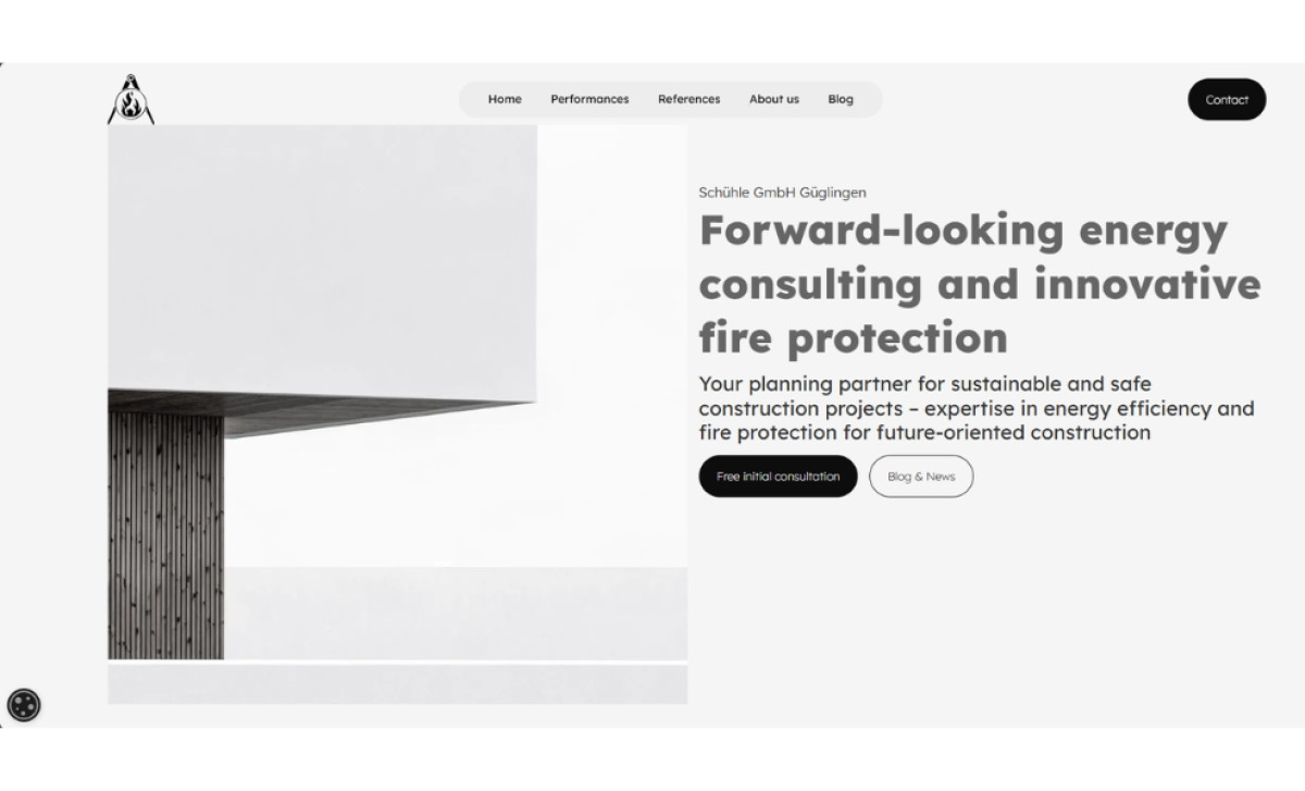
Eliminating any potential visual distractions and powerfully conveying intense focus is the very first impression a visitor gets with the Schühle GmbH website. Designed by Königxmacher, it has an almost severe minimalist aesthetic — tons of clean white space, organized grid-based layouts, pretty much just using black, white, and grey throughout.
Right away, the website feels focused and clear because it sticks strictly to minimalism in its design. It positions Schühle GmbH as a serious, no-nonsense expert firm that knows what’s important. Opting for such an uncommon, disciplined approach cuts out any distractions without sacrificing personality — this starkness is character in itself.
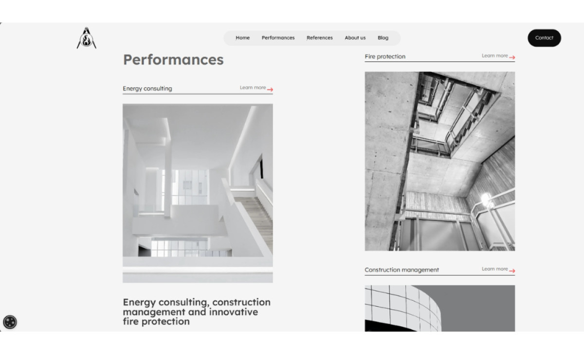
Additionally, high-quality architectural photography, mainly presented in black and white, is a key visual component here. They display modern buildings and structural details pertinent to the firm’s work. The black and white approach highlights form, structure, and context, which explains the technical subject matter immediately and succinctly.
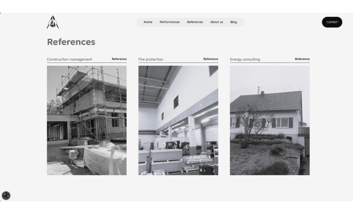
Complementing the visuals, the website's information structure feels clear and logical too. Clean, highly legible sans-serif type, used with clear hierarchy, helps make potentially complex technical details more digestible for the reader. The website also focuses on the essentials: services, examples of work done, and credentials. And that’s all it needs.
This professional services website convincingly proves that the classic "less is more" design principle can be effective today for establishing genuine technical authority. By homing in on presenting essential content, it conveys the meticulousness needed in demanding fields like engineering or high-stakes financial consulting.