“People first.” Many companies boast this as their policy and do not follow through with the promise, but Happy Cog is different. They work hard to maintain this approach for each and every client they work with.
The statement, “People First,” is the very first thing users see the moment they enter the company’s website. With a bold and widened black font, Happy Cog makes sure users won’t miss their message. The home page describes the principles they abide by and the way the company works.
Utilizing the same boldface font, the company highlights a number of significant words within the introductory textual content. These keywords are depicted with a serif font, while the rest of the paragraph is written in a sans serif style. These words mean something to the company and the way they work, which is an obvious point they want to get across to visitors.

Words are the key! Throughout the entire website, Happy Cog uses words to showcase the importance of their values and their design work—an interesting choice for a visual-based company. Their job is to help you craft a message, and they’ve developed a simple message for visitors to their site: “We’re good at what we do, so let us tell you all about it.”
Breaking down the services they provide, Happy Cog creates a storytelling platform of their capabilities. Each part of what they do is simply presented and easy to understand. The menu on the portfolio page is red in coloring, placed against a slate-gray negative space. When one section is activated, it becomes highlighted in white to stand out more against the dark background.
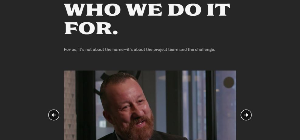
Continuing with the idea that words are the key, Happy Cog understands that not only their own words are the important ones. What other people say about the company is of equal importance. In a series of short clips, Happy Cog presents the testimonies of multiple satisfied clients.
Their wordy technique is smartly applied, and it hits a home run with their videos. The words of Happy Cog’s clients speak volumes for the value of the company’s work.
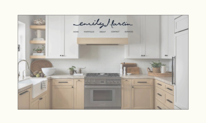
Happy Cog is a minimal website design in the Professional Services industry.